Bonus blog post! I am honored to be the guest designer at As You See It Challenges today! This time around it's a recipe challenge, take a look:
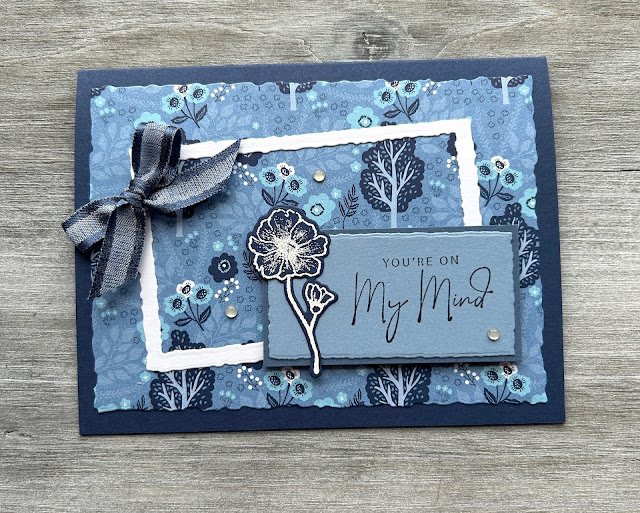
As soon as I saw "flowers" and "shades of blue", I thought of the Countryside Inn DSP which I haven't played with a lot yet, so of course that was my first pick for my card. Here's what I made:
I started by cutting out the white frame with the Deckled Rectangles dies, and then used different sizes of the same dies for other elements on the card front. Luckily I have some Night of Navy ribbon that looks great with the patterned paper, and I tied that around my frame. So I had all of the background elements picked out, and then had to think for a bit about what to use for the main image and sentiment. I landed on Nature's Prints, because it's always fun to play with that one and I thought it went well with the DSP.
I hope you'll join in the fun at As You See It Challenges, and thanks again to the AYSI team for inviting me to play along as a guest designer. I'll be back in a couple of months once my new craft room is set up after the move. Cheers!
Supplies, all SU!
Stamps: Nature's Prints
Ink: Versamark, Night of Navy
Paper: Night of Navy, Misty Moonlight, Boho Blue, Thick Basic White, Countryside Inn DSP
Accessories: Night of Navy bordered ribbon, white EP, Deckled Rectangles dies, Milky Dots, Dimensionals


Beautiful, Christy! I have been using the heck out of this DSP - it's just wonderful. Love your design for our recipe - perfect! You're a great cook! Thanks so much for guesting with us at As You See It!
ReplyDeleteDecided - I NEED this DSP Christy! Your card is so pretty, a wonderful collection of blues and your Sun Prints flower co-ordinates perfectly. So thrilled to have you join us as Guest Designer this week!
ReplyDeleteThanks so much for guesting with us, Christy. This paper is absolutely made for this challenge - whoever came up with it back last December must have been a mind-reader of the new catalogue! Your card is so pretty. I really like the way your frame is skewed - it adds some zing to the design.
ReplyDeleteBeautiful card, Christy - love the way you've interpreted my recipe. Great to have you guesting with us at AYSI
ReplyDelete