Monday, February 8, 2016

Going Down (Mount Fuji)

Scrappy Monday, y'all.  I worked on a scrapbook layout over the weekend that I wanted to share today, but I haven't gotten the journaling done on it yet so instead I'm sharing the last of the Mount Fuji pages (see the other three layouts here, here, and here).


So there it is, our return trip down the dread mountain.  I've never been a big fan of Bravo Burgundy, but to my everlasting surprise it really, really worked for these pictures...click the photo above to see it bigger and look at the red tones in the landscape pictures.  Anyway, when I got out my very dusty Bravo Burgundy ink pad for this layout, I opened it up and found...


The Dreaded Gold Sheen.  This is an older felt-style ink pad; I've also had gold sheen on Raspberry Ripple and Riding Hood Red, and I think my one-year-old Cherry Cobbler has a slight case of it too.  For some reason it usually affects the reds.  Anyway, I'm not really sure how to get rid of it, and I heard that it could be contagious (like, if you ink up a stamp with a gold sheen ink pad, and then clean it on your stampin' scrub, the gold sheen sits on that and could theoretically infect other ink pads if you clean a stamp and then immediately ink it up with another color).  So anyway, I made my layout work without Bravo Burgundy ink (though I suppose I could have used a BB marker).


Title banner in Garden Green and Early Espresso.  I love the Jayne's Type Alphabet.


My final Fuji color palette:  Bravo Burgundy, So Saffron, Garden Green, Wild Wasabi, Tip Top Taupe, and Early Espresso.  Who knew I'd use Bravo Burgundy on a scrapbook layout and like it?

Well, I think I'll try to take my doglets for a walk for the first time since Snowmageddon.  Sadie may explode with joy, so wish me luck...cheers, y'all!

Supplies, all SU!
Stamps:  Jayne's Type, Calendar Alphabet & Numbers, Calling All Heroes
Ink:  Garden Green, Early Espresso
Paper:  Bravo Burgundy, Garden Green, Tip Top Taupe, Wild Wasabi DSP, Haiku DSP
Accessories:  None

Saturday, February 6, 2016

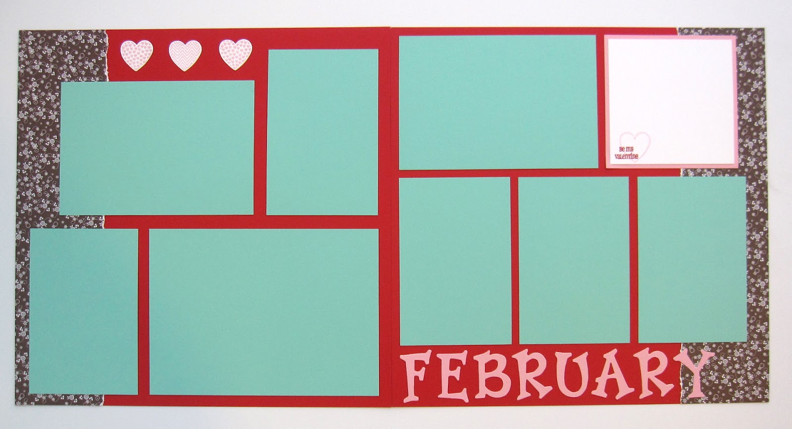
Baby Books: February

A Snapdragon post on a Saturday?  Craziness!  Well, I've come to the conclusion that I need to post baby book layouts on Saturdays for a while or else they're never going to get shared, and some of these layouts I really like.  I still haven't shared like half of the twins' baby books from last fall, much less any of the one for my sister that I just finished, so here we go.  I'm going to go through all the twins' books before I start on posting the other one.


So, February is all pink and red and how do we make this more little-boy-appropriate?  AQUA.  I got the idea after looking at the Fresh Prints (of Bel Air) stack of DSP that was out a year or two ago, it was all Real Red, Coastal Cabana, Crumb Cake, and Whisper White.  So I used the Real Red and Coastal Cabana as my main colors, then added a smidge of pink and use some manly Early Espresso DSP.


Hahahahahaaaa that DSP isn't manly, it's got flowers all over it.  Because it's still Valentine's Day.


I always stamp a little something on the journaling block, and I like how this one turned out.  So I've done several other layouts where I stamp words on the journaling blocks.


Today's color palette, as previously mentioned:  Real Red, Pretty in Pink, Coastal Cabana, Early Espresso, and Whisper White.  I'm kind of in love with this color combination.

So that's it for the first weekly baby book post!  See you next time, same Bat Time, same Bat Channel...

Supplies, mostly SU!
Stamps:  Hearts a Flutter, Filled with Love
Ink:  Pretty in Pink, Real Red
Paper:  Real Red, Pretty in Pink, Coastal Cabana, Whisper White, Sweet Always DSP
Accessories:  Sizzix alphabet, Hearts a Flutter Framelits

Friday, February 5, 2016

Friday Flashback: Gifts from the Orient

Happy Friday, y'all!  Already time once again for a Friday Flashback, and this week's featured stamp set is Gifts from the Orient.  Let's take a trip back through the stampy archives...

Also features Rough Type, Dream Gardens
Here's a scrapbook layout from my parents' visit to Okinawa in 2008.  Wow that was nearly 8 years ago, crazy.  Anyway, the origami crane above the title is from today's stamp set.

Also features Petite Patterns, Warm Words

And here's a card from the same time period, I made this for my parents when they visited and gave them a kokeshi doll too.  So I pulled these two out of the archives and I was absolutely SURE I had made at least one more card with this stamp set, I remembered it quite vividly so I just spent 15 minutes looking for the picture of it in my Splitcoast gallery only to find out that for the card in question, I used a different Asian-themed stamp set.  *sheepish grin*  So that's it for the flashback part, let's see some new stuff!


This card was the combination of three different challenges, starting with the latest from CAS(E) This Sketch:


I turned the sketch on its side, but I kept my card CAS because it's only two layers of white cardstock and the strips behind the oval are stamped red lanterns.  Speaking of red, the Retro Rubber Challenge this week is a color combination:


So for Retro Rubber-ness, I've had Gifts from the Orient since 2008, and I got Rough Type when it was first released in 2010.  Both well over a year old, though that alphabet never has time to get dusty in my house ;)

Anyway, just one more challenge, the theme at the Male Room:


Yep, I used pink on a dude card.  Granted, not a lot of pink, but I did use pink :)  I'm sending this card to my dad because it's punny and he appreciates a good pun.  "Hai" sounds like "hi" but means yes in Japanese (or if you want to get more nit-picky, it's more like "I acknowledge what you're saying" rather than "I agree with you") but it just made me giggle a bit when I thought of it and yep, Dad will like it.

After I finished my hai card, I just wasn't quite ready to stop for the day so I made one more:


When I do the Friday Flashback posts, I almost never look at the older project pictures first so it's just coincidence that I used the same two stamps from the set on my two new projects.  That, and those are my favorite stamps in the set.  Anyway, this one is for the challenge at Fusion:


I went with the sketch more than the paper hearts picture, though I think I could do some thing with green, orange and purple.  Maybe another time.  Anyway, this good luck card I think also counts for the Male Room challenge again.


So that's it for me today.  Hope you have a great weekend, y'all!  I think we might go see Kung Fu Panda 3...

Supplies, Hai card:
Stamps:  Gifts from the Orient, Rough Type
Ink:  Basic Black, Real Red, Pink Pirouette, Crumb Cake, Smoky Slate, Mint Macaron, Blendabilities
Paper:  Thick Whisper White
Accessories:  Ovals Framelits, Neutrals Candy Dots

Supplies, Good Luck card:
Stamps:  Gifts from the Orient, So Happy for You
Ink:  Real Red, Bermuda Bay, Basic Black
Paper:  Real Red, Thick Whisper White, Confetti Celebrations & Perfectly Artistic DSP
Accessories:  Circles Framelits

Thursday, February 4, 2016

Little Miss Perfect

Howdy, peeps!  For the first time this week, I got a card done the day prior to when I needed to post it, I made today's card last night while my hubs was putting together some Ikea drawers for my craft room (thanks, Tiana!).  So anyway, the baby shower might be over but apparently I still have babies on the brain.


I thought that sentiment from Greatest Greetings would be awesome for a baby girl card.  Anyway, my creative process began with the Paper Players' tic-tac-toe challenge:


I went down the left side, using flowers, die cuts, and yellow.  I paired it with the Freshly Made Sketch for this week:


My banners are a bit longer than it shows in the sketch so that they could accommodate the sentiment, so I pulled the onesie over to the side so that I kept the asymmetry of the sketch.

Lastly, I used this week's Colour Tree combination:


I think the trend the past few years to have more saturated colors for baby stuff is fun, I like it.  I only used a tiny bit of Tip Top Taupe and just a bit more of Pool Party, but I think the Daffodil Delight and Calypso Coral work really well for the rest of the card.

I've got a poor sick hubs at home today so I will be quietly working in my basement craft room while he hopefully gets lots of rest so he feels better.  And also so we're separated by an entire level in the house so maybe I won't get sick? ;)  Cheers, y'all!

Supplies, all SU!
Stamps:  Something for Baby, Greatest Greetings
Ink:  Pool Party, Tip Top Taupe, Calypso Coral
Paper:  Daffodil Delight, Thick Whisper White (what did I do before this came out!!!), Calypso Coral DSP
Accessories:  Baby's First Framelits, hexagon punch, Brights Candy Dot, Dimensionals

Wednesday, February 3, 2016

Rubbah-dultery

Okay, kids.  Y'all know that I'm like 95% SUO (Stampin' Up! Only), but every once in a while, I see stamps made my someone else that I just HAVE TO HAVE.  Yep, I occasionally commit rubbah-dultery.  And that's how I got to today's card.


Sooooo if SU! had My Little Pony-esque or unicorny stamps, I wouldn't have strayed.  But this one from The Greeting Farm is just SO RIDICULOUSLY CUTE and I seem to have a problem with capitalization today.  I didn't get the matching dies (...yet) so I hand-cut my little unicorn and this is going to my friend Ashlea because she's convinced I'm obsessed with unicorns and it will make her laugh.  No comment on whether or not she's right about a possible obsession.  Ashlea, however, is obsessed with cupcakes, so of course I had to use the cupcake pattern on here.  Teehee.

Anywha, I used this week's Global Design Project color combo.  I looked on their site and nothing I saw says submissions have to be SUO, so here's their challenge:


And the sketch is from Mojo Monday:


It's been raining all day today so you'd think I would have had this card posted hours ago, but first I had to straighten up a few things from finishing up all the baby shower projects last week.  You know when you get to the finish line for a big project, it pretty much looks like a tornado went through your crafty area...at least, that's how it is for me.  I still have some things that are disorganized, but I'm getting there.

Cheers, peeps!

Supplies:
Stamps:  The Greeting Farm's Magical Friends
Ink:  Basic Black, Bermuda Bay
Paper:  Melon Mambo, Basic Gray, Thick Whisper White, Have a Cuppa DSP Stack
Accessories:  Prismacolor pencils, Dimensionals

Tuesday, February 2, 2016

Green & Gold Butterfly

Well, I had thought that I could get down to the crafty cave this morning to make a new card for today, but instead I spent almost three hours chatting with Missy (HI MISSY AND MISSY'S MOM!!!) because it had been so long since we last talked.

So in Missy's honor, I bring you a Baylor butterfly card.


I made this quite some time ago and just never posted it before now.  And I think maybe I actually mailed this to Missy?  I can't remember, but I bet I did, because it's green and gold. :D

Cheers, peeps!

Supplies, all SU!
Stamps:  Watercolor Wings, A Dozen Thoughts
Ink:  Garden Green, Crushed Curry, Rich Razzleberry, Early Espresso
Paper:  Rich Razzleberry, Whisper White, Crushed Curry DSP
Accessories:  Banners & Butterfly Framelits, rhinestones, Dimensionals

Monday, February 1, 2016

Flower Power Thanks

Happy Monday, peeps.  I figured since I posted a scrapbook layout last Thursday, today I'd post the card I wanted to make then.  So just imagine that today's post and last Thursday's got switched.


Something bright and sunny, to match the weather outside.  Except we still have tons of snow everywhere, and giant mud pits in between the snow blobs.  But it's melting, mellllltiiiiiing!

Anyway.  This really cool color combo is from ColourQ:


And I used the latest Freshly Made Sketch:


And that's it for me right now because I've gotta run.  Cheers, peeps!

Supplies, all SU!
Stamps:  Flower Patch, A Dozen Thoughts
Ink:  Daffodil Delight, Wisteria Wonder, Old Olive, Chocolate Chip
Paper:  Daffodil Delight, Chocolate Chip, Watercolor paper
Accessories:  Hello You Thinlits