Showing posts with label Dream Gardens. Show all posts

Sunday, June 10, 2018

China: JC Mandarin (Shanghai)

It's China Sunday again!  So after we finished up at the gardens, it was teatime.


I've shared this layout before, and I still love it.  I should bust out the Pale Plum more often.  And everything I used on this layout is now retired.  (Doesn't mean I can't still use it for my scrapbooks, obviously!)

So here is today's new layout:


This is the only time I've ever used Rose Red as a page base, I'm not sure why.  I do really like the color but I think it was more fun to work with before they retired Regal Rose because those two paired so nicely.  And now they're both retired and can hang out by the pool together.  Anyway, this was our hotel in Shanghai and that foyer is pretty grand.  Missy always takes pictures of her hotel rooms so every China hotel layout is her pictures :). Of course usually there's only a couple of pictures, so it's kind of fun to do a layout every once in a while where I'm not trying to cram in as many pictures as I can possibly fit on two 12x12 sheets of cardstock.


Today's color palette is Rose Red, Bermuda Bay, Sahara Sand, So Saffron, Basic Gray, and Whisper White.  It's a LOT of color but I think I made it work?  And I should definitely try some Rose Red page bases again in the future.

Breakfast should be coming out of the oven in a few minutes, so cheers, y'all!  Have a great Sunday.

Supplies:
Stamps:  Hello Lovely
Ink:  So Saffron, Basic Gray marker
Paper:  Rose Red, So Saffron, Basic Gray, Whisper White, Thoroughly Modern DSP
Accessories:  lettering template, square punch

Friday, February 5, 2016

Friday Flashback: Gifts from the Orient

Happy Friday, y'all!  Already time once again for a Friday Flashback, and this week's featured stamp set is Gifts from the Orient.  Let's take a trip back through the stampy archives...

Also features Rough Type, Dream Gardens
Here's a scrapbook layout from my parents' visit to Okinawa in 2008.  Wow that was nearly 8 years ago, crazy.  Anyway, the origami crane above the title is from today's stamp set.

Also features Petite Patterns, Warm Words

And here's a card from the same time period, I made this for my parents when they visited and gave them a kokeshi doll too.  So I pulled these two out of the archives and I was absolutely SURE I had made at least one more card with this stamp set, I remembered it quite vividly so I just spent 15 minutes looking for the picture of it in my Splitcoast gallery only to find out that for the card in question, I used a different Asian-themed stamp set.  *sheepish grin*  So that's it for the flashback part, let's see some new stuff!


This card was the combination of three different challenges, starting with the latest from CAS(E) This Sketch:


I turned the sketch on its side, but I kept my card CAS because it's only two layers of white cardstock and the strips behind the oval are stamped red lanterns.  Speaking of red, the Retro Rubber Challenge this week is a color combination:


So for Retro Rubber-ness, I've had Gifts from the Orient since 2008, and I got Rough Type when it was first released in 2010.  Both well over a year old, though that alphabet never has time to get dusty in my house ;)

Anyway, just one more challenge, the theme at the Male Room:


Yep, I used pink on a dude card.  Granted, not a lot of pink, but I did use pink :)  I'm sending this card to my dad because it's punny and he appreciates a good pun.  "Hai" sounds like "hi" but means yes in Japanese (or if you want to get more nit-picky, it's more like "I acknowledge what you're saying" rather than "I agree with you") but it just made me giggle a bit when I thought of it and yep, Dad will like it.

After I finished my hai card, I just wasn't quite ready to stop for the day so I made one more:


When I do the Friday Flashback posts, I almost never look at the older project pictures first so it's just coincidence that I used the same two stamps from the set on my two new projects.  That, and those are my favorite stamps in the set.  Anyway, this one is for the challenge at Fusion:


I went with the sketch more than the paper hearts picture, though I think I could do some thing with green, orange and purple.  Maybe another time.  Anyway, this good luck card I think also counts for the Male Room challenge again.


So that's it for me today.  Hope you have a great weekend, y'all!  I think we might go see Kung Fu Panda 3...

Supplies, Hai card:
Stamps:  Gifts from the Orient, Rough Type
Ink:  Basic Black, Real Red, Pink Pirouette, Crumb Cake, Smoky Slate, Mint Macaron, Blendabilities
Paper:  Thick Whisper White
Accessories:  Ovals Framelits, Neutrals Candy Dots

Supplies, Good Luck card:
Stamps:  Gifts from the Orient, So Happy for You
Ink:  Real Red, Bermuda Bay, Basic Black
Paper:  Real Red, Thick Whisper White, Confetti Celebrations & Perfectly Artistic DSP
Accessories:  Circles Framelits

Friday, January 22, 2016

Friday Flashback: It's Your Birthday

Happy Friday, y'all!  We are currently prepping for Snowmageddon, which is slated to start this afternoon.  But in the meantime, I have a Friday Flashback for you!  Today's stamp set is It's Your Birthday, and who doesn't need a great set of birthday greetings?  In fact, I'd used this set so much that I only picked about half of what I had in my archives to share otherwise we'd still be doing this flashback *next* Friday.  So let's giddyup!

Also features Bronc Buster, Paisley
First is a birthday card I made for my brother a few years ago.

Also features Floral, Roses in Winter
And here's one for my mother's great aunt...

Also features Baroque Motifs, Embrace Life
Honestly I don't know who I sent this to, it's a rare square card.

Also features Bloomin' Beautiful
This "someone like you should be celebrated every day" stamp is done in the same font as the "happy birthday" above so you could use them together.  Or just use this one for a card and it doesn't have to be birthday-specific.

Also features Dream Gardens
 I do love my Oriental stamps :)

Also features Pun Fun
Here's a cute little one I did for my mom, who loves hippos.

Also features Mixed Bouquet
I made this one for one of my favorite people in the world, who has sadly passed away.  Miss you, Neelu!

Also features Petal Prints
Let's be honest, this is one of my favorite cards.

Also features Wing It, Flannel Plaid
And one more kinda masculine card to round out the group.  Are you ready for today's new creation?  Here it is:


My friend Tiana (who doesn't read this blog, so I'm not giving away any birthday secrets) came out to visit at the beginning of the month and mentioned when we were out shopping that she wanted some super-soft comfy pajama pants.  And since her birthday is next week, I found her some ridiculously cute ones at Kohl's, they're black and have foxes on them and look kinda like this card :D  The jammies are more of a raspberry color than coral, but I only have Calypso Coral embossing powder so I went with that.  I loved these so much I ordered some for myself, and I also got her a set of Star Wars jammies because awesome.  The Star Wars ones have purple in them so this card kinda matches both.

Anyway, I used a sketch from the Retro Rubber challenge site, my very first time to play along over there!


If I got both It's Your Birthday and Fox & Friends when they first came out, then I've had It's Your Birthday for TEN years and Fox & Friends for 6.  And I still love them both :)

Ok, I'd better get moving before Snowmageddon starts.  Cheers, peeps!

Supplies, last card only:
Stamps:  It's Your Birthday, Fox & Friends
Ink:  Basic Black, Versamark
Paper:  Basic Black, Lavender Lace, Lucky Limeade & Calypso Coral DSP
Accessories:  Circles Framelits, retired heart punch, Calypso Coral EP, Dimensionals

Monday, May 4, 2015

Time for Tea (in Shanghai)

Scrappy Monday, peeps!  I haven't worked on any scrapbook pages in over a week (last week was a little crazy with prep for the garage sale) but I still have a LOT of layouts I haven't posted here yet.  So let's go back to China again today!


See the original pics and get more blah-blah here. 


Still using the same lettering template and stamps for titles as all the rest of my China layouts.  And this is when I finally unwrapped my new Always Artichoke ink pad, though the last color I opened turned out to be Tempting Turquoise.


My color palette is Pale Plum, Always Artichoke, Regal Rose, Perfect Plum, and Very Vanilla.  This was actually my first layout with a Pale Plum page base; I had some fun with purples and made three layouts in a row with purple as the main color.

That's it for me today.  Pinkies up when you drink your tea, people.  Manners!

Supplies, mostly SU!
Stamps:  Rough Type, Dream Gardens
Ink:  Perfect Plum, Always Artichoke
Paper:  Pale Plum, Always Artichoke, Regal Rose, Very Vanilla, Enchante DSP
Accessories:  Circle punch, hexagon punch, non-SU lettering template


And also, May the Fourth be with you!  Happy Star Wars Day.


Friday, October 4, 2013

Friday Flashback: Grateful Greetings

Welcome to this week's Friday Flashback!  Today's randomly chosen featured stamp set is Grateful Greetings, which has lots of great sentiments for Halloween, Thanksgiving, Christmas, and Valentine's Day.  Just so happens that I have cards for all four of those holidays today!


How do you like this Parisian Valentine?  (I still just like the word Parisian, it's fun to say.)


One of these was up on the blog last month when I did the Falling Leaves Friday Flashback, so I thought I'd show you the two different versions I'd made of this card.


These were the Christmas cards we sent out the last year that we lived in Japan.

And for today's brand-new card:


Toldja I'd do another Halloween card.  The only problem I had while making this was that I'd picked out a sketch to use, but my main image panel ended up being too large and in charge to work with the sketch, so I kinda just went with this layout based on some DSP scraps I had (yay for using up more scraps).  Weirdly, it's almost identical to the Parisian Valentine card, and I didn't even look at that one before I made this one.  Regardless, I rather like the layout, what do you think?  I think I know who to send this one to.

The jack-o-lanterns' faces are stamped in craft Basic Black and embossed with Iridescent Ice EP, which looks really fun IRL but is kinda hard to capture in a photo.  Well, you can kinda see the sparkle, but it's better in person.  This was the first time I'd used my craft ink pad in quite a while and it looked like the Exxon Valdes in there--I think I re-inked it last time and it's now really, really messy.  Oops.

Anywha, I used the brand new color challenge over at Fab Friday:


Great Halloween colors, don'tcha think.  I like a good purple in the mix for Halloween.  Thanks for stopping by for today's Friday Flashback, have a great weekend!

Supplies, last card only, all SU!
Stamps:  Carved & Candlelit, Grateful Greetings (both retired)
Ink:  Tangerine Tango, Rich Razzleberry, Old Olive, Basic Black craft
Paper:  Rich Razzleberry, Basic Black, Whisper White, scraps of Howlstooth & Scaringbone and Cast-a-Spell DSP (both retired)
Accessories:  Iridescent Ice EP

Friday, August 9, 2013

Friday Flashback: Dream Gardens

Welcome to this week's Friday Flashback!  Today I get to feature one of my favorite stamp sets, Dream Gardens.  Since I used to live in Japan, I pretty much buy every Oriental stamp set Stampin' Up! makes ;)  So let's flash back!


I discovered pretty early on that I love this lady stamped in craft ink on patterned paper and then heat embossed.


I did Japanese Christmas cards one year.  See, you can use a non-Christmas stamp set and make perfectly festive Christmas cards.


Alternate Christmas card design; my hubs liked this one because he said the layout reminded him of kimonos with the obi around the middle.


Quick and easy thank you card for some friends of ours whom we met in Okinawa.


I shared these pages a few months ago and I was unhappy because I did the title and then decided to mat the kimono lady instead of stamping her directly on the paper, so it looked out of whack to me with too much space above the title.  It stuck in the back of my head for a while and finally I got it back out and added the little origami crane from Gifts from the Orient and voila!  Fixed.

And here's today's new card:


I love blues and greens together, they're very peaceful to me.  Something about using shades of those two colors together just makes me happy...which might be why 98% of the stuff we own is blue and/or green ;)  Anyway, I pulled out my favorite Baja Breeze (sniffle! please don't really be retired forever) and I picked the two stamps I'd never used from the stamp set.  I love that dream kanji stamp, don't know how it hadn't been used on something before.  And I used a couple of DSP scraps on this too.

Thanks for joining me for this week's Friday Flashback.  Have a wonderful weekend!

Supplies, last card only:
Stamps:  Dream Gardens
Ink:  Baja Breeze, Always Artichoke, Midnight Muse
Paper:  Baja Breeze, Midnight Muse, Very Vanilla, Always Artichoke retired DSP, retired Green Tea DSP
Accessories:  circle punches, Dimensionals

Thursday, March 14, 2013

Japan Scrappin'

So, I'm finally getting some traction on scrapbooking this year--I'm now 6 pages into my 100-page goal for the year.  Ok, I admit, that's still kinda daunting, but hey, every little bit counts.  I have a LOOOOOOONG way to go before I'll be caught up, but then again, I kinda don't think there are any scrappers who are caught up.  I've never met one.

Anyway, my current project is an album from my parents' visit to Okinawa in 2008, since it's the one that's closest to completion (like, maybe 8 more pages to go).


This is at *least* the third layout in this book dedicated to food.  We ate a. lot. while my parents were visiting, it was kind of crazy.  The first place we took them in Okinawa?  McDonald's, of course.  Because it's funny.  I'm not 100% sure how much I like this layout, but not every one can be your favorite.  The circle accents are just because I wanted something else on there because it seemed a little plain, though I'm not sure how successful the accents are.  Somehow in my vast stamp collection, I didn't have much that I thought would go with this layout.  Hmm.  Guess that means I need more stamps...

The blue paper isn't solid cardstock, it's a teeny polka dot pattern from the long-retired Summer Picnic DSP.  Part of the reason why I have such a ridonkulously large collection of DSP is because I use it on scrapbook layouts...and I'm way behind with scrapping.


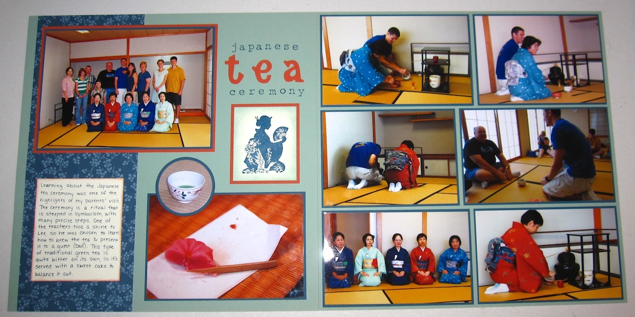
This layout is also kinda-sorta related to food.  My original plan was to stamp the lady directly on the page base cardstock, but there was a little bleached-out spot right where it woulda looked like she was sneezing something, so I did it on Very Vanilla cardstock and now it looks like my title needs to be moved up, but unfortunately I'd already stuck it down/stamped it when I switched plans for the lady.  Arg.  That's gonna bug me whenever I look at this layout.  And I can't redo it because I think those were my last two sheets of 12x12 Sage Shadow.

Thanks for stopping by today!  Since all the stamps, DSP, and several of the colors are retired, I won't include a recipe here, but I will post it on my SCS gallery if you want to take a look there.