Tuesday, May 15, 2018

Simple Smile

Hey dudes, how's it going?  Mosquito season has started here, and lemme tell you, skeeters LOVE me.  I'm already coming down with a case of polka dots.  Ick.

So let's talk about something more fun today, like a very fast card.


I've been having some trouble lately with getting colors to show up true-to-life when I take pictures of cards and scrapbook pages.  At first I was afraid the sponged background wasn't even going to show up in the photo.  I used a technique called reverse masking to do that--I die cut a square out of some scrap computer paper (so it's thinner), and then I used the negative of the square for my mask.  Super easy but it gives neat results.  Anyway, the sentiment is stamped in Soft Suede and doesn't look nearly so dark IRL.

Here's the sketch from CAS(E) This Sketch that I used:


I just thought this sketch was fun and different, and I enjoyed the challenge of using this sketch to make a one-layer card.

Here's a pretty springy color combo from Just Add Ink:


I've been slowly working on rearranging all my craft supplies for the new catalog.  Usually it's just a matter of moving the In Colors over to the retired section for my cardstocks and ink pads, but with the color revamp this year it's a bigger job than normal.  And I got my new catty preorder yesterday afternoon so I finally got an eyeball on the new colors!  I'll probably be playing with those this week which makes me happy.  I love new colors.

Anyway, sounds like the kid is awake so I'm going to go get him up.  Have a great day!

Supplies, all SU!
Stamps:  Artistically Asian, Colorful Seasons
Ink:  Powder Pink, Pear Pizzazz, Melon Mambo, Wild Wasabi, Soft Suede
Paper:  Thick Whisper White
Accessories:  Stitched Shapes Framelits used as a mask

Monday, May 14, 2018

York

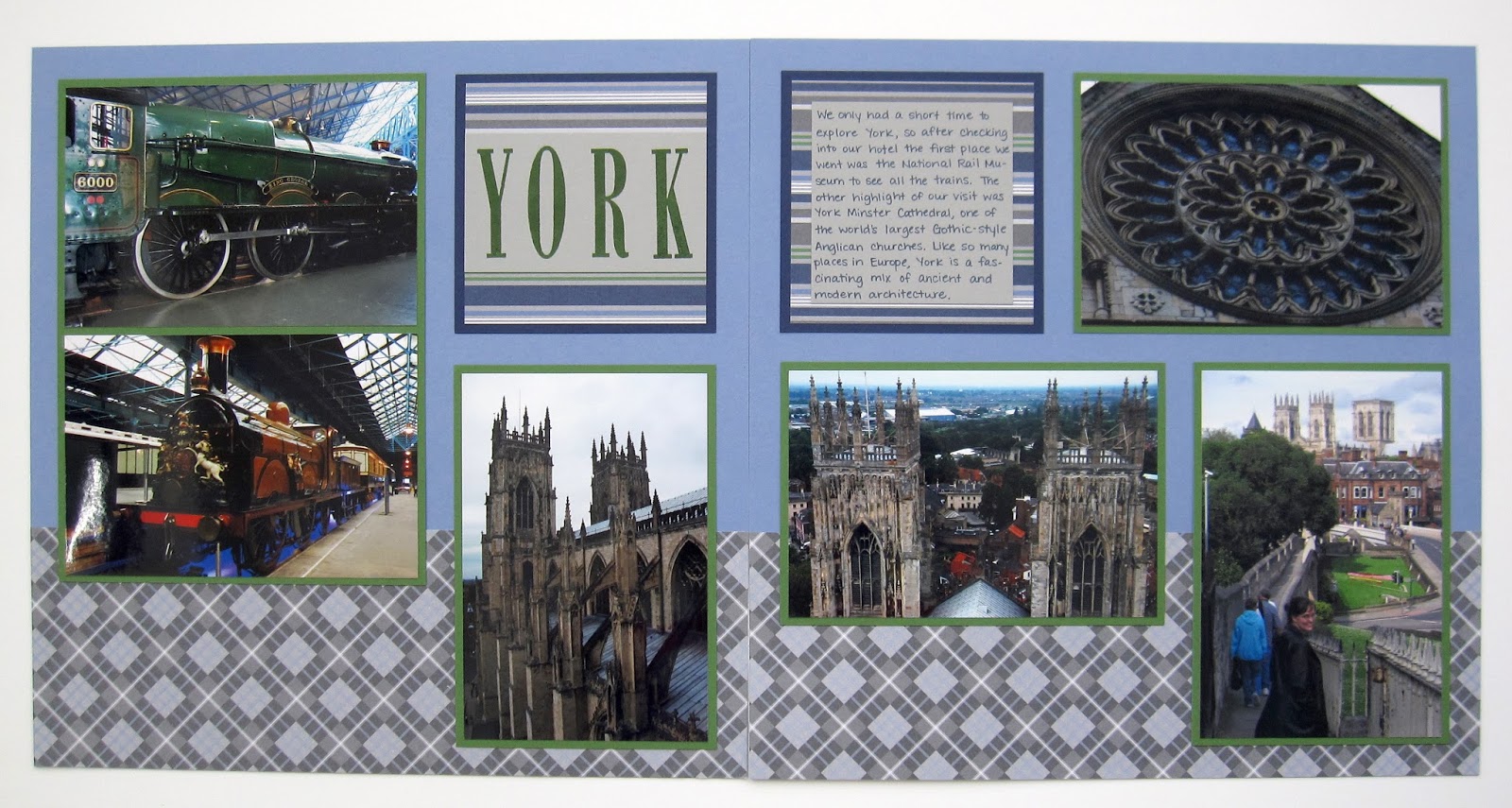
Scrappy Monday, y'all!  I was just looking through all my draft blog posts, a lot of which are China layouts so we'll get to them, and I've got some that have been waiting almost a year and.a half to see the light of day!  So here's a layout I made early last year.


As you might expect from the page title, these pictures were taken in York ;) Somehow I don't think I ever put them up on my other blog though.  But anyway, we visited a train museum and Yorkminster, one of those huge Gothic churches with a pretty rose window.


My title itself is really, really simple so I jazzed it up a bit with some stripey paper.  I also used that to mat the journaling block too, which is fun.


Today's color palette comes mostly from the very old Prestwick DSP:  Brocade Blue, Basic Gray, Smoky Slate, Garden Green, and Night of Navy.

Well, I've got to feed Cheerios to a very demanding little creature.  Peace out, kids!

Supplies, all SU!
Stamps:  Letterpress Alphabet
Ink:  Garden Green, Night of Navy
Paper:  Brocade Blue, Garden Green, Night of Navy, Smoky Slate, Prestwick DSP
Accessories:  None

Sunday, May 13, 2018

China: Jade

Happy Mother's Day to all the mamas out there!  Ryan supervised as his dada made waffles with strawberries and cream for breakfast :)

I'm sharing two more China layouts today.  The first one has been seen 'round these parts before:


I didn't really notice until I was flipping through the finished albums, but I really like doing horizontal strips of patterned paper on my layouts.  And here is what comes next:


I think it's a law in China that the tour guide takes you to places specifically for you to shop and spend all your moneys.  And we did buy that jade pixiu (pronounced pee-shoo) so it worked this time.  See the pictures here.  Anyway, this is not my favorite layout but I tried.  I don't know, it's just not my favorite.


Once upon a time in a galaxy far, far away, Stampin' Up! had a color called Mint Melody which was the perfect match for the pixiu.  I only had a little bit of cardstock from an assortment pack I bought way back when, and I never got the matching ink, so I had to be creative with how I used it.  I stamped white swirls on it for the mat and used some to cut out my title.


Since I only had I think two pieces of the Mint Melody cardstock, I never cut a sample for my color swatch book.  But here's the palette anyway:  Peekaboo Peach, Dusty Durango, Brocade Blue, and Mint Melody.

I'm off to go play with the kid...or else get me another waffle, I haven't decided yet.  Have a great Sunday!

Supplies, Shanghai Museum layout:
Stamps:  Rough Type, Gifts from the Orient (floral vase), Asian Art (coin and characters), Ancient Asia (dragon vase), Asian Artistry (flower)
Ink:  Memento Tuxedo Black, Basic Black, Marina Mist, Garden Green, Crushed Curry
Paper:  Primrose Petals, Basic Black, Thick Whisper White, Crushed Curry DSP
Accessories:  circle punch, Circles & Ovals Framelits, lettering template 

Supplies, Jade layout:
Stamps:  Gorgeous Grunge, Stars & Swirls
Ink:  Brocade Blue, Whisper White, Basic Gray marker
Paper:  Peekaboo Peach, Dusty Durango, Brocade Blue, Mint Melody
Accessories:  1/2" circle punch, lettering template

Friday, May 11, 2018

Tea-Riffic

Happy Friday, y'all!  I couldn't resist making one more tea-related project this week.


All the stamps I used are retired; the sentiment is from A Nice Cuppa and the teacups are from the Take a Sip wheel, which I unmounted and turned into I think eight individual stamps.  It coordinates with the Morning Cup stamp set and in my house the Take a Sip stamps live in the same stamp case as Morning Cup.

Let's start with a color challenge from Inkspire Me:


You know I am here for anything involving Tranquil Tide, and I thought this worked pretty well with my teacups.

Here is this week's Freshly Made Sketch:


And of course the irresistible theme challenge from the Paper Players:


At first when I was working on this card, I had planned to stamp the card base as well but I decided it was just too busy:


The tea rings and splats are from Timeless Textures, but again, it was just too busy for my card and took away the focus from the teacups.  Luckily I hadn't stuck down the main image panel when I made that decision, so I just had to redo my card base.

I'm off to go feed the kiddo his morning Cheerios.  Have a great day, peeps!

Supplies, all SU!
Stamps:  Take a Sip, A Nice Cuppa
Ink:  Soft Sky, Tranquil Tide, Soft Suede, Sahara Sand
Paper:  Soft Sky, Tranquil Tide, Thick Whisper White
Accessories:  Dimensionals, Tranquil Tide ribbon

Thursday, May 10, 2018

Eclectic Thanks On One Layer

Hey y'all!  During Ryan's naptimes yesterday, I managed to get some embroidery floss organized for my next ten projects (ten Pretty Little Cities patterns from Satsuma Street, yes I'm crazy but they're SO CUTE), got started on a new scrapbook layout, and I also managed to make a real fast one layer card. Yep, I'm maximizing naptime!


It's too bad the Just Add "O" challenge is over, because the two stamp sets I used both start with O--One Big Meaning and Oh So Eclectic.

Here's the sketch from Clean & Simple Stamping that made my card come together so fast:


And the color challenge from Color Throwdown:


I used Real Red, So Saffron, Smoky Slate (stamped off once), and just a hint of Mint Macaron on the flower stem on my white card base.

I'm also entering this in the Retro Rubber May Flowers challenge, but I can't get the challenge graphic to upload.  Sometimes Blogger does that, where it just flatly refuses to upload a picture, so I'll have to try again later.  I've had One Big Meaning since at least February of 2016, but Oh So Eclectic hasn't achieved retro status yet ;)

Okay, the kid is clamoring for attention so I'd better go see what he wants.  Cheers!

Supplies, all SU!
Stamps:  Oh So Eclectic, One Big Meaning
Ink:  Basic Gray, Smoky Slate,  Real Red, So Saffron, Mint Macaron
Paper:  Thick Whisper White
Accessories:  None

Wednesday, May 9, 2018

Tea Time

We're just going with the tea theme this week.  I didn't make a card yesterday (but I did finish a scrapbook layout that I LOVE) so how about another tea-related layout?


These are pics of some of the teapots and teacups I bought while I lived in England.  (I have pictures of even more stuff I bought right before we moved back to the States!). There's one thing I'm particularly proud of on this layout--if you click to embiggen, look at the darker pink stripes between the patterns.  Those are from a third piece of patterned paper; I cut out the stripes and carefully glued them down to make borders between the two larger busy patterns.  Quite pleased with how that turned out.


I used the Notable Alphabet for my title and then stamped a few teacup embellishments just in case the theme wasn't obvious enough.


Today's color palette includes Flirty Flamingo (always surprised when I can use this color successfully, I don't dislike it but I have trouble using it in ways that I like), Peekaboo Peach, Cucumber Crush (one of my favorite greens ever), Watermelon Wonder, Early Espresso (it's not black, I promise) and Whisper White.

Now I've got a cuppa English Breakfast steeping, so I'm going to get something to eat and enjoy my cup of tea.  Cheers!

Supplies, all SU!
Stamps:  Notable Alphabet, Morning Cup
Ink:  Watermelon Wonder, Flirty Flamingo, Early Espresso
Paper:  Flirty Flamingo, Cucumber Crush, Fruit Stand DSP
Accessories:  Layers Collection Framelits

Tuesday, May 8, 2018

It's Always Tea Time

Mornin' y'all!  We're going a bit retro for today's card because of this challenge from the Paper Players:


As I said on yesterday's Tea Party pages, I have several tea-related stamp sets.  None of them are current, so I dusted off an old favorite for this card:


That's A Nice Cuppa, which was in the Occasions Catalog a few years ago.  I think this one might be my favorite of all my tea stamps :). I also pulled out the matching Have a Cuppa DSP stack to go with the Global Design Project color challenge:


The paper already had Melon Mambo and Pool Party in it, so I just had to incorporate some Lemon Lime Twist, which I did with the card base and a snippet of LLT ribbon hoarded from the Lots of Happy card kit.

You know what?  I think I'll go make myself a cuppa right now...cheers!

Supplies, all SU!
Stamps:  A Nice Cuppa (retired)
Ink:  Pool Party, Melon Mambo
Paper:  Lemon Lime Twist, Melon Mambo, Thick Whisper White, Have a Cuppa DSP Stack (retired)
Accessories:  Dimensionals, LLT ombre ribbon