Thursday, January 12, 2017

Enjoy Life

Hey kids!  I had the idea for this card yesterday, but I ran out of time to make it...turns out when you're 8 months pregnant, a day that includes walking the dogs, going to the post office, doing 30 minutes on the elliptical at the gym, and grocery shopping will pretty much wipe you out :)  I just have to accept the fact that I'm not going to be able to post (or make) as many cards and scrapbook pages now that Baby Sodapop is almost here.  But I still got the card made today.


I let the Cupcakes & Carousels paper stack do the heavy lifting here; the only thing stamped is the "Enjoy life and have fun" piece, and that stamp is from Suite Sentiments.

The sketch is courtesy of Fab Friday:


I think this makes a good birthday card, though the sentiment is ambiguous enough that it could be used for other things too.

I'm going to skedaddle back down to my craft room and work on some scrapbook pages before I have to leave for a haircut appointment.  Cheers, y'all!

Supplies, all SU!
Stamps:  Suite Sentiments
Ink:  Bermuda Bay, Calypso Coral, Peekaboo Peach
Paper:  Bermuda Bay, Calypso Coral, Peekaboo Peach, Early Espresso, Very Vanilla, Cupcakes & Carousels DSP Stack
Accessories:  Dimensionals

Tuesday, January 10, 2017

Dijon Baby Shower?

Hey kids, I had some arguments with the computer this morning but I'm finally getting this post up.  My card for today:


The two background panels are silver DSP, which kinda reflected the camera flash a bit so that looks better IRL.  However I think the Delightful Dijon card base is just too dark and that I should have done white...but I didn't want to attempt to peel everything up.

The sketch is from Create with Connie and Mary:


I think I'd like this better with some lighter, brighter colors (like So Saffron instead of Delightful Dijon), but I was having a hack at the Global Design Project color challenge:


I used Dapper Denim as my free choice color.  Still, I think I picked the right stamps for the sketch but the wrong stamps for the color challenge...I have a feeling that color combination could be a lot more fabulous than I made it look.

Oh well, not every card can be your favorite, right?  I'm going to blame this one on lack of sleep.

Cheers, y'all!

Supplies, all SU!
Stamps:  Weather Together, Work of Art
Ink:  Delightful Dijon, Dapper Denim, Smoky Slate
Paper:  Delightful Dijon, Dapper Denim, Thick Whisper White, Silver DSP
Accessories:  Umbrella Weather Framelits, Dimensionals

Monday, January 9, 2017

Ghostbusters

Scrappy Monday, y'all!  Today I have a layout that makes me happy.  As it happens, this was the last set of scrapbook pages I made in 2016, and the pictures are also the most recent ones I've scrapped--they're only from last September.


I'm working on getting our NYC pictures up on my other blog; hopefully you'll be able to see them all here pretty soon.  So when we visited New York this time, one of the things I wanted to do was check out several of the sites featured in Ghostbusters (one of my favorite movies ever).  The public library on Fifth Avenue was just a couple blocks from our hotel (remember the first ghost the guys encounter in the library?).  Dana's apartment building is right next to Central Park so it was easy to find as well.  We found the Ghostbusters firehouse I think less than a mile away from the World Trade Center, but to my acute annoyance it's covered in scaffolding (I am totally pouting in that picture).  I was wearing a Ghostbusters shirt and everything!  I did take the pictures of the two Ghostbusters "patches" painted on the sidewalk outside the firehouse.  But I'm still mad I didn't get to see the firehouse itself in all its glory.

The three journaling blocks with red mats are quotes from the first movie, each of which has to do with the location we visited (shortest one:  "Your girlfriend lives at the corner penthouse...of Spook Central!").  I quote this movie all the time, but honestly the three quotes I used on the layout aren't ones I usually use ;)


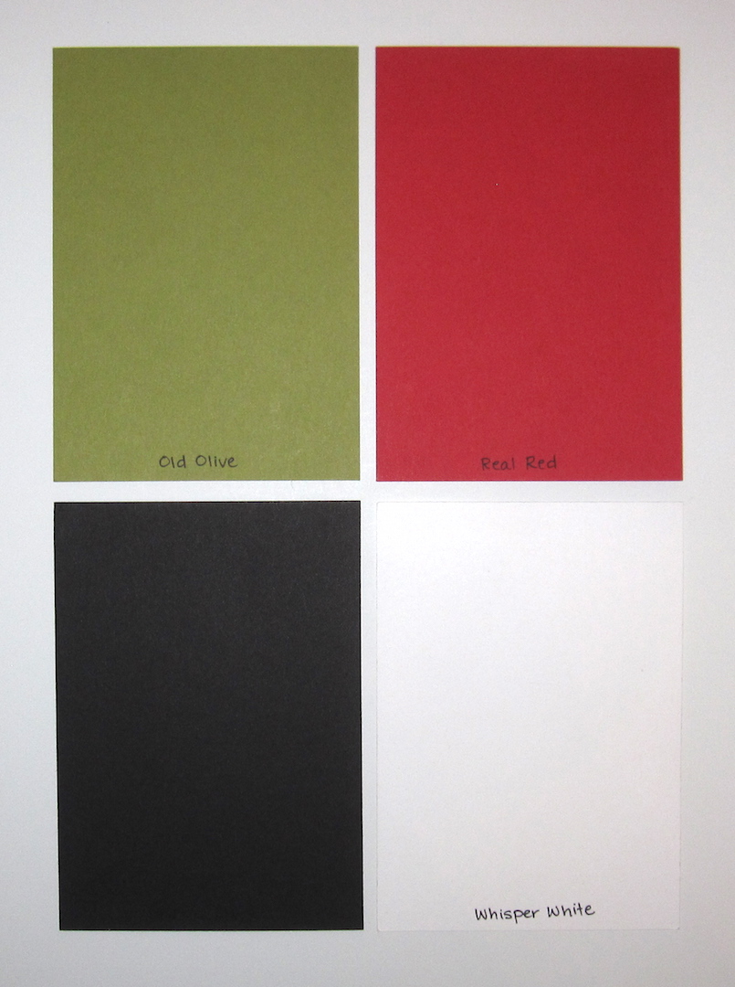
Today's color palette:  Old Olive (like Slimer!), Real Red, Basic Black, and Whisper White.

Cheers, y'all!  And remember, we ain't afraid of no ghosts!

Supplies, all SU!
Stamps:  Well-Worn Alphabet, Rough Edges Alphabet
Ink:  Whisper White, Basic Black marker
Paper:  Old Olive textured, Basic Black, Real Red, Whisper White, Cast-a-Spell & Ghostly Greetings DSP
Accessories:  Hexagon punch for the banner ends

Saturday, January 7, 2017

Bear Book: August

Happy Saturday, y'all!  It's snowing outside where I am right now.  Not a whole lot, but enough that there's some white on the roofs and grass.

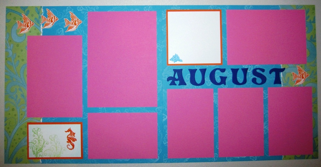
So for something completely different, I'm sharing a very warm and sunny August layout for the bear book I made last year.


Okay, I looooooooooooooooooove that patterned paper on the bottom of this layout, so I let it dictate the colors I used for everything else.


And how cute is this bear?  I got that triple corner punch that SU! had last year and, um, this is the only time it's ever been used.  Oops.


I thought the hot air balloons would be a good accent for this layout....I've got the hot air balloon stamp set and Framelits from the Occasions Catalog on my wish list right now too.


Journaling block :)


Today's sunny summer layout colors are Tangelo Twist, Crushed Curry, Bermuda Bay, a wee bit of Mossy Meadow, and Whisper White.

Cheers, y'all!  I'm gonna go make me a second cuppa tea.

Supplies:
Stamps:  Balloon Bear from Whipper Snapper, Up Up & Away
Ink:  Basic Black, Mossy Meadow, Tangelo Twist
Paper:  Tangelo Twist, Crushed Curry, Bermuda Bay, Thick Whisper White, Birthday Bash DSP
Accessories:  triple corner punch, Sizzix alphabet, Prismacolor Pencils

Friday, January 6, 2017

Friday Flashback: Ocean Commotion

Happy Friday, y'all, and welcome to the first Friday Flashback of the year.  This week's stamp set is Ocean Commotion...it's funny to me, I'm not a huge ocean person but the hubs is, and we lived on Okinawa for a bit under three years so I do have some beachy/ocean-y pictures and basically I always get the marine sets and use them pretty frequently.  But I think Ocean Commotion might have been my first fishy set :)

Also features Rough Type

Speaking of Okinawa, here's a scrapbook layout from the Churaumi Aquarium in Nago.  I do love that photo with the sea turtle :)  Anyway, Ocean Commotion is a wee little set of just four stamps, and I used all of 'em on this layout--the fish, the seahorse, the seaweed, and the shell.


I did a couple of baby books for kiddos born on Okinawa so I made an ocean layout for those.
Also features Thank You Kindly
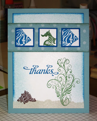
The hubs loves to scuba dive, so when he asked for some thank you cards I made up a set of six of these.

Also features Short & Sweet
Ocean images are perfect for using with polished stone!  I miss SU's glossy white cardstock just for polished stone backgrounds, that was one of my favorite techniques.

Also features Warmest Regards
Here's a birthday card for one of the hubs' scuba diving friends.
Also features Big Deal Alphabet
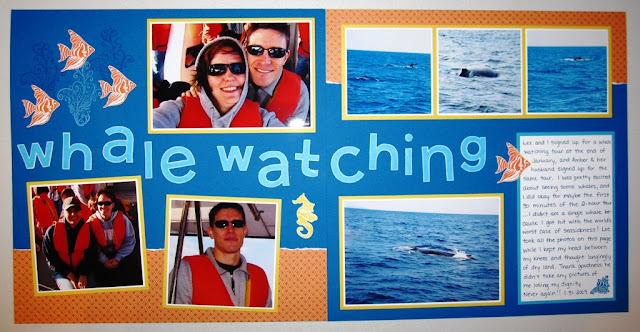
And one last scrapbook layout from the one and only time I'll ever go whale watching--I was so busy being seasick I didn't see not ONE STINKING WHALE!  But I did really like how this layout turned out.  I love the bright blues and orange together.  And while the hubs kinda laughs at how my photos all seem to tilt a little bit, I can categorically say all the crooked photos on this layout were taken by HIM, not me.

So there's the flashback, and here is my brand new card:


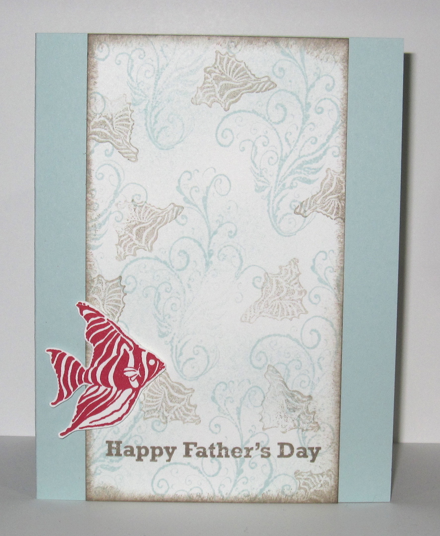
Why Father's Day?  Well, since I'm 8 months pregnant that means this year will be my hubs' first Father's Day as a daddy himself.  And the idea popped into my head when I was perusing stamp sets for a sentiment to put on this card so I went with it.  I was inspired by the Fusion challenge:


Obviously I used the sketch, but I also used the photo--completely different theme, but I took the colors Soft Sky, Tip Top Taupe, and Real Red from the picture.  So now I just need to put this card someplace the hubs won't see it, but that I won't forget where to find it in June...

Cheers, y'all!  Stay warm this weekend.

Supplies, last card only:
Stamps:  Ocean Commotion, Something to Celebrate
Ink:  Soft Sky, Tip Top Taupe, Real Red
Paper:  Soft Sky, Thick Whisper White
Accessories:  Dimensionals

Thursday, January 5, 2017

Think Pink

Hey kids!  I was *determined* to get a card made for today and here it is 6:30 but I made it.  And it's PINK!


We met up with some friends of ours on New Year's Eve who now live in Hawaii, and they gave us some cute baby clothes so this is the card I made to send to them.  Ashlea loves her some hot pink and bling, so this is not the first flamingo she's gotten from me :)

I used the first new Freshly Made Sketch of the year:


I didn't do my stripes on the left *exactly* like on the sketch but I think it's not too far out of line.  Don't call the challenge police on me.

The Color Throwdown has the perfect combination for a flamingo card this week:


I used Basic Black, Melon Mambo, and Old Olive for my colors.

And now the hubs is making me dinner, I'm a lucky girl.  Cheers, y'all!

Supplies, all SU!
Stamps:  Pop of Paradise, No Bones About It, Rose Wonder
Ink:  Melon Mambo, Old Olive, Basic Black
Paper:  Melon Mambo, Old Olive, Basic Black, Thick Whisper White
Accessories:  Rhinestones, corner rounder punch

Tuesday, January 3, 2017

Perfect Dragonfly

Okay I finally got in my craft room for the first time all year!  :D  Sometimes it's good to take a little break and recharge the batteries a bit though, and it was fun to take a look back at my paper craftiness for 2016.  But now it's time for brand new craftiness!


Speaking of brand new, the sentiment is from Suite Sentiments which debuts in the Occasions Catalog starting tomorrow.  I can't wait to get the dragonfly bundle from that catalog, but in the meantime Awesomely Artistic does have a great smaller dragonfly.

I started with this week's Global Design Project CASE the Designer Challenge:


Obviously I kept the same color combo (Night of Navy, Watermelon Wonder, and Crumb Cake), but there are a few more subtle callbacks to this card as well:  my Crumb Cake layer has spots on it (though mine are speckles rather than true polka dots), I've got a horizontal Watermelon Wonder layer, and my Night of Navy panel is a vertical element.  I suppose I coulda found some balloons but I was just feeling the dragonfly today.

I paired that challenge with this week's Mojo Monday sketch:


And that was that!  The card came together pretty fast once I decided on colors for each of the elements of the sketch.  Not too bad a start for 2017 I think.  Of course, Baby Sodapop is due one month from tomorrow so who knows how much I'll actually get to stamp this year...we'll see if I can work it in between diaper changes and baby cuddles.

Cheers, y'all!

Supplies, all SU!
Stamps:  Awesomely Artistic, Suite Sentiments
Ink:  Night of Navy, Watermelon Wonder, Crumb Cake
Paper:  Night of Navy, Watermelon Wonder, Crumb Cake, Whisper White
Accessories:  Stitched Shapes Framelits, Dimensionals