Showing posts with label The Greeting Farm. Show all posts

Saturday, July 4, 2026

The Thirteenth Pearl

Happy 4th of July, y'all, and welcome to the Nancy Drew Challenge!  We get fireworks for the final hardback Nancy Drew, #56 The Thirteenth Pearl.


The one on the left is my childhood copy, and the one on the right is another matte edition that I picked up at that middle-of-nowhere used book store in Wyoming; the colors are just a bit more saturated on it but for now at least I plan to keep them both.  We get a fun BLUE book cover this time and you can tell we're traveling based on the building depicted on this cover.  I do like how Nancy is in profile and she's the only spot of color on this otherwise blue and gray cover.

Case file:  Japanese jeweler Mr. Moto asks Nancy to locate a missing pearl necklace that belongs to a wealthy socialite (we hear about her a lot but she never actually appears in the book), and shortly after that Mr. Moto also disappears.  Nancy and Carson follow rather insubstantial clues to Tokyo and start tracking an international gang of jewel thieves; upon returning to River Heights the book takes a very strange left turn when Nancy and Ned spy on a cult of pearl worshipers before getting kidnapped.  At least we got a daddy-daughter trip to Japan first, it's fun to have more Carson than usual in this one.

Here's my card:


Naturally I had to do a card featuring pearls for The Thirteenth Pearl, though I included seven pearl embellishments and a bunch of stamped ones.  Did I purchase Seaside Bay specifically to make a card for this book?  Yep.  Of course I did.


I found this Azure Afternoon (and possibly Pool Party?) wash in the Lights of Aurora DSP Stack and I like how it feels like you're underwater and the sun is shining into the water.  I kept a very simple layout and just did some Barely Blush shading on the inside of the oyster and some Wink of Stella on the pearl.  They do talk about color variations in pearls in the book, mentioning pink specifically.

Supplies, all SU!
Stamps:  Seaside Bay
Ink:  Basic Gray, Barely Blush, Barely Blush Blends
Paper:  Basic Gray, Azure Afternoon, Barely Blush, Basic Beige, Lights of Aurora DSP Stack
Accessories:  Seaside Bay dies, Layering Circles dies, Circles Collection dies, pearls, Dimensionals, Wink of Stella

It's the last hardcover book, you know we're not stopping with one card.  Here's my second:


I bought Geisha Anya from The Greeting Farm many, many moons ago (I have a collection of Asian-inspired stamps since we used to live in Japan for a couple of years) and I'm fairly certain this is the first time I've used her as I still had backing paper on the stamp.  I had some fun coloring in her hair and her kimono, and this time I used some In Color Dots but they look like the flat pearls we had last year in the newer colors so they're still pearls.


I decided to use some Golden Glow for Nancy's hair this time and Flirty Flamingo and Barely Blush for pinks to go with Nancy's face.  And lots more Azure Afternoon for my blue book cover.

Supplies:
Stamps:  Geisha Anya from The Greeting Farm, Symbols of Solicitude, French Filigree
Ink:  Memento Tuxedo Black, Azure Afternoon, Stampin' Blends in Basic Black, Smoky Slate, Barely Blush, Azure Afternoon, Golden Glow
Paper:  Azure Afternoon, Basic White, Moonlit Flora DSP
Accessories:  Stitched So Sweetly dies, Dimensionals, In Color Dots

But wait, there's more!


I had pulled Power of Hope and this pagoda before I remembered that I had Geisha Anya, but I wanted to make a card with it too.  I used the leftover scrap of DSP from my first card here and once again accented with more pearls.  I found the Basic Gray DSP scrap in my stash.


Supplies, all SU!
Stamps:  Power of Hope
Ink:  Azure Afternoon, Basic Gray
Paper:  Azure Afternoon, Basic Gray, Basic White, Lights of Aurora DSP Stack, Basic Gray DSP
Accessories:  Stitched So Sweetly dies, Dimensionals, pearls

The Thirteenth Pearl trucks along fairly normally by ND standards for like the first 80%, and it reminds me of Fire Dragon where Nancy and several friends visit Hong Kong.  Nancy even dresses up in a kimono and wig to pass herself off as Japanese in this one while George impersonated a specific Chinese girl in Fire Dragon, which is still not my favorite plot point.  I did like the part of this book spent in Japan and we learn quite a bit about cultured pearls, but the ending of it just comes out of left field where suddenly there's not just jewel thieves but a pearl cult.  Say what now?  The heck is a pearl goddess??  I give it three and a half stars for the bizarre turn, it does get extra credit for going to Japan because I loved that part of the plot.

This is the last hardcover Nancy Drew, so does that mean we're done with the Nancy Drew Challenge?  Heck no!  Starting next week, we'll turn over to the Simon & Schuster paperbacks, and not only are there many many of those, there are several cover variations for a lot of them too so I have a whole lot of cards in my future.  If you're inspired to make a card based on today's book, leave me a comment!  And I'll see you here next Saturday for The Triple Hoax.

Saturday, January 17, 2026

The Witch Tree Symbol

Happy Saturday and welcome to the 33rd Nancy Drew Challenge, where today we will investigate The Witch Tree Symbol!  Here are my books:


I think my OT cover on the left might be printed darker than usual, it seems dark when I compare it to pictures online.  We have Nancy and a pair of Amish people looking at the titular witch tree symbol and I kinda wonder why Rudy Nappi painted the hands the way he did for the two Amish people.  I bet painting hands in a realistic way is a challenge.

The RT on the right is a newer Nappi cover and it's spookier, which is amusing to me because I wouldn't classify this story as being particularly spooky, even by Nancy Drew standards.  Nancy is wearing a '70s-style blue pantsuit here with some purplish details which I find interesting, and we learn over the course of the book that a witch tree is one that has a parasite on it that makes it look odd.

For once, I don't have a favorite among the two covers, I think they're both interesting.  Let's take a look inside:


Case file:  Nancy, Bess, and George travel to Pennsylvania's Amish country in pursuit of stolen furniture; we learn about Amish culture (not sure how accurately it's portrayed here but interesting nonetheless) and Nancy is repeatedly accused of being a witch, usually right after some character says the Amish people aren't superstitious.  Nancy finds the furniture, reunites a runaway girl with her strict parents, and they eat a lot of food while of course fat-shaming poor Bess, who deserves better friends.

Here's my card:


Nancy has to track down where a "schnitz" is, which has something to do with apples, and that combined with the Amish character Manda Kreutz made me think of this sweet Greeting Farm stamp called Lottie, isn't she darling with her bowl of apples?  I made her hair dark because I was thinking of Manda rather than Nancy.  Plus I have dark hair so that's what I tend to do when I color in stamped images like this.


I chose Boho Blue to go with the sky on the cover, a bit of Calypso Coral to match the symbol being painted on the tree, and a bit of Wild Wheat to coordinate with Nancy's shirt here.

Supplies:
Stamps:  Lottie from The Greeting Farm, Fancy Flexible Phrases
Ink:  Early Espresso, Stampin' Blends in neutrals, Petal Pink, Calypso Coral, Boho Blue, Mossy Meadow, Wild Wheat
Paper:  Boho Blue, Thick Basic White, Timeless Plaid DSP Stack
Accessories:  Stitched So Sweetly dies, Ombre Matte Decorative Dots, Dimensionals

Next up is the RT:


As I said, I think this cover is misleadingly spooky, but it does grab attention.  Here's my card:


Nancy is accused of being a witch several times so I just had to make a witch card, plus it has witch in the name of the book.  I used some nontraditional Halloween colors to match the book cover.


Once again I think Nancy's pantsuit is Boho Blue but I ended up not working that into my card; instead I have Moody Mauve for the purple accents on her clothes and some Pretty Peacock for the blue color in the tree, plus a black card base for the shadows behind Nancy.  I got Out on a Limb last year and this is the first time I've inked it up other than doing my index sheet for it.

Supplies, all SU!
Stamps:  Out on a Limb, Fancy Flexible Phrases
Ink:  Memento Tuxedo Black, Pretty Peacock, Stampin' Blends in Petal Pink, Copper Clay, Pretty Peacock, Moody Mauve
Paper:  Basic Black, Thick Basic White, All About Autumn DSP
Accessories:  Seasonal Labels dies, Mini Dimensionals, Pretty Peacock sequins

But wait, there's more!  I found some DSP that I really wanted to use to match the RT cover, but the DSP didn't match the vibe of my little witch, so I ended up making another card:


This is the Earthen Elegance DSP, which coordinates with the Earthen Textures stamps and dies I used, that background pattern just felt like it coordinated with the book cover.

This time I did work in some Boho Blue to match Nancy's outfit, and still have Moody Mauve on there to boot.  I think I like the witch card better though, I was getting tired by the time I got to making this one so I'm not sure how much I like it.

Supplies, all SU!
Stamps:  Earthen Textures
Ink:  Pebbled Path, Boho Blue
Paper:  Misty Moonlight, Boho Blue, Pecan Pie, Earthen Elegance DSP
Accessories:  Earthen Textures dies, Deckled Rectangles dies

I wish I had reread this before the hubs and I visited Ohio's Amish country a few years ago just to see if Amish culture and turns of phrase are similar to what's depicted here, though we were in Ohio as opposed to Pennsylvania.  I do think the focus on food is accurate, I still remember Amish pies from our trip : )  I give this one four stars, it's a fun adventure outside of River Heights.  If you are inspired to join the challenge, comment with a link so I can see what you make!  Otherwise, I'll see you next week when we investigate The Hidden Window Mystery.

Saturday, September 23, 2023

Halloween Bats

Happy Saturday, y'all!  I've got two more cards that I want to share today : )


You didn't think I'd miss out on my weekly mashup of Freshly Made Sketches and Color Throwdown, did you?  Here's the sketch:


And the Color Throwdown:


I used Pumpkin Pie, Night of Navy, Crushed Curry, and Pool Party for the colors, and went pretty CAS with the sketch.  I love Spooky Sweets from 2018 and I usually manage to pull it out at least once every year for spooky season.

Bonus card today:


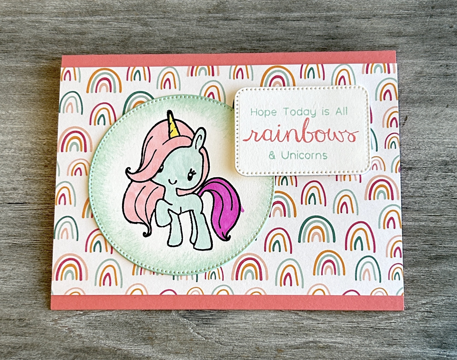
Ryan was invited to a birthday party that's happening this afternoon for a girl in his class; the invitation had a unicorn on it in pretty pastel colors so we started with that as our inspiration.  Ryan chose the patterned paper and did the stamping and coloring on the unicorn; I did the sentiment because it was three separate pieces, and he did the die cutting.  So now we're ready for the party this afternoon.

Cheers, y'all!

Supplies, first card:
Stamps:  Spooky Sweets
Ink:  Pool Party, Night of Navy, Crushed Curry, Pumpkin Pie
Paper:  Pool Party, Thick Basic White
Accessories:  Spooky Bats punch, Moon punch, Mini Dimensionals

Supplies, second card:
Stamps:  The Greeting Farm
Ink:  Memento Tuxedo Black, Pool Party, Flirty Flamingo, Blends in Pool Party, Daffodil Delight, Flirty Flamingo, Berry Burst
Paper:  Flirty Flamingo, Thick Basic White, Sunshine & Rainbows DSP Stack
Accessories:  Stylish Shapes dies, Nested Essentials dies, Dimensionals

Sunday, January 2, 2022

Paper Players: Sparkling New Year

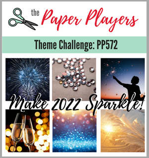
Okay, so in years past I haven't usually posted on Sundays, but for 2022 I will be because I'm a guest designer for The Paper Players this year!  I am so very honored to be joining this fabulous group of artists for the next year.  So here's the kickoff challenge for 2022:


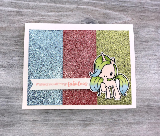
And here's my card:


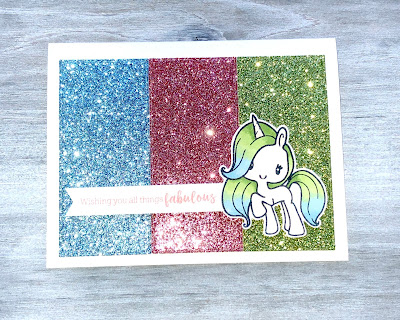
You say sparkle, I say unicorn, so I found this stamp from The Greeting Farm and dug in my stash for a variety of colored glimmer paper.  I showed this card to my husband and told him I had to make a card with sparkles; he said clearly I did not understand the challenge brief because the unicorn herself isn't sparkly.  But she IS because she's stamped on Shimmery White cardstock and I added some Wink of Stella to her horn, haha!  Here's what the card looked like when I tried to take a picture with flash:


So, does my card sparkle enough?  Upload your own sparkling creation at the Paper Players blog, can't wait to see what you create!

The Paper Players Design Team


Supplies:
Stamps:  All Things Fabulous from SU, unicorn from The Greeting Farm
Ink:  Memento Tuxedo Black, Blushing Bride, Stampin' Blends in Balmy Blue, Petal Pink, Granny Apple Green
Paper:  Shimmery White, various retired glimmer papers
Accessories:  Stampin' Dimensionals

Saturday, June 4, 2016

A-Team Baby Book: September

Happy Saturday, y'all!  Any fun plans for the weekend?


Here's the September layout for my niece.  Her mama (my SIL) works for the school district so of course apples (for teachers!) are a natural choice for September.  And I had this super cute image from The Greeting Farm:


Isn't she darling?!  For some reason my camera doesn't like Marina Mist cardstock, but trust me, it's blue and not gray.


And there's a few more apples.


Today's color combo:  Marina Mist, Real Red, Old Olive, Chocolate Chip, and Whisper White.  That's all she wrote today, have a great weekend!

Supplies:
Stamps:  Tart & Tangy, One Smart Cookie, Lottie from The Greeting Farm (all retired)
Ink:  Basic Black, Real Red, Chocolate Chip, Old Olive
Paper:  Marina Mist, Old Olive, Chocolate chip, PTI White, Summer Picnic DSP
Accessories:  Sizzix alphabet, Prismacolor Pencils, Ovals & Lots of Labels Framelits, circle & scalloped circle punches

Wednesday, February 3, 2016

Rubbah-dultery

Okay, kids.  Y'all know that I'm like 95% SUO (Stampin' Up! Only), but every once in a while, I see stamps made my someone else that I just HAVE TO HAVE.  Yep, I occasionally commit rubbah-dultery.  And that's how I got to today's card.


Sooooo if SU! had My Little Pony-esque or unicorny stamps, I wouldn't have strayed.  But this one from The Greeting Farm is just SO RIDICULOUSLY CUTE and I seem to have a problem with capitalization today.  I didn't get the matching dies (...yet) so I hand-cut my little unicorn and this is going to my friend Ashlea because she's convinced I'm obsessed with unicorns and it will make her laugh.  No comment on whether or not she's right about a possible obsession.  Ashlea, however, is obsessed with cupcakes, so of course I had to use the cupcake pattern on here.  Teehee.

Anywha, I used this week's Global Design Project color combo.  I looked on their site and nothing I saw says submissions have to be SUO, so here's their challenge:


And the sketch is from Mojo Monday:


It's been raining all day today so you'd think I would have had this card posted hours ago, but first I had to straighten up a few things from finishing up all the baby shower projects last week.  You know when you get to the finish line for a big project, it pretty much looks like a tornado went through your crafty area...at least, that's how it is for me.  I still have some things that are disorganized, but I'm getting there.

Cheers, peeps!

Supplies:
Stamps:  The Greeting Farm's Magical Friends
Ink:  Basic Black, Bermuda Bay
Paper:  Melon Mambo, Basic Gray, Thick Whisper White, Have a Cuppa DSP Stack
Accessories:  Prismacolor pencils, Dimensionals