Showing posts with label From Land to Sea. Show all posts

Monday, April 15, 2019

Ripley's Aquarium

Scrappy Monday, y'all!  Well, Ryan had a fever through Saturday, but yesterday he was feeling much better so we should be able to go to the Y this morning.  Yay!  I hate missing my running days...not because I like running, but because if I don't run regularly then it's really tough to start again, so I have to be consistent with it.

Anywha!  I did pretty well this weekend, I finished two more scrapbook layouts.  I actually have a stack that I need to photograph, but in the meantime here's one I did last year.


This is, once again, part of my quest to scrap more of my pictures from before we moved to Japan in 2008.  I actually finished my 2008 scrapbooks, and 2008 is when I started my first blog, so I really need to get those older photos done ASAP because I'm forgetting what all we did and I don't have a handy blog to refer back to :p  These pages feature pictures from Ripley's Aquarium in Myrtle Beach; I let the photo in the upper left do double duty as my page title.  A couple of sea creatures from the sadly retired From Land to Sea and this layout came together pretty quick.


The color combo feels a little unusual for me, but it's what I came up with based on the colors in the photos:  Pool Party, Primrose Petals (I love that diamond pattern), Tranquil Tide (appropriate for an aquarium visit, no?), Marigold Morning, and Whisper White.

Cheers, y'all!  Hope your week is off to a good start.

Supplies, all SU!
Stamps:  From Land to Sea
Ink:  Pool Party, Tranquil Tide, Night of Navy marker
Paper:  Pool Party, Tranquil Tide, Marigold Morning, Whisper White, Patio Party DSP
Accessories:  None

Thursday, December 29, 2016

2016 Showcase, Part 2

Time for Part 2 of my favorite projects from 2016.  Let's dive right in, shall we?


Love this bright and cheery card for May.


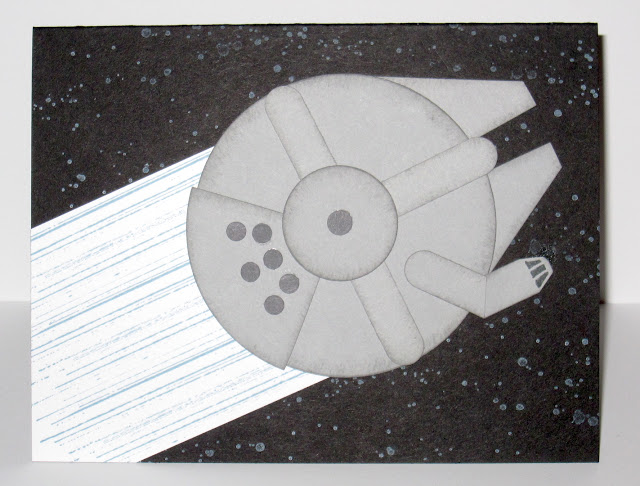
June's pick is this Millennium Falcon card, might not be the prettiest thing ever but I'm rather proud of it given that I don't do much punch art.  And I watched The Empire Strikes Back last night in honor of Carrie Fisher.


For July I chose this flamingo card, love the bright colors and I need to break out that stamp set again soon.


And the last card for today is August's jellyfish.  I admit the main image is a little indistinct with the clear EP, but I loved the idea of it and how the "sand" on the background turned out.

Part 3 coming tomorrow!

Thursday, August 4, 2016

Jellyfish Note

Well, somehow I've managed *another* quadruple challenge for today's card, and they're four completely different challenges from yesterday.  So here it is:


Hubs and I went to the National Aquarium in Baltimore a few weeks ago, and I love watching jellyfish in the tanks where there's no way they can sting me.  It's just fascinating to watch how they move.  So there was one inspiration for this card, on to the challenges.

First up is Color Throwdown:


I used Crumb Cake, Tempting Turquoise, and Shimmery White, though I think Coastal Cabana might have been a closer color match to the swatch (and I do dearly miss my Coastal Cabana).

Next is the Global Design Project theme challenge:


And then the Mojo Monday sketch:


I left off the little flower element because I thought the card had enough going on...well, maybe I traded it for the enamel dots which no matter what I do always photograph weird.

And finally (because alphabetically it came last) is the Paper Players tic-tac-toe challenge:


I did the left column of enamel dots, beach, and texture.  For the texture-y background, I started with a 4x8.5" piece of Crumb Cake cardstock, tore it in strips and sponged the edges, and then overlapped them and glued them back together.  So even though the piece I started with was 8.5" tall I ended up with a piece that was just over 5 inches tall.  Then I just cut the strips apart until I liked the widths and adhered that to the card base.  It just makes me think of tide lines on the sand at the beach.

In other news, HI MISSY'S MOM!!! Thanks for reading the blog and leaving me comments, that was very sweet of you! :)

Okay kids, I'm off to the gym.  Cheers!

Supplies, all SU!
Stamps:  From Land to Sea, Picture Perfect
Ink:  Versamark, Crumb Cake, Tempting Turquoise
Paper:  Shimmery White, Crumb Cake, Tempting Turquoise
Accessories:  Clear EP, Metallic Enamel Dots

Thursday, June 16, 2016

I'll Be Your Candle on the Water

Hey, kids!  It's been one wild and ca-razy day here but I finally got a card made to share, and I really like it!


I've been wanting to pair the lighthouse stamp with that sentiment (and the corresponding "...and brightening the rest" on the inside) for a while now and today I finally found the perfect combination of challenges for it.  First up is this week's Freshly Made Sketch:


And then the Paper Players' color challenge:


With those two challenges, it didn't take me long to put my card together.  And I think it turned out quite nicely :)

Well, I have a haircut appointment in 20 minutes so I'd better skedaddle.  Cheers, y'all!

Supplies, all SU!
Stamps:  From Land to Sea, Me = Grateful
Ink:  Versamark, Dapper Denim, Cherry Cobbler
Paper:  Thick Whisper White, Crumb Cake, Dapper Denim DSP
Accessories:  Layering Circles Framelits, Dimensionals, Clear EP

p.s.  Do you recognize the song from my post title?  I think it's from Pete's Dragon (the original one).  I have several CDs of Disney songs from various movies so I'm not sure, but that one is a really sweet song and that's what this lighthouse made me think of.

Wednesday, June 15, 2016

Nacho Blog Hop: All Cards Masculine

Guess what, y'all?  It's time for another Nacho Average Blog Hop!  This month the Nachos are all about the dude cards.  Yep, masculine cards!  You might have come here from Anne's blog, but if not, don't worry--I've got all the links you need at the bottom of the post.  But first up, here's my cards.

So, when thinking about this theme, I decided to think about the guys in my life and specifically what they'd like, and naturally I started with my hubs.  He loves scuba diving, so for him I made this:


Teehee, it's punny, which will only make him roll his eyes.  I figured that fish looked more masculine than the sea turtle or the jellyfish :)  I stamped the sentiment with the now-retired Alphabet Rotary, but if I'd been smart enough to put the new Labeler Alphabet on my first order then that would work too.  Anyway, if you saw my hubs' wardrobe, you'd think the only colors he can see are dark blue, gray, khaki, and black, so I used Dapper Denim and Smoky Slate for my main colors on this one.

Next up, funny story!  Last week I was in a tizzy trying to get Father's Day cards made, and I was thinking we were sending stuff off all horrendously late (last Saturday) and on Sunday I even reminded my hubs to call his dad for Father's Day.  Which he did, and my FIL was like, you do know that's next week, right?  Oops.  Well, anyway, since I was in such a (needless) rush, I used last month's Paper Pumpkin kit to make a card for my dad:


My dad (and my brother, for that matter) graduated from Oklahoma State so he loves all things orange and black.  If you looked at *his* wardrobe, pretty much all you'd see is orange, black, and blue jeans. :p  Lucky for me the Paper Pumpkin kit came with corrugated orange cardstock (corrugated = manly, I guess), and the "happy" sticker was Pool Party so I was able to brayer black ink over it for this orange and black card.  And I added the Pool Party star from the kit just for funsies.

Thinking I was pretty much out of time for Father's Day cards, I made this one for my FIL:


So far as I know, he's not overly partial to orange, but I was in a hurry.

Last up, since I finally figured out I still had some time before everything for Father's Day is late (this next one is still going to be late unless I mail it today), I thought about my brother who's been a dad for two months now.  And he (like me) loves Star Wars...


Please please pretty please tell me you know what that is!!!  Not a lot of detail, sure, but I started by looking at this gorgeous print online and kinda working it into paper art.  The only stamping on this one is the hyperspace trail and the starry background, both courtesy of Gorgeous Grunge, and then I used stamps from Crazy About You to add Happy Father's Day to the inside.  And now I need to order a Chewbacca mask for my brother for Father's Day.

So there you have my four masculine cards (although I admit, #3 feels like a cheat).  I highly encourage you to follow along with the rest of the hop for more manly paper crafting goodness!


Supplies, card #1:
Stamps:  From Land To Sea, Alphabet Rotary
Ink:  Versamark, Dapper Denim, Smoky Slate, Soft Sky
Paper:  Dapper Denim, Smoky Slate, Watercolor paper, Whisper White
Accessories:  Clear EP, Dimensionals

Supplies, card #2:
Stamps:  My Paper Pumpkin May 2016 kit
Ink:  Basic Black
Paper:  came with the kit
Accessories:  came with the kit

Supplies, card #3:
Stamps:  My Paper Pumpkin May 2016 kit
Ink:  Night of Navy
Paper:  came with the kit
Accessories:  came with the kit

Supplies, card #4:
Stamps:  Gorgeous Grunge, Crazy About You
Ink:  Whisper White, Smoky Slate, Basic Gray, Marina Mist
Paper:  Basic Black, Whisper White, Smoky Slate, Basic Gray
Accessories:  Layering Circles Framelits, Word Window Punch (retired), hole punches

Tuesday, June 7, 2016

Just Keep Swimming

Hey y'all, how's it going today?  I'm feeling a little off my stamping game, to be honest.  But I did get a card made for today.


I'm a little disappointed that the top turtle ended up being a little smeary.  I stamped the turtles with Versamark and Cucumber Crush, and I really didn't expect that to work with stamping off but that turtle looks pretty good.  They're embossed with clear EP, then I spritzed the whole thing with water and haphazardly watercolored some Tempting Turquoise for the background and dried it with the heat tool.  So why an undersea card today?  Because of the Cupcake Inspirations challenge, of course:


And I made it a get well card for the Global Design Project challenge:


Now all I have to do is write "just keep swimming" on the inside when I need to send it to someone :)  I combined those two challenges with the Mojo Monday sketch:


The sea turtles were actually my second try on the background panel, here was the first one:


I liked how the "sea" turned out better on this one (except the scribble on the top above the turtle because the paper wasn't wet enough yet) but I thought that having all three of the sea creatures on there just made it too busy.  So I went with my favorite turtle instead :)

In other news, watermelon-flavored Greek yogurt is just weird and should not be a thing.  Glad I only got one container of that...

Cheers, y'all!  And just keep swimming.

Supplies, all SU!
Stamps:  From Land to Sea, Gorgeous Grunge, Greatest Greetings
Ink:  Versamark, Cucumber Crush, Tempting Turquoise, Pacific Point
Paper:  Tempting Turquoise, Pacific Point, Thick Whisper White
Accessories:  clear EP, silver doily

Tuesday, February 23, 2016

Long Time...

Y'all know I love me a good pun, right?  Well, I had a sketch and a color combination in mind and then I saw the sea turtle stamp and I couldn't help it, I laughed out loud and made this.


OH THE PUNNINESS.  I inked up the sea turtle with Versamark before I did the Soft Suede, and then heat embossed with clear EP so the colors wouldn't run when I watercolored.  Only took a minute but he looks pretty good.  I'm squeaking in just under the wire for the Just Add Ink inspiration challenge:


Pink and green is always a winner in my book, and I had lots of different thoughts go through my brain before the sea turtle won.  I also used the new Pocket Sketch Challenge:


For my card, I moved the ribbon element up to the top strip because there just wasn't room for it the way I stamped the main image.  But this card is flat and easy to mail, so now I just need to decide who to send it to!  Who would enjoy a good maritime pun?

Thanks for checking in today, y'all.  Cheers!

Supplies, all SU!
Stamps:  From Land to Sea, Alphabet Rotary, By the Tide, Gorgeous Grunge
Ink:  Soft Suede, Wild Wasabi, Blushing Bride, Watermelon Wonder, Versamark
Paper:  Wild Wasabi, Blushing Bride, Watermelon Wonder, Thick Whisper White
Accessories:  Clear EP, linen thread

Thursday, December 31, 2015

2015 Showcase, Part 2

Part 2 of the card showcase, so July through December.


July's pick features the fantastically-named stamp set Awesomely Artistic, which I need to use a whole lot more in 2016.  Sometimes having so many stamps is a problem ;)


July's other pick is this ax murderer card, which is quite possibly one of my favorite cards in the history of ever because of a joke I share with a friend, whom I have referred to for years as "my online friend, the ax murderer".  She thinks it's funny too.


My pick for August is this little stellar card, I love the bright colors and all the white space just seems to make it work.


September's pick is the faboolous Stella, who got sent to my friend Sarah who loves all things Halloween and even managed to have her daughter on her favorite holiday.


October's pick is this jellyfish card, just because I think it's funny.


November's pick is this beary thankful card, because I just couldn't get through an entire showcase without that Thankful Forest Friends bear.


November's other pick is this Star Wars birthday card, which I somehow neglected to sign when I gave it to my brother.  Oops.  But I was pretty proud of how Artoo turned out...maybe I should give BB-8 a try?


And to finish up the showcase, December's pick is this sparkly blue poinsettia card, which I sent to my mom because she loves sparkly and blue and all things Christmas.

Happy New Year, peeps!

Tuesday, October 27, 2015

Nachos: Beware of Jellyfish

Howdy, Nacho fans!  Are you ready for another great Nacho Average Sketch Challenge?  'Cause it's here!


I've said it before and I'll say it again, I love sketches like this that look pretty simple but you can really let your imagination go wild with 'em.  So here's my card:


When the Stampin' Up! catalog debuted last summer, there was a lot of discussion on Splitcoast about why on earth they'd have a jellyfish stamp.  Now, I've never been stung by a jellyfish (probably because I don't ever want to swim in the ocean, it smells weird and it's full of jellyfish and sharks and other things that can kill you) but when they're in an aquarium and nowhere near stinging me, they're kinda pretty.  So I like the jellyfish stamp, and this card just kinda made me giggle a bit.  I used the Alphabet Rotary stampy thing to make the sentiment...I had to do it over three times before I got a good impression of everything and I got the words exactly where I needed them.  I also used the rotary for the inside of the card:


So yep, there you have it.  The Night of Navy Candy Dot was a late addition to the card, I thought that corner just needed something else, but if you want to see it Dot-less then here you go:


Your turn now, peeps!  Visit the Nacho Average Challenges blog to see the rest of the Design Team's eye candy, then make your own to share on the linky.  Cheers, peeps!

Supplies, all SU!
Stamps:  From Land to Sea, Alphabet Rotary
Ink:  Night of Navy, Watermelon Wonder, Pool Party
Paper:  Night of Navy, Whisper White, Cherry on Top DSP
Accessories:  Regals Candy Dot

Tuesday, September 15, 2015

Nachos: Let's Rope Some Sea Turtles

Happy Tuesday and welcome to another fabulous Nacho Average Sketch Challenge!  Apparently I'm not the only one who's scared of gray and brown together, we only had one brave soul take on our last color challenge.  So I hope today's sketch is more approachable:


Keep it simple or gussy it up, this is a great sketch.  And so I broke out a brand-new-to-me stamp set and made this:


Squee!  I love it.  It's a little hard to tell, but the sea turtle is stamped on watercolor paper (I did that thing where I inked up the stamp with Versamark and then a colored ink, stamped, and then heat embossed) and then I used an AquaPainter to paint him and the background.  Yep, the whole image panel is painted with Pool Party ink, though it's hard to tell in the picture.  I tried to give it some different shading here and there so it wouldn't be just flat blue, it looks better IRL.  The sentiment is from the August My Paper Pumpkin kit, I love that font and it fit just perfectly under the sea turtle.  But then I needed something to balance it out on the other side, so I grabbed a few Candy Dots and done!

I like how the Pool Party panel works too, I stamped off Old Olive ink and then stamped the splats from Gorgeous Grunge on it, and it reminds me of the turtle's pebbly skin.  The banner is made from some retired Island Indigo DSP because why shouldn't I use up some older scraps (and also because I've ordered the new DSP stack in Regals, but I don't have it yet).

This sea turtle image reminds me of everyone's favorite pirate captain, whom I once met in Tokyo.  Don't believe me?  Take a look:


Captain Jack Sparrow was marooned on an island and roped a couple sea turtles to escape.  : D

Okay, now it's your turn to take on this sketch challenge!  Don't forget to upload your creation on the Nacho blog.  Cheers, peeps!

Supplies, all SU!
Stamps:  From Land to Sea, My Paper Pumpkin August 2015, Gorgeous Grunge
Ink:  Old Olive, Pool Party, Soft Suede, Versamark
Paper:  Old Olive, Pool Party, Watercolor paper, Island Indigo DSP
Accessories:  Clear EP, Deco Labels & Banners Framelits, Brights & Regals Candy Dots