Showing posts with label French Script. Show all posts

Saturday, October 10, 2026

Clue in the Ancient Disguise

Happy Saturday and welcome to this week's edition of the Nancy Drew Challenge!  Today we are on book #69, Clue in the Ancient Disguise:


The arch cover reminds me of the cover of Old Attic but with a completely different color palette.  I think the middle one is the one I've had in my collection the longest but I think the last cover is more dynamic.  All three covers depict scenes in the book, but the suit of armor is NOT the ancient disguise.  I think the last cover wins for most action-packed, though I quite like the first cover this time too and maybe it's not a coincidence that those are the two where she has reddish hair.

Case file:  Nancy is asked to help French inventor Pierre Michaud, who found a mysterious old letter in his grandfather's effects from a River Heights resident referencing some big family secret.  (Absolutely no mention of Ned in this book, which is good because he would have been insanely jealous of Pierre even though Pierre is in love with someone who is not Nancy.)  At the same time, she's investigating a series of break-ins at a local museum.  This one is pretty much what would happen if Old Lace had taken place in River Heights, but with more French Revolution.

Here's my first card:


Most of Nancy's adventures seem to happen in the summer, so I'm always happy when we get something that specifically mentions it's fall.  And the colors on the arch cover are perfectly autumnal.


I used Petunia Pop, Dusty Durango, and Bumblebee for my colors.  Since we're dealing with a French mystery set in the fall, I got out French Foliage : )  I also feel like I am working hard to make my arch cards look different and interesting, how am I doing on that challenge?

Supplies, all SU!
Stamps:  French Foliage, French Script, Carte Postale
Ink:  Petunia Pop, Dusty Durango, Bumblebee
Paper:  Petunia Pop, Dusty Durango, Bumblebee, Very Vanilla, Dusty Durango DSP
Accessories:  Everyday Arches dies, Dimensionals, In Color Flat Pearls

On to the second cover:


Nancy, Bess, and George arrange with the museum curator to hide out in the basement overnight to try to catch the people breaking into the museum, but they get chased by someone wearing a suit of armor (which is 100% straight out of the very first Scooby-Doo episode from 1969, What a Night for a Knight) and locked in a storage room.  Since I have this adorable little knight from Magical Day, I had to use him, and he's got a fleur de lis pattern because he's a French knight.


I used Flirty Flamingo, Hydrangea Hue, Ballet Blue, and Basic Gray for my colors.

Supplies, all SU!
Stamps:  Magical Day
Ink:  Basic Gray, Ballet Blue, Stampin' Blends in Smoky Slate, Petal Pink, Flirty Flamingo, Hydrangea Hue, Seaside Spray
Paper:  Flirty Flamingo, Hydrangea Hue, Basic White, Myths & Magic Specialty DSP
Accessories:  Magical Mates dies, Stylish Shapes dies, Dimensionals, In Color Dots

And now for the third one:


This book has a LOT of tea in it, I think in the first half Nancy has tea four or five times and coffee twice.  Any excuse to make a tea card, right?


I used Gorgeous Grape, Seaside Spray, and Melon Mambo for my colors and my Gorgeous Grape ink pad is very juicy so the hearts are quite dark.  This stamp set does have coordinating dies, but not for either of the stamps I used so I fussy cut instead.

Supplies, all SU!
Stamps:  A Nice Cuppa
Ink:  Gorgeous Grape, Seaside Spray
Paper:  Gorgeous Grape, Seaside Spray, Basic White, Have a Cuppa DSP Stack
Accessories:  Dimensionals

I thought this one was fun even if the French Revolution connection was totally implausible; it's always fun when Nancy is snooping around a museum (it's a vibe).  It does remind me of Old Lace like I said before, but I like this one better so I'm giving it three and a half stars.  If you're inspired to make a card based on this book or any of the cover art, leave me a comment so I can see!  And I'll see you here next week when Nancy encounters The Broken Anchor.

Thursday, April 2, 2026

E is for Eventually

Mornin' y'all!  I'm tired today...I woke up at 1am thinking that Ryan had yelled or something, but he hadn't, and then I had a lot of trouble getting back to sleep and more or less woke up on the hour until I finally got up at six this morning.  That's always fun.  So I'm going to drink two XL cups of tea before I get out with Daphne this morning.

So!  As I have said, I've been feeling a bit blocked creatively this week and it was driving me nuts yesterday as I was looking for a stamp set to go with the AAA Cards Challenge:


This image popped into my head of a stamp featuring flowers spilling out of an envelope, so I went searching through my hoard and...I don't have it?!  My brain was conflating that image with an old Sale-a-Bration stamp set which I do have (back when it was Sell-a-Bration) and while I do have a few stamp sets featuring envelopes, none of them was what I wanted.

Then my brain FINALLY decided to join the chat (hello brain, I have missed you) and I thought of something starting with E that was not an envelope or an elephant or the Easter bunny.  Those are all totally valid options, but I wanted to do something different.  So here's what I eventually made:


The Eiffel Tower!  And another excuse to use Artistic Etchings, YASSS.  I also embossed the tower with clear EP so I have two Es.  I wanted to add some embellishments (which would have been another E), but since this is for a CAS challenge I resisted the lure of all things shiny.  I thought the new Color Hues Challenge was perfect for this:


That looks like Berry Burst and Night of Navy to me.  I started with the card on the left, using Crumb Cake as a neutral for the script background (I inked up part of the background stamp using a sponge to keep it light, stamped it, and sponged more ink over that one corner) and then my Artistic Etchings stamps kept falling off the blocks so I had to get my Aleene's Tack It Over and Over glue and paint it on the backs of the stamps and let it dry for a while.  In the meantime I wondered what it would look like if I switched the neutral to Smoky Slate, so that's the card on the right and the answer is I need to ink up my Smoky Slate ink pad because it's a bit TOO light.  I let the glue on the stamps dry while I went to pick Ryan up from school and was able to finish both cards in short order when I returned home.

Yesterday I also did my preorder for new In Colors and stuff from SU!, and the new Peaceful Pine ink pad wasn't available and that was the color I'm most excited about (green is my favorite color) but I wanted to get some of the outgoing In Color 12x12 cardstock before it sold out so I submitted the order.  Wow, that was a run-on sentence.  A few hours later I got a notification that the Peaceful Pine ink pad was back in stock so naturally I had to do a second order...I might have gotten another stamp set and another color of cardstock while I was at it.  And some embellishments I missed the first time around.  Aside from new colors (I always love new colors), I splurged and got most of the Midnight Flora suite, I can't wait to see that DSP in person.

Supplies, all SU!
Stamps:  Artistic Etchings, Carte Postale, French Script
Ink:  Night of Navy, Berry Burst, Crumb Cake, Smoky Slate, VersaMark
Paper:  Night of Navy, Basic White
Accessories:  Clear EP

So yesterday, Jan commented on my post (HI JAN!) and she wanted to see a picture of Daphne, and of course I am always happy to share pictures of my darling girl so here she is:


The oversize chair has turned into Daphne's throne and I just got her a new fluffy blanket to put on it.  She particularly loves that chair because she can see out the window into the backyard and the green space behind us to make sure all the neighbors are behaving and staying out of her territory.

This is what she looks like when she wants something:


And there's my current stitching project in the background, it's fun with the bright orange fabric.  Daphne does this impression of a baby seal when she has her ears slicked back, I'm sure she's trying to look more pathetic so I'll give in to what she wants.

Here's what Daphne looks like when she's being a pushy brat but tries to act like she's not a pushy brat when I take her picture:


Not buying the innocent act, Daph.  (She was shoving my arm with her nose until she saw me trying to take her picture.)  We got her DNA tested (that was a Christmas present to me from Daph last year) and she really is a supermutt.  She was listed as a German shepherd/Labrador mix at the shelter, which is 10% right; she's American bully/pibble/German shepherd/golden retriever/border collie with a bit of Australian cattle dog, Shar-Pei (!!), and Australian shepherd thrown in.  She's about the same size as our previous Lab mixes and weighs about 65 pounds.  She is my darling girl even when she's being a punk nugget, I adore her.

Okay, I'm nearly finished with my second cuppa, so I'm going to take the Daphinator out for her tour of the neighborhood, start some laundry, and hopefully get some work done in my craft room today.  Cheers, y'all!

Saturday, March 28, 2026

The Mystery of the 99 Steps

Happy Saturday and welcome to the latest Nancy Drew Challenge!  Today we are investigating The Mystery of the 99 Steps, Nancy's 43rd adventure.


We have a pretty cool Rudy Nappi cover here with a whole lot of steps and I really want Nancy's dress.  George's dress is good too, but she's still rocking Danny Zuko's hairstyle from Grease, like she was on the cover for Old Stagecoach.  That mysterious figure at the top of the stairs looks scary but it's Bess, who I'm sure is also wearing a lovely frock.

Case file:  We have another travel mystery as this time the Drew Crew is heading to France on two different cases.  While Carson has been hired to try to figure out why a French financier is suddenly behaving oddly, Nancy has been asked by a French lady to find out why she has recurring nightmares about falling while someone says "99 steps".  We get tourist time in Paris and the Loire Valley as well as lessons on medieval alchemy and Joan of Arc.

Here's my first card:


Actually I can't remember offhand if they talk much about the Eiffel Tower, but they go to Paris and I just had to make a Paris card.  Plus Artistic Etchings is an old favorite stamp set and I will accept any excuse to use it.  I have several stamp sets in French, with today's greeting coming from Carte Postale.


I used Terracotta Tile to match Nancy's dress and Pool Party for George's.  

Supplies, all SU!
Stamps:  Artistic Etchings, Carte Postale, French Script
Ink:  Terracotta Tile, Pool Party, Pecan Pie, Early Espresso, Cajun Craze Blend to color the rhinestones
Paper:  Terracotta Tile, Thick Basic White, Early Espresso DSP
Accessories:  some kind of label punch, I forget what, Dimensionals, Rhinestones

I couldn't stop with just one card though, so here's the second:


Since we have the alchemy angle in this mystery, I had to break out the It's a Science stamp set for some chemistry beakers.  And you know what, this is the very first time I've used that stamp set!  I knew it would come in handy sometime.


This time I used my favorite Fresh Prints (of Bel-Air) DSP, so the colors are Coastal Cabana, Real Red, and Crumb Cake.

Supplies, all SU!
Stamps:  It's a Science
Ink:  Early Espresso, Coastal Cabana, Real Red, Versamark
Paper:  Coastal Cabana, Thick Basic White, Fresh Prints DSP Stack
Accessories:  Textured Notes dies, clear EP, Dimensionals, Delightful Dots, Wink of Stella

I was going to stop there, but then I decided I had to make a card to commemorate the Drew Crew's visit to Notre Dame, so here is my third card:


I had to get out the stained glass stamps from Painted Glass for Notre Dame's rose window.  Once again I tried to choose colors that coordinate with the book cover:


This time I did Coastal Cabana for George, but used Timid Tiger for Nancy, and incorporated Daffodil Delight for the book title.  Still kept quite a bit of Pecan Pie for all the brown on the cover of the book too.

Supplies, all SU!
Stamps:  Painted Glass, Stacked Stone
Ink:  Early Espresso, Pecan Pie, Stampin' Blends in Daffodil Delight, Timid Tiger, Coastal Cabana, Pecan Pie
Paper:  Coastal Cabana, Pecan Pie, Thick Basic White
Accessories:  Stylish Shapes dies, Textured Notes dies, Best Year Ever ribbon, In Color Flat Pearls, Earthy Matte Dots

This is another example of the mystery being secondary to the setting, but kid Christy loved the French tourist bit (I started taking French classes in middle school and would have gotten a minor in French if I had taken two more classes in college).  Adult Christy thinks the financier was just about the stupidest person ever--the fake alchemist has him convinced that he can turn coal into gold, which is a trick alchemists have been trying to pull since the Middle Ages so why is the financier so easy to fool?  All in all I give it three and a half stars.  If you're inspired to play along, leave me a comment on this post so I can see!  And come back next Saturday when Nancy investigates The Clue in the Crossword Cipher.

Friday, September 27, 2024

L'Automne en France

It's French Friday!  : )  That's not really a thing, I just made it up because I used two stamp sets on today's card that have "French" in the name.  Also I took French classes for something like 7 years and used to be at least minimally functional in the language, but I haven't practiced much except for when we visited France.  And Belgium.  Anyway, card!


So I've been stamping for nearly 20 years and I almost never get rid of any stamps or supplies which is why my craft room is trying to take over the entire house and also why I occasionally like to take a trip down Memory Lane with some long-retired stamps.  This time I paired said stamps with some new DSP and accessories because it's fun to see how they play together. 

For challenges, first up is the Hand Stamped Sentiments challenge:


I loved that!  I zoned in on French Foliage for my leafy stamps right away but what seemed to take forever was choosing patterned paper.  I kept coming back to Thoughtful Journey, though.  I'm also entering this at Shopping Our Stash, where the theme is leaves.  Last up is the CASE the Designer challenge at Inspire. Create.:


I kept the basic layout but switched where the sentiment and the images go, and I stamped my French Script over the dark DSP on the left side of my card.

That's it for me today, y'all.  Ryan is off school, we have the hubs' first post-op appointment this afternoon and then we're going to see the new Transformers movie.  But first I have to go clean bathrooms : p Cheers!

Supplies, all SU!
Stamps:  French Foliage, French Script, All-Year Cheer I
Ink:  Cajun Craze, Early Espresso, Pretty Peacock, Versamark
Paper:  Cajun Craze, Thoughtful Journey DSP Stack
Accessories:  Stylish Shapes dies, Stitched Rectangles dies, Basic Borders dies, White EP, Dimensionals, Faux Glass Dots

Thursday, February 3, 2022

The Language of Love

 Bonjour, mes amis.  Today's card-making adventure takes us to Paris.


*singing* I love Paris in the springtime...okay, it's not spring yet, but with all those pinks it sure feels like it on this card.  I painted the "Amour" with Wink of Stella too, but it shows up a bit better in this pic:


I stacked three die-cut words together to give it a bit of dimension, too.  This little card is for three challenges, starting with Retro Rubber:


Parisian Beauty (the Eiffel Tower and postmark stamps) is two years old; Artistic Etchings (the circle design) is eleven years old; and French Script (the...wait for it...French script background) is sixteen years old.  I think that qualifies my card as retro ;)  I ended up with a bit of a collage thing going on my card which was a surprise to me.  Sometimes things take an unexpected turn when I'm crafting.

Next up is The Color Throwdown:


I used Blushing Bride, Rococo Rose, Cherry Cobbler, and Cinnamon Cider for my colors.

Finally, I used this week's Freshly Made Sketch:

I admit, when I first saw the sketch, my reaction was not positive.  Imagine my surprise when I made something with it that I do like!  I had no plan when I went in my craft room, just started looking for Valentine-y stamp sets and pulled out Parisian Beauty; the card just kinda happened from there.

Have a great day, peeps. À bientôt!

Supplies, all SU!
Stamps:  Parisian Beauty, French Script, Artistic Etchings
Ink:  Blushing Bride, Rococo Rose, Cinnamon Cider
Paper:  Blushing Bride, Rococo Rose, Cherry Cobbler, Thick Very Vanilla
Accessories:  Parisian dies, Wink of Stella

Friday, May 27, 2016

Friday Flashback: Linen

Happy Friday, y'all!  Today's Friday Flashback stamp set is Linen--yep, we're shining the light on a background stamp today.  Let's check it out!

Also features Baby Talk, Petite Patterns

One thing I noticed going through my archives is that I've used Linen quite a few times, but it's hard to see in the pictures because the texture is so fine on the stamp.  So click on the photos to enlarge, and check out the card base on this one.

Also features Heartfelt Thanks, Warm Words, French Script

Or the Almost Amethyst layer on this one.

Also features Fall Whimsy, Print Pattern, AYC3

Pumpkin Pie layer on this one...

Also features Touch of Nature, Print Pattern, Weathered, AYC3

The card base on this one...

Also features Steppin' Style, Print Pattern

And finally, the blue layer on this one.  Uh, Linen is a hard stamp to photograph I guess?  Well, here's my new card:


I think you can see it a little better here; I stamped Linen with Dapper Denim ink on Dapper Denim cardstock and IRL it looks like blue jeans which makes me happy.  I'm entering this at Just Add Ink, where the challenge is to just add "B"--I made a birthday card with a blue jeans background, using the color Blushing Bride and the stamp set Bodacious Bouquet for my blooms, to which I added a bit of bling in the form of rhinestones, and I used my Big Shot to cut out the Lots of Labels die for my sentiment.  How's that for Bs?

This also counts for Retro Rubber's challenge to use flowers:


I've had Linen for 10 years (!!!), Bodacious Bouquet for 9, and Perfectly Penned for 5, so they're all nice and retro for that challenge.

I also incorporated the colors from The Color Throwdown:


I used Dapper Denim, Blushing Bride, and Watermelon Wonder for my colors, and I think they'll forgive me for adding a smidge of Pear Pizzazz because I just needed some leaves for my flowers.

This afternoon, hubs and I are going to see the new X-Men movie (hubs is off work today!) and then we're going out to dinner.  Maybe I can talk him into going to Chuy's for some Mexican food...adios for now!

Supplies, last card only:
Stamps:  Linen, Bodacious Bouquet, Perfectly Penned
Ink:  Dapper Denim, Blushing Bride, Watermelon Wonder
Paper:  Dapper Denim, Blushing Bride, thick Whisper White
Accessories:  Lots of Labels Framelits, rhinestones

Friday, December 18, 2015

Friday Flashback: Holidays & Wishes

Happy Friday, friends!  So the hubs and I saw Star Wars: The Force Awakens last night, and despite my best efforts I had to blink at least a half a dozen times during the movie so we're going back tonight so I can catch anything I missed the first time around ;)  But you're here for the Friday Flashback!  Right?  Right!  Today's retired stamp set is Holidays & Wishes, so here we go!

Also features Lovely as a Tree, Bella Toile

I love greens and blues together, I think they make a nice sympathy card when you use more subdued tones.

Also features Heartfelt Thanks, Paisley
Playing with Heartfelt Thanks and inchies.  Also, I miss Almost Amethyst and all the other purples :(

Also features Snow Burst
This was before I learned how to tie pretty knots, but otherwise I like this one.  It's shimmery white cardstock for a bit of shine.

Also features Simply Said, Kindness jumbo wheel

And there's a pink and purple Valentine...

Also features Scandinavian Season

And a Scandinavian Christmas tree.

Also features Lovely as a Tree, French Script

One more sympathy card, and now it's time for today's new creation!  Spoiler alert, it has blue and green on it, but it's not subdued for a sympathy card and it might be one of my favorite cards this year.  Take a look:


I just had to use Joyful Christmas again because that flower is so pretty.  And I was inspired by these colorful poinsettias at my local grocery store:


They have glitter on them in addition to being a wonderful shade of royal blue.  Aren't they pretty?

I also used this week's Pals Paper Arts sketch:


And this week's Color Throwdown is a free-for-all Christmas challenge:


I used Garden Green, Pacific Point, and Blackberry Bliss, and I think I love that combination.  The poinsettia was inked with Versamark, then Blackberry Bliss, and I used Iridescent Ice embossing powder plus it's stamped on shimmery white cardstock.  For the leaves, I just stamped them in Garden Green, so they ran a little bit when I watercolored them.  I waited until the water dried and then used the fine tip of my Garden Green marker to go over the lines again, and I like how that worked out for me.

Anyway, I've got to get moving.  Have a great weekend, peeps, and if you haven't seen the new Star Wars movie yet I won't spoil any plot points for you.  May the Force be with you!

Supplies, last card only:
Stamps:  Holidays & Wishes, Joyful Christmas
Ink:  Versamark, Pacific Point, Garden Green, Blackberry Bliss, Crushed Curry
Paper:  Pacific Point, Garden Green, Blackberry Bliss, Shimmery White
Accessories:  Iridescent Ice EP, rhinestones, Decorative Label punch, Ovals Framelits, Dimensionals

Friday, February 13, 2015

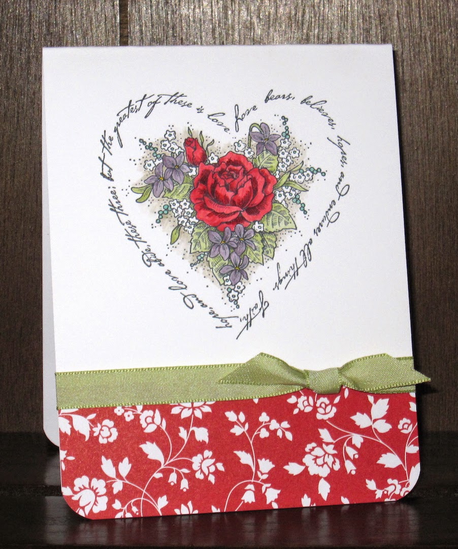
Friday Flashback: Script Heart

Happy Friday and thanks for joining me on today's (rather late) Friday Flashback!  Since tomorrow is Valentine's Day, I have an appropriately lovey-dovey stamp set today:  Script Heart.  Oddly, it seems this little set is so obscure that it doesn't even have a Splitcoast gallery.  So let's get started!

Also features French Script

Honestly, I thought I hadn't used this stamp set at ALL so I was a little surprised to find this one in the archives.  And that's the entire flashback part of today's post, so here's my new creation:


There are other stamps in the set, like some floral bits that would be used in corners and a couple of sentiments in that same spidery script, but I like the big heart the best.

I wanted an extra-simple layout to let the ornate stamp be the star of the show.  I'm still loving my new firm foam ink pads and I'm slowly getting all the colors out of the wrappers...just for funsies, I've only been opening up new colors as I use them, because I was kind of curious to see what I would open up first and what would be left to the very last.  I don't think I've got even half the colors opened up yet, though Perfect Plum, Pear Pizzazz, and Real Red joined the list this time.  (Garden Green was the very first one out of the wrapper, it is my favorite green!)

Speaking of colors, I must thank the lovely folks at the Color Throwdown for today's color palette:


I used Coastal Cabana, Perfect Plum, Real Red, and Pear Pizzazz, plus a bit of Sahara Sand for shading and a teensy bit of Crushed Curry for the violets' centers.  A scrap of patterned paper and some ribbon, and finito!

I hope y'all have a great Valentine's Day tomorrow.  Cheers, peeps!

Supplies, last card only:
Stamps:  Script Heart
Ink:  Memento Tuxedo Black, Real Red, Perfect Plum, Coastal Cabana, Pear Pizzazz, Sahara Sand, Crushed Curry
Paper:  non-SU white (because it's thicker), Fresh Prints of Bel Air DSP stack (I never get tired of that joke)
Accessories:  Pear Pizzazz taffeta ribbon, corner rounder punch

Friday, April 11, 2014

Friday Flashback: Butterfly of Happiness

Happy Friday!  Welcome to this week's Friday Flashback, where my retired stamp set this week is Butterfly of Happiness, which debuted back in 2006.  I think I'm going to try out something a little different...I like to tag every stamp set I use in each post, but it can be confusing for the longer flashbacks so I'm going to try out putting captions on the photos with the names of the other stamp sets (other than the featured Friday Flashback stamp set) that I used and we'll see how I like it.  I do have several photos to share today, so let's go!

Also features French Script

My first card with these butterflies; very simple monochrome purple.

Also features Take Three and Wild Hearts

Next one up, I rather liked this one at the time in blues and teals.  The background with the butterflies on top and the blue sponged on bottom is actually one piece, I covered the seam with ribbon.  I think I could do this idea better now ;)  Maybe I should have just done a makeover of this card, hmm.  Well, I still can I suppose.

Also features The Gifts of Spring and Beyond the Basics

Can't forget the baby books!  The little stamped butterfly in the journaling block is from today's stamp set.

So that's it for the flashback, here's today's bright and happy new card:


Let's take a closer look at that tangerine butterfly:


SPARKLY!  I stamped it once in Tangerine Tango and then stamped over it again with Versamark and embossed with Iridescent Ice.  Looks pretty cool IRL if I do say so myself :)  The ribbon tab and rhinestones on the card add other bits of shine.  I like it.  Which is saying a lot since I kinda feel like my mojo has been on vacay of late.

Must give props to Colour Q for the beautiful color combination:


Loved those colors together as soon as I saw them, so I was happy that my randomly drawn stamp set worked with the color palette.  Ok, to be fair if it hadn't worked I would have probably drawn another stamp set name until I got one that did ;) but this time I got it on the first try.

Anywha, do also check out the latest Retro Sketch:


I stuck to it pretty good this time around, I even got the little embellishments in the right places.  Whee!

Thanks for stopping by today, and I hope you have a lovely weekend.  Cheers, peeps!

Supplies, last card only:
Stamps:  Butterfly of Happiness
Ink:  Tangerine Tango, Bermuda Bay, Cool Caribbean, Versamark
Paper:  Peach Parfait, Cool Caribbean, Bermuda Bay, Tangerine Tango, Whisper White
Accessories:  White organza ribbon, rhinestones, Iridescent Ice EP, Dimensionals