Showing posts with label Big Deal Alphabet. Show all posts

Monday, September 1, 2025

Appel Happel

Scrappy Monday, y'all, and welcome to SEPTEMBER which kicks off my favorite time of the year, fall!  Squeeeee!  I'm so excited for cooler temperatures and autumn colors and many, many cups of tea and also apples.  I love today's layout!


In 2021, we went apple picking at a place called Appel Happel in Germany despite having two apple trees in our own yard, and I wish we had done it every year because it was fun.  I made pie and muffins and my first-ever attempt at homemade applesauce and I love that picture of Ryan just stretched out at his leisure in the wheelbarrow.  Love love love love love.


Today's color palette is courtesy of the Orchard Harvest DSP, one of my favorites and one of the first that I can remember SU! having on the clearance rack after it had retired.  Like, when the clearance rack was introduced, this paper was on it and I happily snagged several packs of it because I had already used most of my first pack (which rarely happens, I buy DSP faster than I use it even with how much stuff I make).  Anyway, the colors are Raspberry Ripple, More Mustard, Lucky Limeade, Island Indigo, Early Espresso, and white.  I had a mishap while creating this layout though; I wanted to ink up my Island Indigo ink pad and I accidentally used Pacific Point ink instead.  Since then I've been using a Stampin' Spot (like a mini ink pad), but I do have a full-size one in my eBay cart to replace the one I messed up.  Harrumph.

I have a bag of apples on my counter right now, I think some apple muffins would not go amiss to celebrate the beginning of September.  Cheers, y'all!

Supplies, all SU!
Stamps:  Big Deal Alphabet, Perfectly Preserved
Ink:  More Mustard, Island Indigo, Lucky Limeade, Early Espresso marker
Paper:  Raspberry Ripple, Lucky Limeade, Island Indigo, Basic White, Orchard Harvest DSP
Accessories:  Cannery Framelits

Monday, April 18, 2022

New Wheels!

Scrappy Monday, y'all!  Hope you had a good weekend, and a good Easter if you celebrate.  Ryan definitely loved the candy and chocolate--and this year the Easter Bunny gave him more toys than candy, 'cause he's crazy enough without extra sugar ; )

Anyway, I wanted a bright, fun layout to share today, and I found one in the drafts folder!


Pics were taken in August of 2019, when Ryan was 2 1/2.  Oh man, he LOVED that truck!  We still have it, but we haven't gotten it out since we moved here--it's pretty loud, and we don't want to be THOSE people who make tons of noise and act like annoying Americans.  Plus we can't plug it in to charge it since it's 110 and our electricity is 220.  But when we lived in North Carolina, he would tootle around the neighborhood and wave at everyone as he drove past.  When we first got the truck, Ryan was little enough that he had to sit way forward to reach the pedals, and we had to put a 20-lb. weight in the back of it to give it better traction.  He was a pretty good little driver, too.


Today's color palette:  Lemon Lime Twist, Grapefruit Grove, Poppy Parade, and Blueberry Bushel.  Love it!  And now I'm going to go play with my brand new In Colors :)  Cheers!

Supplies, all SU!
Stamps:  Big Deal Alphabet, By Land, Shapes & Shadows
Ink:  Blueberry Bushel, Granny Apple Green, Memento Tuxedo Black, Basic Gray marker
Paper:  Lemon Lime Twist, Poppy Parade, Thick Basic White, Birthday Bonanza DSP
Accessories:  None

Monday, May 13, 2019

Whale Watching

Scrappy Monday, y'all!  Hope you had a good Mother's Day weekend.  Ours was exhausting and barfy on Ryan's part, unfortunately.  He woke up at 11:00 on Saturday night throwing up and hollering for Mama, and then we all spent the next hour and a half trying to comfort Ryan while he was sick, cleaning up everything he was sick on, and changing clothes.  Ryan, the hubs and I all went through at least two outfits each.  Then poor Ryan alternated between saying he wanted to go to bed or watch Cars, so in the end we took his mattress out to the living room and he laid on that and watched Cars 2.  Twice.  The whole movie.  When it ended again a bit after 2 a.m., Ryan asked to put it on again and I was like nooooo we're going to sleep.  So Ryan slept on his mattress in the living room, and I tried to sleep on the couch next to him, and at 6:30 yesterday morning, Ryan woke up all chipper, poked me and said, "Cars on TV?"  So I started the movie again, and at 7 I tagged out with the hubs and tried to go to sleep for a bit in my own bed.  Meanwhile, hubs took Ryan to the store to get stuff for breakfast, and Ryan insisted on buying flowers for Mama, so when I woke up again I got cherry turnovers and a dozen red roses.  Awwwww.

Anywha, all that barfiness made me think of this layout so I have to re-share it today:


Hubs and I went on a whale watching tour in 2007 when we lived in Okinawa, and I didn't see not ONE STINKING WHALE because I got seasick for almost the entire time we were on the boat.  Actually, although I was the first to succumb, by the end of it there were only three people on the boat who had NOT gotten sick, including my hubs and the captain of the boat.  All the rest of us were miserable.  Don't know that I'll ever voluntarily go on a whale watching expedition again.

Hope your weekend involved much less barf and laundry than ours did.  Cheers, y'all!

Supplies, all SU!
Stamps:  Ocean Commotion, Big Deal Alphabet
Ink:  Pacific Point, Tangerine Tango, Daffodil Delight, Tempting Turquoise, Whisper White
Paper:  Pacific Point, Daffodil Delight, Tempting Turquoise, Whisper White, Haiku DSP
Accessories:  None

Monday, October 22, 2018

Snow & Ice 2017

Mornin', y'all!  I woke up this morning and it was 34 degrees, and we had frost on the ground.  We had like two days of fall weather and all of a sudden it feels like winter!  Okay, it's going to be in the 60s later today but still, awfully chilly this morning.  Which definitely influenced my choice of scrapbook layout to share today...


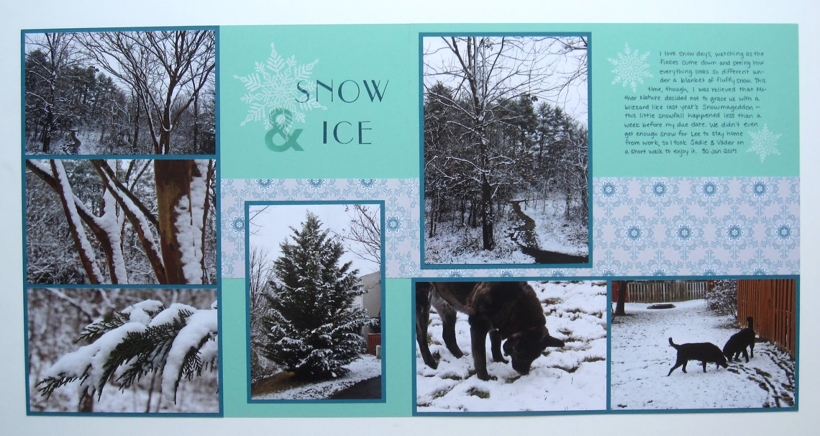
These pics are from late January 2017, when we got some winter weather just before Ryan's due date (although he didn't arrive until a good two weeks after I took these pictures).  I walked down to a little wooded area down the block from our townhouse to take some pictures of the snow on the trees, and took a few more of the doggos out in the common area.  Sadie loves her some snow.


Okay wow it must have been really overcast the day I took pictures of this layout and color palette, those colors look all wonky.  I used Coastal Cabana, Island Indigo, Smoky Slate, and Whisper White for my wintry layout.

I don't hear Ryan moving around yet, so I'm going to go drink my morning cuppa before I get him up.  Cheers y'all!

Supplies, all SU!
Stamps:  Snowflakes, Empire Alphabet Upper, Big Deal Alphabet
Ink:  Coastal Cabana, Island Indigo, Whisper White, Night of Navy marker
Paper:  Coastal Cabana, Island Indigo, Winter Frost DSP
Accessories:  None

Monday, July 30, 2018

Bath Time for Sadie

Scrappy Monday, y'all!  And today I have one of my most recent scrappy finishes...


Bath time for Sadie when she was but a wee pup!  Like, 12 years ago.  So I just finished the pages but the photos themselves are pretty old.  At least I'm getting them done?  Anyway, I could have SWORN I had a rubber duck die cut somewhere, from back in the day when we had locally owned scrapbook stores and they had racks and racks of die cut shapes of just about anything you can imagine, but apparently I imagined the duck.  So I found some clip art on the computer and just printed it on Daffodil Delight cardstock.  I hope that the printer ink doesn't flake off the cardstock...

Something else to make you giggle:  see that pink cup the hubs is using to pour water on Sadie?  We're using that EXACT SAME CUP now when we give the kiddo baths.


Today's color palette includes Pool Party, Bermuda Bay, Pumpkin Pie, Daffodil Delight, and Whisper White.  Plus a fair amount of Basic Black on Sadie and the journaling.

Hope your week is off to a good start.  I'm excited to go to the gym in my new workout pants!  ...It's weird what adults get excited about.  Cheers!

Supplies:
Stamps:  Big Deal Alphabet, Big Pieces
Ink:  Pumpkin Pie, Daffodil Delight, Basic Black marker
Paper:  Pool Party, Bermuda Bay, Daffodil Delight, Whisper White, Pumpkin Pie DSP
Accessories:  rubber duck clip art, circle punch

Monday, July 10, 2017

Cold Dog Noses

Scrappy Monday, y'all!  Hope your week is off to a good start.  I've got a busy day ahead; need to do some cleaning around the house and I want to take the little one to Target this afternoon.  But for right now, how about a scrapbook layout!


I was looking through my scrapbook pages for something bright and summery to share today and came up with this one.  These aren't the best pictures of my little doggos, and certainly not the most flattering either, but they make me laugh so I had to scrap them.  I can't tell you how many times I've awakened to see a giant dog nose just inches from my face.  They don't do it to the hubs, just me!


The letters look better on that polka-dot paper IRL than they do in the picture, it kinda makes my eyes want to cross looking at the picture.  I just stamped the letters from the Big Deal Alphabet on Whisper White paper and cut them out; I seem to do that a lot.


One very simple accent made with the retired Hearts Framelits and one wee paw print stamp.  I have it stored with a set called Bow Wow, but I think it might not have actually been from that set originally--seems like I found the paw print elsewhere, but it fit in to the set style-wise so I always kept it in the box with the stamp set.


Today's very bright and appropriately summery color palette includes Cucumber Crush, Tangelo Twist, Crushed Curry, Tempting Turquoise, Basic Black and Whisper White.  They only just retired the color family DSP packs and I already miss them.  But I'm sure I'll keep using them on my scrapbook pages!

Cheers, y'all!  Have a great week.  I'm going to go rescue the tiny human from his crib.

Supplies:
Stamps:  Big Deal Alphabet, Bow Wow?
Ink:  Basic Black, Tempting Turquoise, Cucumber Crush
Paper:  Cucumber Crush, Tempting Turquoise, Tangelo Twist, Crushed Curry, Whisper White, Tangelo Twist & Crushed Curry DSP
Accessories:  Hearts Framelits

Tuesday, July 4, 2017

July 4th

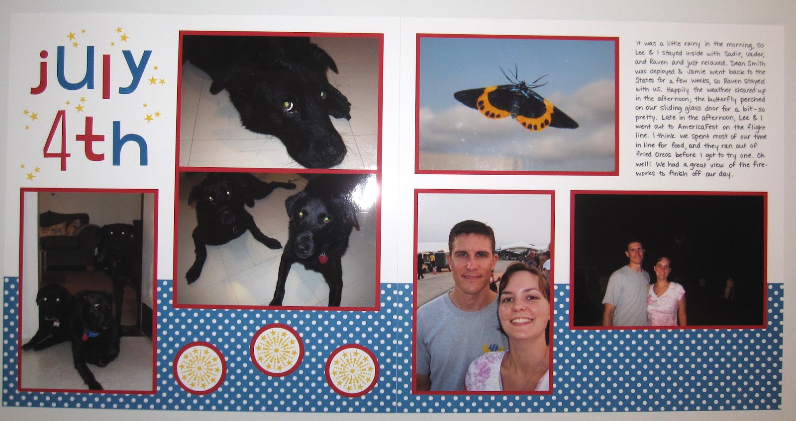
Happy Fourth of July, y'all!  I thought today would be the perfect day to share this layout:


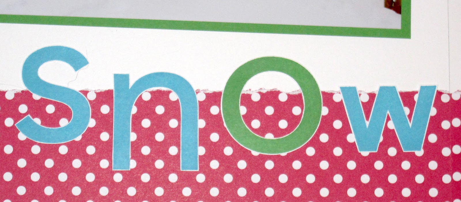
This is from 2009 (see pictures here) when we were in Japan.  How about a closeup of the title:


The Big Deal Alphabet doesn't have numbers to go with it, but I figured the Tall Tales Numbers for the 4 would be close enough in style, even if it's a bit skinnier.  Then I stamped the star trio from July Fourth all around my stamped "July 4th".


Today's color palette:  Whisper White, Pacific Point, Real Red (because of course it was red, white & blue!) and Summer Sun for some fireworks and stars.

Have a safe and happy holiday, y'all!

Supplies, all SU!
Stamps:  Big Deal Alphabet, Tall Tales Numbers, July Fourth
Ink:  Pacific Point, Real Red, Summer Sun, Basic Black marker
Paper:  Whisper White, Real Red, Pacific Point DSP
Accessories:  1 3/8" circle punch, Layering Circles Framelits

Monday, January 30, 2017

Snowmageddon

Edited to add:  I set this up last night to post today, and woke up to two inches of snow outside.  How's that for good timing? ;)

Scrappy Monday, y'all!  How's it going today?  I'm hanging in there and still pregnant :p  Hubs and I are taking bets as to when Sodapop will arrive.


These pictures are from last year's giant snowstorm that was over my birthday weekend :)  Dang, why is this photo so dark of the layout??  Anyway, click to embiggen.  Hubs got almost an entire week off of work due to the snow, so we used the time to play with the dogs and build a giant snowbear and then we had to dig out the car because eventually hubs did have to go back to work.


There's a closeup of some of the letters and rest assured the dog hair is not a permanent part of the layout.  My friend Tiana made us a sign once that says "Home is where the dog hair sticks to everything but the dog!" and that is 1000000% TRUE.  Thanks, Sadie.


And here's a bonus second layout!  Sooooo I've got an album of pictures of my dogs because when my yellow lab Chewie died, I realized I didn't have a lot of pictures of him despite spending a LOT of time with him.  So we do make an effort to take pictures of our two doglets and yes I'm the crazy person with a dog scrapbook.  Anyway, we took so many cute pictures of them during Snowmageddon that I decided to make a layout for their book in addition to the other layout above.  But I figured why reinvent the wheel, so I did basically the same layout, except I squeezed in three photos on the top right instead of two.  Sadie wishes it would snow like this again because she totally loves the snow, but so far nothing doing.


The color palette that's much brighter in person:  Whisper White, Tempting Turquoise, Cucumber Crush, and Melon Mambo.  Seriously, why did the pictures of these layouts come out so dark?  Grr.

Cheers!

Supplies, all SU!
Stamps:  Big Deal Alphabet, Merry
Ink:  Tempting Turquoise, Cucumber Crush
Paper:  Whisper White, Tempting Turquoise, Cucumber Crush, Melon Mambo DSP
Accessories:  None

Monday, January 16, 2017

Merge and Squish!

Scrappy Monday, y'all!  Today is something slightly different--a couple of scrapbook pages that I made and framed and sent to Missy and Bennet as a belated Christmas present.  I didn't take pictures of them in the frames because the glass makes such a glare, so here's the two pages I made:


For Bennet, a commemoration of the running joke that will never die.  So on our trip to China in 2010 (wow that long ago!!!), we went to a McDonald's for lunch one day and somehow Lee and Bennet accidentally switched drinks.  No big except Bennet had a cold so then Lee got it.  And then Bennet started calling it The Merge and we actually have not one but TWO Merge street signs in our house now.  So I made a special one for Bennet with one of the pics from McDonald's where The Merge happened.  For the M, I just Googled "golden arches" and printed off one on regular computer paper, then attached the image to cardstock with removable adhesive and cut it out.  Peel off the computer paper and voila, cardstock golden arches.  P.S.  Notice that the patterned paper is skull & crossbones!!


For Missy I chose this picture of the four of us squished into a little cubby to sleep at the eighth station on Mount Fuji.  What is it about the four of us and excessive togetherness? ;)  Since it was for Missy, of course I used green and gold for the main colors (I actually used that same patterned paper for all the Fuji pages in my own scrapbooks).  What tripped me up was the color to do for the letters...I stamped them first in Marina Mist, cut them all out and then thought it looked too gray.  So then I stamped them in Pacific Point and cut them all out but it still didn't look quite right on the Garden Green cardstock.  So I stamped them a THIRD time in Tempting Turquoise and that finally worked.  Then I added the Thankful Forest Friends bear because again, it's Missy.  Green + gold + bear = Missy.

A couple of black frames and they were done.  Although since my mom has given me a complex about how navy blue and black don't go together, Bennet's page kinda made my eye twitch after I got it framed.  Oops.  Well, not everyone has the same color hang-ups that I do, and I know that almost all of the frames in their house are black so I was going for something that would match what they already have.

That's it for me today, peeps.  Cheers!

Supplies, Merge page:
Stamps:  None
Ink:  None
Paper:  Night of Navy, More Mustard, So Saffron, Rockabilly DSP
Accessories:  Lettering template

Supplies:  Fuji Squish page:
Stamps:  Big Deal Alphabet, Thankful Forest Friends
Ink:  Tempting Turquoise, Early Espresso
Paper:  Garden Green, Pacific Point, Tempting Turquoise, Whisper White, Haiku DSP
Accessories:  Oval punch

Friday, January 6, 2017

Friday Flashback: Ocean Commotion

Happy Friday, y'all, and welcome to the first Friday Flashback of the year.  This week's stamp set is Ocean Commotion...it's funny to me, I'm not a huge ocean person but the hubs is, and we lived on Okinawa for a bit under three years so I do have some beachy/ocean-y pictures and basically I always get the marine sets and use them pretty frequently.  But I think Ocean Commotion might have been my first fishy set :)

Also features Rough Type

Speaking of Okinawa, here's a scrapbook layout from the Churaumi Aquarium in Nago.  I do love that photo with the sea turtle :)  Anyway, Ocean Commotion is a wee little set of just four stamps, and I used all of 'em on this layout--the fish, the seahorse, the seaweed, and the shell.


I did a couple of baby books for kiddos born on Okinawa so I made an ocean layout for those.

Also features Thank You Kindly
The hubs loves to scuba dive, so when he asked for some thank you cards I made up a set of six of these.

Also features Short & Sweet
Ocean images are perfect for using with polished stone!  I miss SU's glossy white cardstock just for polished stone backgrounds, that was one of my favorite techniques.

Also features Warmest Regards
Here's a birthday card for one of the hubs' scuba diving friends.

Also features Big Deal Alphabet
And one last scrapbook layout from the one and only time I'll ever go whale watching--I was so busy being seasick I didn't see not ONE STINKING WHALE!  But I did really like how this layout turned out.  I love the bright blues and orange together.  And while the hubs kinda laughs at how my photos all seem to tilt a little bit, I can categorically say all the crooked photos on this layout were taken by HIM, not me.

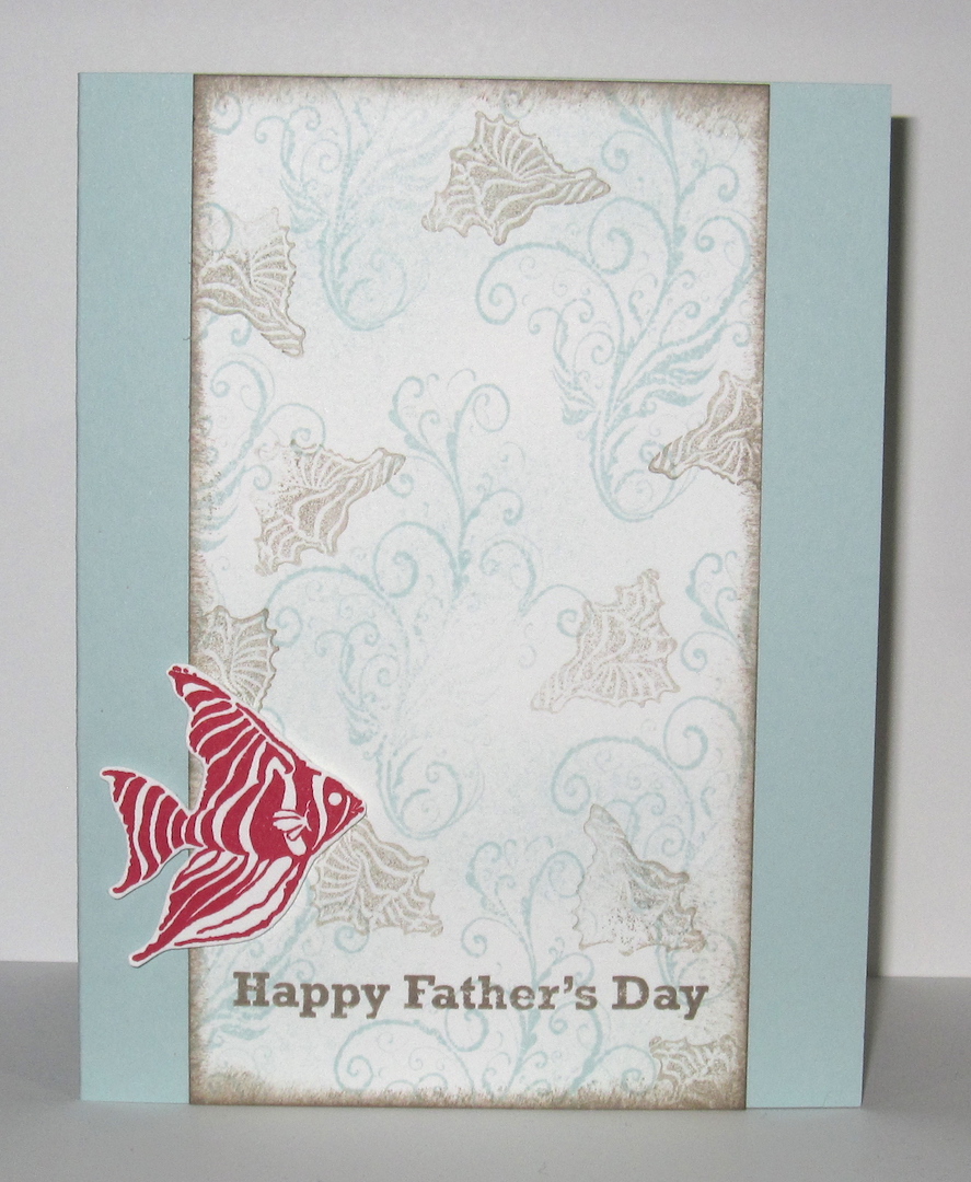
So there's the flashback, and here is my brand new card:


Why Father's Day?  Well, since I'm 8 months pregnant that means this year will be my hubs' first Father's Day as a daddy himself.  And the idea popped into my head when I was perusing stamp sets for a sentiment to put on this card so I went with it.  I was inspired by the Fusion challenge:


Obviously I used the sketch, but I also used the photo--completely different theme, but I took the colors Soft Sky, Tip Top Taupe, and Real Red from the picture.  So now I just need to put this card someplace the hubs won't see it, but that I won't forget where to find it in June...

Cheers, y'all!  Stay warm this weekend.

Supplies, last card only:
Stamps:  Ocean Commotion, Something to Celebrate
Ink:  Soft Sky, Tip Top Taupe, Real Red
Paper:  Soft Sky, Thick Whisper White
Accessories:  Dimensionals

Friday, January 1, 2016

2015 Scrapbook Showcase, Part 1

So the card showcase is already up, let's take a look back at the year's scrapbook layouts!  I'm very proud to say I made a whopping 154 scrapbook pages this year, not counting the ones I did for baby books.  I have enough draft scrapbook posts to do Scrappy Mondays through June.  So let's take a look, shall we?


January's pick is this hot layout from Greece.  It's funny, I don't really do a lot of pages with red or orange page bases, but half of my showcase picks feature just that.  Anyway, I love the Tangelo Twist base on this page because it reminds me how stinkin' hot it was in Olympia that day.


February's pick is this hot pink layout from our last days in Okinawa.  I need more Melon Mambo in my life.


My pick for March is this birthday layout, and that baby girl is now six.  Even more exciting is that my friend Tiana will be here in just a few days!!!


I just couldn't choose only one layout for April, so the first April pick is this comic-inspired layout from when my family accidentally got involved in a drug bust in London.  They seriously love telling that story, and props to Mom for taking the pictures of it so I could make this layout.


My second April pick is this layout from China, and is the genesis for a longstanding joke between me and the hubs and our friends.  I'm not in love with my fried egg embellishments on here, but I love the golden arches and the story behind this one.


For May's pick, I went with a Melon Mambo layout once again and these gorgeous pictures from Santorini, Greece.  This was the very first time I used Tip Top Taupe too.


And to cap off the first half of the scrapbook showcase, June's pick is from that same cruise and the island of Capri.  I think I've already scrapped about half of that cruise and I love looking at all the pictures (and I seriously want to go back to Greece).

Happy New Year, y'all!  Next week's Scrappy Monday will be the second half of the scrapbook showcase, and then we'll get the new year started with some new stampy projects.  Cheers!

Friday, November 27, 2015

Friday Flashback: Big Deal Alphabet

Heyyy it's Black Friday.  Are you getting your shop on?  I'm not really planning to.  I think we have too much stuff already, unless we're talking about craft supplies, in which case I do need some more ;)  But it's time for the Friday Flashback!  This week's stamp set is Big Deal Alphabet, and you know that if it's an alphabet that means scrapbook pages :)

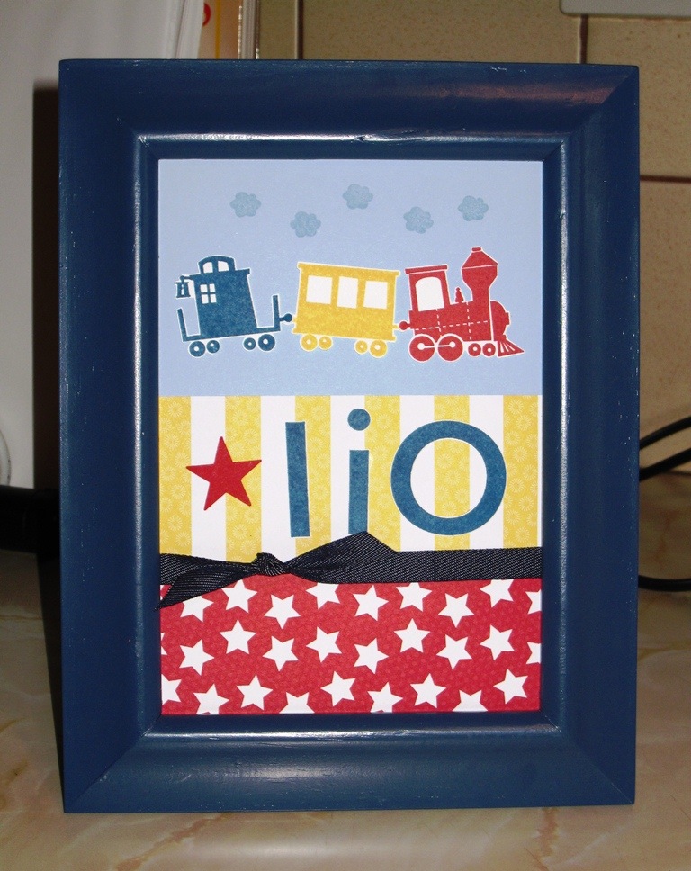
Also features Up, Up & Away

But first up a name frame.  Kinda cute, right?  The paper I used is called Big Top Birthday, and half of it is really, really fabulous and the other half I don't know what you'd use it for, but happily that half is all on the flip side of the half I really like and I need about a zillion more sheets of that red star pattern.

Also features Retro Alphabet Upper & non-SU stamp

Love this layout.  I don't seem to do a lot of pink for page bases, but I love how this one turned out.  and the title.  Love the rainbow-licious title.

Also features Rough Type, Gorgeous Grunge

The thing I love about alphabet stamps is that you can use them as much as you want, unlike stickers where you always run out of E's and have a zillion X stickers and nothing to use them on.  And I can make the letters any color I want, that's pretty fabulous too.


When you read this page title, you're supposed to sing it to yourself and do jazz hands.

Also features Ocean Commotion
Another favorite page, although the day we took these pictures I was really busy being seasick the whole time.  But the pages look pretty great.  What's not to love about a blue and orange color combo!

So that's the Flashback, and here's today's new project, another scrapbook layout:


And it's another blue and orange color combo.


It's been so overcast and rainy here lately that the colors aren't coming out true to life, that's not gray it's Marina Mist.  As you can tell from the title, these pics are also from our Fuji trip, but I had pictures of us at several different restaurants so I just grouped them all together.  And "Fuji Food" just sounded funny in my head, thus my title was born.  Plus it amuses me to post a food-related layout the day after the biggest meal of the year.


Today's color palette:  Marina Mist, Garden Green, So Saffron, Tangerine Tango, Basic Black, and Whisper White.  I'm still doing green and gold for Fuji pages, although I used a different pattern from the Haiku pack than I did on the three layouts where we're actually on the dread mountain.

Have a great weekend, peeps!  And if you're out shopping, be careful out there.  People be crazy!

Supplies, Fuji Food only:
Stamps:  Big Deal Alphabet
Ink:  Tangerine Tango, Early Espresso
Paper:  Marina Mist, Garden Green, Whisper White, Garden Green DSP, Haiku DSP
Accessories:  Circles Framelits

Friday, September 18, 2015

Friday Flashback: Choo Choo

Howdy, folks!  It's time once again for a Friday Flashback, and this week's stamp set is Choo Choo.  Let's take a look, shall we?

Also features Big Deal Alphabet

I've done a few name frames, but not a lot.  The ribbon is actually the denim ribbon SU! sold a few years ago, it's not black like it looks in the picture.

Also features Loads of Love

A friend of mine wanted to use the Choo Choo train to make Christmas cards one year so this was the idea I came up with to help her out.  The packages from Loads of Love are sized just right for this train :)  But that's all the archives had to offer, so let's look at today's new piece:


It's a baby book layout from the books I just finished.  My friend the mama asked for one layout to document all the twins' milestones like first tooth, first laugh, etc. so this is what I made.  I thought the train was cute and slightly punny with *mile*stones and I used some patterned paper that kinda reminded me of train tracks a little bit.  The white tags with the stars aren't stuck down, so mama can use them to label each picture if she wants or she can choose to only write on the journaling block.  Options.


And there's a closeup of the train.  The animals are from the stamp set I Dig You, which comes up on another baby book layout (but I didn't use the animals on that one).  I got the new Basic Black ink pad from the holiday mini catalog and it is a nice crisp black!  And non-smeary.  Love it.


There's my color palette:  Crushed Curry, Real Red, Pacific Point (I tried Coastal Cabana first but it just didn't work), Basic Gray, Soft Suede, Basic Black, Smoky Slate, and Whisper White.  Of course a few of those colors are only used on the train but hey, they were used.

That's it for me this week, peeps.  We're going to the baseball game tonight, woo!  Cheers!

Supplies, baby book layout only:
Stamps:  Choo Choo, I Dig You, Banner Blast (small stars)
Ink:  Crushed Curry, Real Red, Pacific Point, Soft Suede, Basic Black, Smoky Slate
Paper:  Crushed Curry, Real Red, Pacific Point, Whisper White, Confetti Celebration DSP
Accessories:  Sizzix alphabet, medium star punch, key tag punch