Scrappy Monday! Once again, I'm sharing pages from our European travels because I'm crossing my fingers that we'll get to travel again once this pandemic thing gets under control.
See these pics (and more) here and here. I kept this layout very simple, but since I usually don't crop my pictures very much and I like to cram in as many as I can get on a single layout, I kinda have to keep things simple :)
Today's color palette: Mint Macaron, Dusty Durango (this layout started a Dusty Durango spree, I used it on three or four layouts in a row but since I skip around when I scrap, they won't be next to each other in my albums), Midnight Muse, Tangerine Tango, and Very Vanilla. I think I use Whisper White for 85% of my scrapbook pages, but around the time I went on a Dusty Durango spree I also started using a lot of Very Vanilla. When I'm really in a scrapping groove and making lots of pages, I pretty frequently gravitate towards a color and use it several times on different layouts. It's fun to think up different ways to use a specific color.
Cheers, y'all!
Supplies, all SU!
Stamps: Morning Post Alphabet, Positive Thoughts
Ink: Dusty Durango, Midnight Muse
Paper: Mint Macaron, Dusty Durango, Thick Very Vanilla, Paisley Petals DSP
Accessories: None
Showing posts with label Morning Post Alphabet. Show all posts
Monday, August 10, 2020
Wednesday, January 1, 2020
Ikebana and 2020 Goals
Happy New Year, y'all. I didn't get as much time in my craft room as I wanted to yesterday because the hubs asked me to help him wax my car, and I couldn't say no since it's my car ;) I did work on finishing up a scrapbook layout yesterday (well, it will be done when the hubs does the journaling on it) and I will be ready to start a new one during naptime today provided *I* don't have to take a nap. Ryan was afraid of the noise from the fireworks last night so I ended up sleeping on the floor in his room, which means I didn't get enough sleep : / Ryan, of course, is bright-eyed and bushy-tailed this New Year morn. (I started writing this post at 7:30 this morning, but didn't finish it until after 3:30 in the afternoon.)
Anyway, let's start out with a scrapbook layout from Okinawa. I don't have a whole lot of layouts left to do from our time in Okinawa...on the one hand, that means I can finish up those scrapbooks; on the other hand, that means no more Japan pictures.
You can see more pics here. Ikebana is the Japanese art of flower arrangement, but you know how I like macro shots of flowers so most of my pictures are closeups instead of the whole arrangement.
Today's color palette includes Pink Pirouette, Elegant Eggplant (it's dark purple, not black, I promise), Lemon Lime Twist (I put Granny Apple Green in the palette but it's actually Lemon Lime Twist), Highland Heather, and Whisper White. I've done Pink Pirouette as the page base for floral pages several times, something about that soft pink just appeals to me with flower pictures.
Supplies, all SU!
Stamps: Morning Post Alphabet, Strength & Hope, Carte Postale
Ink: Pink Pirouette, Elegant Eggplant, Highland Heather, Lemon Lime Twist
Paper: Pink Pirouette, Elegant Eggplant, Highland Heather, Whisper White, Botanical Butterfly DSP
Accessories: None
Okay, so now it's goals time. First, let's check in on my 2019 goals.
Scrapbooking:
1. Make 200 pages. Well, if I count my future nephew's baby book, I ended 2019 at 188 pages, which is nothing to sneeze at. Not quite up to the goal, but pretty darn close.
2. Finish Ryan's baby book. DONE, BABY! I'll start sharing those pages soon. The album is all put together (it's huge, I'm sure it weighs more than Ryan did when he was born) and it is now at my parents' house because I didn't want to chance something happening to it when we move overseas this spring.
3. Organize pictures. Uh, this one didn't happen.
Reading:
1. Have fewer unread books on my Kindle than I started with on this day a year ago. Yeah, 2020 me is laughing at 2019 me. I started 2019 with 125 unread books; I ended with 134. Oops.
Cross stitching:
1. Finish The Accolade. DONE, BABY! I finished this in late July and immediately went on a pattern-buying binge and have a zillion more projects I want to tackle. I need to clone myself.
So, out of those five goals, two were unequivocal successes, one was pretty close, and two were failures ;) Still, I did a lot of scrapbooking, reading, and stitching in 2019, and that's good.
And now it's time for 2020 goals.
Scrapbooking:
1. Make 200 pages (100 two-page layouts). I was SO close last year, I'm going to keep that as my goal this year. Might be more difficult since we're moving overseas and I might not have access to my stuff for a couple of months, but I'm really going to have a go at this. I don't have a specific scrapbook project I'm working on, just plugging away at years and years of pictures.
ETA: Oh, I have to change this goal. Plan is for me to find a job once we get to Germany, which obviously will take away a lot of my scrapbook time. So let's shoot for 100 pages.
2. Speaking of pictures, I really DO need to get those organized and pared down a bit. This goal fell by the wayside, and I need to tackle it.
Reading:
I don't think I'll make a reading goal this year because I have a feeling my TBR (To Be Read) pile will only ever increase. I'll just read as much as I can and give myself permission to not finish books if I'm not enjoying them. I did read two nonfiction books near the end of last year that I found fascinating, if rather depressing: The Five and The Radium Girls. Maybe this year I'll just track how many books I read.
Cross Stitching:
3. The Accolade is finished (and I finished a couple of other projects last year too), but I have one last Scarlet Quince that I've started and not finished yet: The Quarry, by Julian Onderdonk.
I pulled this one out after a 5-year timeout and I remember vividly why it was in timeout. It's 99% blended threads and 99% confetti, which means it is SLOW and it's hard to feel like I'm making any progress on it. There's a lot of electric blue and purple in the bluebonnets, which I like, but this might just kill me :p I'm at 31% done, so my goal for this year is to get to 40%. Might not sound like a lot...might not look like a lot...but it's going to take a lot of work to get there. This is my odd days project (so I work on it on odd-number days), and I've got another project for even days, because if I worked on this one and nothing else I'd probably set it on fire. Here's what it will look like probably when I'm 80:
I've completed six Scarlet Quince designs (all large, full-coverage pieces) so this ain't my first rodeo, but this is still on another level even from The Accolade, which may be slightly larger (150,000 stitches vs. 130,968 on this one) but didn't have nearly as much confetti as this one. This goal is going to be hard to achieve.
Fitness:
So I think I've joked on here that I joined Missy's fitness cult (Missy: "Stop calling it a cult!") at the beginning of November. I've worked hard on improving my diet and still working out, and I'm down around 18 to 19 pounds from when I started, so yay me! I can actually wear my wedding and engagement rings after several years of them being too tight to wear. I'm wearing pants I haven't worn in years and they're loose so I have to wear a belt (which is now two notches tighter than it used to be, too). I don't necessarily have a specific weight goal in mind, but I do have a fitness goal:
4. Be able to do a full chatturanga (which I don't know how to spell). It's a yoga move, basically a slow tricep pushup. Since I started this program, I've been working on trying to strengthen my wrists as I've had longstanding issues with both of them (especially the right one) which has kept me from doing pushups and necessitated the modification of lots of exercises. My flexibility has improved A LOT over the last two years thanks to regular yoga and pilates classes, but this is one thing I haven't been able to do yet. I'm gonna have to figure out those dang tricep pushups.
So there are my four goals for this year. I'd better get off the computer and start working!
Anyway, let's start out with a scrapbook layout from Okinawa. I don't have a whole lot of layouts left to do from our time in Okinawa...on the one hand, that means I can finish up those scrapbooks; on the other hand, that means no more Japan pictures.
You can see more pics here. Ikebana is the Japanese art of flower arrangement, but you know how I like macro shots of flowers so most of my pictures are closeups instead of the whole arrangement.
Today's color palette includes Pink Pirouette, Elegant Eggplant (it's dark purple, not black, I promise), Lemon Lime Twist (I put Granny Apple Green in the palette but it's actually Lemon Lime Twist), Highland Heather, and Whisper White. I've done Pink Pirouette as the page base for floral pages several times, something about that soft pink just appeals to me with flower pictures.
Supplies, all SU!
Stamps: Morning Post Alphabet, Strength & Hope, Carte Postale
Ink: Pink Pirouette, Elegant Eggplant, Highland Heather, Lemon Lime Twist
Paper: Pink Pirouette, Elegant Eggplant, Highland Heather, Whisper White, Botanical Butterfly DSP
Accessories: None
Okay, so now it's goals time. First, let's check in on my 2019 goals.
Scrapbooking:
1. Make 200 pages. Well, if I count my future nephew's baby book, I ended 2019 at 188 pages, which is nothing to sneeze at. Not quite up to the goal, but pretty darn close.
2. Finish Ryan's baby book. DONE, BABY! I'll start sharing those pages soon. The album is all put together (it's huge, I'm sure it weighs more than Ryan did when he was born) and it is now at my parents' house because I didn't want to chance something happening to it when we move overseas this spring.
3. Organize pictures. Uh, this one didn't happen.
Reading:
1. Have fewer unread books on my Kindle than I started with on this day a year ago. Yeah, 2020 me is laughing at 2019 me. I started 2019 with 125 unread books; I ended with 134. Oops.
Cross stitching:
1. Finish The Accolade. DONE, BABY! I finished this in late July and immediately went on a pattern-buying binge and have a zillion more projects I want to tackle. I need to clone myself.
So, out of those five goals, two were unequivocal successes, one was pretty close, and two were failures ;) Still, I did a lot of scrapbooking, reading, and stitching in 2019, and that's good.
And now it's time for 2020 goals.
Scrapbooking:
1. Make 200 pages (100 two-page layouts). I was SO close last year, I'm going to keep that as my goal this year. Might be more difficult since we're moving overseas and I might not have access to my stuff for a couple of months, but I'm really going to have a go at this. I don't have a specific scrapbook project I'm working on, just plugging away at years and years of pictures.
ETA: Oh, I have to change this goal. Plan is for me to find a job once we get to Germany, which obviously will take away a lot of my scrapbook time. So let's shoot for 100 pages.
2. Speaking of pictures, I really DO need to get those organized and pared down a bit. This goal fell by the wayside, and I need to tackle it.
Reading:
I don't think I'll make a reading goal this year because I have a feeling my TBR (To Be Read) pile will only ever increase. I'll just read as much as I can and give myself permission to not finish books if I'm not enjoying them. I did read two nonfiction books near the end of last year that I found fascinating, if rather depressing: The Five and The Radium Girls. Maybe this year I'll just track how many books I read.
Cross Stitching:
3. The Accolade is finished (and I finished a couple of other projects last year too), but I have one last Scarlet Quince that I've started and not finished yet: The Quarry, by Julian Onderdonk.
I pulled this one out after a 5-year timeout and I remember vividly why it was in timeout. It's 99% blended threads and 99% confetti, which means it is SLOW and it's hard to feel like I'm making any progress on it. There's a lot of electric blue and purple in the bluebonnets, which I like, but this might just kill me :p I'm at 31% done, so my goal for this year is to get to 40%. Might not sound like a lot...might not look like a lot...but it's going to take a lot of work to get there. This is my odd days project (so I work on it on odd-number days), and I've got another project for even days, because if I worked on this one and nothing else I'd probably set it on fire. Here's what it will look like probably when I'm 80:
I've completed six Scarlet Quince designs (all large, full-coverage pieces) so this ain't my first rodeo, but this is still on another level even from The Accolade, which may be slightly larger (150,000 stitches vs. 130,968 on this one) but didn't have nearly as much confetti as this one. This goal is going to be hard to achieve.
Fitness:
So I think I've joked on here that I joined Missy's fitness cult (Missy: "Stop calling it a cult!") at the beginning of November. I've worked hard on improving my diet and still working out, and I'm down around 18 to 19 pounds from when I started, so yay me! I can actually wear my wedding and engagement rings after several years of them being too tight to wear. I'm wearing pants I haven't worn in years and they're loose so I have to wear a belt (which is now two notches tighter than it used to be, too). I don't necessarily have a specific weight goal in mind, but I do have a fitness goal:
4. Be able to do a full chatturanga (which I don't know how to spell). It's a yoga move, basically a slow tricep pushup. Since I started this program, I've been working on trying to strengthen my wrists as I've had longstanding issues with both of them (especially the right one) which has kept me from doing pushups and necessitated the modification of lots of exercises. My flexibility has improved A LOT over the last two years thanks to regular yoga and pilates classes, but this is one thing I haven't been able to do yet. I'm gonna have to figure out those dang tricep pushups.
So there are my four goals for this year. I'd better get off the computer and start working!
Monday, January 14, 2019
Dublin, Part 1
Scrappy Monday, y'all! It's all gray and overcast where I am but I think I need some sunglasses before I look at today's pages...
All hail Lemon Lime Twist! And also that super-cool patterned paper, now retired. We went to Ireland in December of 2011; see the pictures up close here. I did several layouts for our trip, some of which I think have been shared here, and because it's Ireland I did every layout on green cardstock. Plus I love green :)
This one was pretty straightforward; the only stamping is my page title and the patterned paper really does the work here.
There's my color palette: Lemon Lime Twist, Berry Burst, Night of Navy, and Whisper White. Kiddo is talking and I need to get him up so we can eat breakfast before we go to the gym. Cheers, y'all!
Supplies, all SU!
Stamps: Morning Post Alphabet
Ink: Night of Navy
Paper: Lemon Lime Twist, Berry Burst, Night of Navy, Whisper White, Naturally Eclectic DSP
Accessories: None
All hail Lemon Lime Twist! And also that super-cool patterned paper, now retired. We went to Ireland in December of 2011; see the pictures up close here. I did several layouts for our trip, some of which I think have been shared here, and because it's Ireland I did every layout on green cardstock. Plus I love green :)
This one was pretty straightforward; the only stamping is my page title and the patterned paper really does the work here.
There's my color palette: Lemon Lime Twist, Berry Burst, Night of Navy, and Whisper White. Kiddo is talking and I need to get him up so we can eat breakfast before we go to the gym. Cheers, y'all!
Supplies, all SU!
Stamps: Morning Post Alphabet
Ink: Night of Navy
Paper: Lemon Lime Twist, Berry Burst, Night of Navy, Whisper White, Naturally Eclectic DSP
Accessories: None
Monday, October 2, 2017
Sacile
Good morning y'all! It's finally OCTOBER which might be my favoritest month of the year and I have an appropriately autumnal scrapbook layout to share today!
LOVE IT. The pictures (see them here) are from a little town we went to in Italy called Sacile. It's so small, most of the people don't seem to speak English. Hubs and I wandered into a leather goods store and the saleslady gave us a ten-minute spiel, which we listened to intently, and then she figured out we didn't understand a word she said except for when she SAID we didn't understand her (sounds like no capeesh!). We did end up buying a leather wallet for my brother for his birthday despite the language barrier, and then as we were leaving, hubs and I both BOWED to the saleslady like we were still in Japan, which made her even more confused. Ha!! But I did write that funny story in my journaling.
I used Garden Green and Blackberry Bliss for the title letters, and then embossed the leaves with retired Tangerine Tango embossing powder. Stampin' Up! used to have several colors of embossing powder, they were fun to play with...and I still have 'em so they'll make occasional appearances here and there :) I liked the effect on the Blackberry Bliss cardstock.
I cut out a few embossed leaves to use as accents. What's funny is the two leaves stuck together were an accident, I meant to stamp them a little further apart, but I decided they still worked fine so I just cut them both out together.
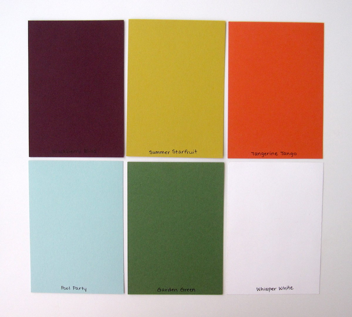
Today's fall color palette: Blackberry Bliss, Summer Starfruit, Tangerine Tango, Pool Party, Garden Green, and Whisper White. The patterned paper actually has Rich Razzleberry in it, but it just reads like slightly lighter Blackberry Bliss so it's all good.
Cheers, y'all!
Supplies, all SU!
Stamps: Morning Post Alphabet, Best of Autumn
Ink: Versamark, Blackberry Bliss, Garden Green
Paper: Blackberry Bliss, Garden Green, Summer Starfruit
Accessories: Tangerine Tango embossing powder
LOVE IT. The pictures (see them here) are from a little town we went to in Italy called Sacile. It's so small, most of the people don't seem to speak English. Hubs and I wandered into a leather goods store and the saleslady gave us a ten-minute spiel, which we listened to intently, and then she figured out we didn't understand a word she said except for when she SAID we didn't understand her (sounds like no capeesh!). We did end up buying a leather wallet for my brother for his birthday despite the language barrier, and then as we were leaving, hubs and I both BOWED to the saleslady like we were still in Japan, which made her even more confused. Ha!! But I did write that funny story in my journaling.
I used Garden Green and Blackberry Bliss for the title letters, and then embossed the leaves with retired Tangerine Tango embossing powder. Stampin' Up! used to have several colors of embossing powder, they were fun to play with...and I still have 'em so they'll make occasional appearances here and there :) I liked the effect on the Blackberry Bliss cardstock.
I cut out a few embossed leaves to use as accents. What's funny is the two leaves stuck together were an accident, I meant to stamp them a little further apart, but I decided they still worked fine so I just cut them both out together.
Today's fall color palette: Blackberry Bliss, Summer Starfruit, Tangerine Tango, Pool Party, Garden Green, and Whisper White. The patterned paper actually has Rich Razzleberry in it, but it just reads like slightly lighter Blackberry Bliss so it's all good.
Cheers, y'all!
Supplies, all SU!
Stamps: Morning Post Alphabet, Best of Autumn
Ink: Versamark, Blackberry Bliss, Garden Green
Paper: Blackberry Bliss, Garden Green, Summer Starfruit
Accessories: Tangerine Tango embossing powder
Labels:
Best of Autumn,
Morning Post Alphabet,
Scrapbooks
Monday, September 4, 2017
Versailles, Part 1
Scrappy Monday, y'all! I have no fewer than FIFTY draft posts and I think they're all scrapbook layouts. Or the vast majority are, at any rate. And today I'm sharing a layout I just finished last week instead of one that I probably finished last year :D I've been working hard on the scrapbooks this year to have that many draft posts. Yay me!
Anyway, on to today's layout!
See the pics here and here. There's a bit of a glare on the left page...I think it matters if it's sunny or overcast when I take the photos, and I try to take them in the morning due to the direction of the light coming in the windows...well, I try to take good pics of the layouts anyway, even if I don't always succeed.
I think I know why I don't typically cut out the letters in the Morning Post Alphabet...this took FOR.EV.ER!! No kidding it took well over an hour just to cut the letters out, but this is where my scrappy muse took me for today so cut them out I did.
This is the first of three Versailles layouts (we took a lot of pictures); they all three have this color palette: Crushed Curry, Emerald Envy, Brilliant Blue, and a bit of Basic Gray for the journaling and some Whisper White. I'm getting very close to running out of 8.5x11" Brilliant Blue cardstock...I may have to cave and buy some on eBay. I do love that color for my scrapbooks.
I'm going to finish my cuppa and my piece of pumpkin coffee cake...I made the first pumpkin coffee cake of the fall season yesterday and YUM we've pretty much eaten all of it already. So. Good. Anyway, after breakfast I probably need to go to the gym to work off the pumpkin coffee cake ;) Cheers, y'all!
Supplies, all SU!
Stamps: Morning Post Alphabet, Carte Postale
Ink: Brilliant Blue, Crushed Curry, Basic Gray marker
Paper: Emerald Envy, Brilliant Blue, Whisper White, Crushed Curry DSP
Accessories: circle punches
Anyway, on to today's layout!
See the pics here and here. There's a bit of a glare on the left page...I think it matters if it's sunny or overcast when I take the photos, and I try to take them in the morning due to the direction of the light coming in the windows...well, I try to take good pics of the layouts anyway, even if I don't always succeed.
I think I know why I don't typically cut out the letters in the Morning Post Alphabet...this took FOR.EV.ER!! No kidding it took well over an hour just to cut the letters out, but this is where my scrappy muse took me for today so cut them out I did.
This is the first of three Versailles layouts (we took a lot of pictures); they all three have this color palette: Crushed Curry, Emerald Envy, Brilliant Blue, and a bit of Basic Gray for the journaling and some Whisper White. I'm getting very close to running out of 8.5x11" Brilliant Blue cardstock...I may have to cave and buy some on eBay. I do love that color for my scrapbooks.
I'm going to finish my cuppa and my piece of pumpkin coffee cake...I made the first pumpkin coffee cake of the fall season yesterday and YUM we've pretty much eaten all of it already. So. Good. Anyway, after breakfast I probably need to go to the gym to work off the pumpkin coffee cake ;) Cheers, y'all!
Supplies, all SU!
Stamps: Morning Post Alphabet, Carte Postale
Ink: Brilliant Blue, Crushed Curry, Basic Gray marker
Paper: Emerald Envy, Brilliant Blue, Whisper White, Crushed Curry DSP
Accessories: circle punches
Labels:
Carte Postale,
Morning Post Alphabet,
Scrapbooks
Friday, February 3, 2017
Friday Flashback: Mosaic Madness
Happy Friday, y'all. And guess what...my due date is TOMORROW. Which is frightening. I know that the vast majority of babies are not born ON their due dates, but I'm still kinda hoping. So I'm getting a pedicure today, and hopefully going out for one last date night with the hubs tonight. And wondering if I should do crock pot chicken taco soup for dinner tomorrow...I mean, what if I DO go into labor?!
Anyway. I don't feel like doing a whole lot now because it's like I'm the human embodiment of the quote "That's no moon...it's a space station!" but I have been doing some stamping and scrapping (because it involves sitting but still being productive). So for today's Friday Flashback, let's check out the archives for Mosaic Madness!
First up is this layout from Greece! Actually I did two, and used Mosaic Madness on both, but this post is already going to be pretty long. I do love this layout.
Here is a tribute to the Stamp-a-Ma-Jig. That multicolored panel? All hand-stamped. Yes, it took forever, but I really liked how it turned out.
Something quick for Father's Day, though I think the circle element needed a mat too.
Here's another scrapbook layout, this time from Hearst Castle in California. Know what I just realized? I got that picture in the top left enlarged to 5x7, but somehow the photo I had in my archives is with the 4x6 placeholder. Oops. So in the real finished layout, that's a 5x7 photo and doesn't have a big distracting white border! : D
And another Stamp-a-Ma-Jiggy card. I love stamp sets that have matching punches.
Okay, this one is a little different: the Mosaic Madness stamp I used on this one is the border underneath the sentiment, instead of one of the mosaic shapes.
*suddenly noticing how often I use yellows with this stamp set*
Oh hey look, not yellow.
But there it is again.
So there's the Flashback part, which wasn't everything I've got in my archives but I don't want to bore anyone. Ready for the new project? Spoiler alert: I love these scrapbook pages.
I mentioned earlier this week that I had done the rest of my Spain layouts, so here's the first one! (And this is why I redid the Shenanigans layout in a different color combination.)
I think I need to refresh the ink in my Midnight Muse ink pad, it's not *quite* dark enough on the patterned paper here. Anyway, I love stamps like Mosaic Madness for our travel layouts; sometimes you just need a little accent stamp that isn't really themed, so I like these that can be any color and go along with everything.
Segovia layout #2, and on this one I used different mosaic stamps for the accents but they still coordinate with the first layout. And I just love how the Coastal Cabana looks with the pictures. I used the Best Year Ever DSP on all the Spain layouts, it's one of my very favorite DSP packs.
There's a closeup of some of the mosaic elements from this layout. Super quick and simple to do, and they look good too :)
So here's my Spain palette again: Coastal Cabana, Calypso Coral, Crushed Curry, Midnight Muse, Soft Suede, Sahara Sand, and Whisper White. Dog hair not included.
I'm going to go get cleaned up and ready to go for my pedicure. Cheers, y'all!
Supplies, last two layouts only:
Stamps: Mosaic Madness, Morning Post Alphabet
Ink: Midnight Muse, Calypso Coral, Crushed Curry
Paper: Coastal Cabana, Calypso Coral, Midnight Muse, Whisper White, Best Year Ever DSP
Accessories: Mosaic Punch
Anyway. I don't feel like doing a whole lot now because it's like I'm the human embodiment of the quote "That's no moon...it's a space station!" but I have been doing some stamping and scrapping (because it involves sitting but still being productive). So for today's Friday Flashback, let's check out the archives for Mosaic Madness!
| Also features Empire Alphabet, Magical & Mystical |
| Also features Curly Cute |
| Also features Teeny Tiny Wishes |
Here's another scrapbook layout, this time from Hearst Castle in California. Know what I just realized? I got that picture in the top left enlarged to 5x7, but somehow the photo I had in my archives is with the 4x6 placeholder. Oops. So in the real finished layout, that's a 5x7 photo and doesn't have a big distracting white border! : D
| Also features Happy Day |
| Also features Perfect Peacock, Too Kind |
| Also features Simply Sketched |
*suddenly noticing how often I use yellows with this stamp set*
| Also features My Paper Pumpkin stamps |
| Same sentiment as the card above :) |
| Also features Best of Greetings |
I mentioned earlier this week that I had done the rest of my Spain layouts, so here's the first one! (And this is why I redid the Shenanigans layout in a different color combination.)
I think I need to refresh the ink in my Midnight Muse ink pad, it's not *quite* dark enough on the patterned paper here. Anyway, I love stamps like Mosaic Madness for our travel layouts; sometimes you just need a little accent stamp that isn't really themed, so I like these that can be any color and go along with everything.
Segovia layout #2, and on this one I used different mosaic stamps for the accents but they still coordinate with the first layout. And I just love how the Coastal Cabana looks with the pictures. I used the Best Year Ever DSP on all the Spain layouts, it's one of my very favorite DSP packs.
There's a closeup of some of the mosaic elements from this layout. Super quick and simple to do, and they look good too :)
So here's my Spain palette again: Coastal Cabana, Calypso Coral, Crushed Curry, Midnight Muse, Soft Suede, Sahara Sand, and Whisper White. Dog hair not included.
I'm going to go get cleaned up and ready to go for my pedicure. Cheers, y'all!
Supplies, last two layouts only:
Stamps: Mosaic Madness, Morning Post Alphabet
Ink: Midnight Muse, Calypso Coral, Crushed Curry
Paper: Coastal Cabana, Calypso Coral, Midnight Muse, Whisper White, Best Year Ever DSP
Accessories: Mosaic Punch
Friday, May 6, 2016
Friday Flashback: Best of Sale-a-Bration
A rainy Friday morning to you, friends! Seriously, I'm going to need a boat to get to the gym today, and my little girl dog is going to be very sad when she realizes we're not going for a walk in the wet. But you're not here for a weather report, you're here for the Friday Flashback. And today's stamp set is Best of Sale-a-Bration, which shoulda been called Best of Flowers Part 2 because every image but one is a flower. I was a total lemming and bought all 12 of the Best Of sets a few years ago.
So the Best of Sale-a-Bration stamp on this card is the smaller red flower (and there's my favorite Fresh Prints of Bel Air paper!)
Same stamp on here. It was actually a smaller version of a flower in Petal Parade, which was a SAB offering that same year the Best Of stamp sets came out.
And here's the labels I made for my cross stitch projects because I'm a dork :) The flower stamp on the Quarry label is the Best of Sale-a-Bration stamp on here. Each one of the images has something to do with the cross stitch picture I'm working on: Rain Blossoms is a scene of people in kimonos with Japanese parasols walking across a bridge; Eilonwy is a fairy with a crown of butterflies; the Quarry is a sort of Impressionist scene with lots of bluebonnets; and the Accolade is a famous Pre-Raphaelite painting of a lady knighting a man who is kneeling before her.
But anyway. That's it for the Flashback, here's the new card:
Heyyy, I managed to use one of the stamps in the set that hadn't been used before! Woo. I used this week's Create with Connie & Mary sketch challenge:
And the Color Throwdown:
I used Pretty in Pink (though it might have worked a little better with a more saturated shade), Bashful Blue, Tangelo Twist, and Peach Parfait. I can't wait to get the new In Colors in my hot little hands next week--there's a new peach color but what has me really excited are the new green and blue and purple. And there's a pink. I'll bust 'em out next week.
That's it for now, y'all. Have a great weekend and stay dry.
Supplies, last card only:
Stamps: Best of Sale-a-Bration, Perfectly Penned
Ink: Basic Gray, Pretty in Pink, Peach Parfait, Tangelo Twist
Paper: Peach Parfait, Tangelo Twist, Thick Whisper White, Bashful Blue DSP
Accessories: Lots of Labels Framelits, Dimensionals, Wink of Stella glitter pen
| Also features Petal Parade, Four You |
So the Best of Sale-a-Bration stamp on this card is the smaller red flower (and there's my favorite Fresh Prints of Bel Air paper!)
| Also features Petal Parade, Banner Blast |
| Also features Morning Post Alphabet, Rain or Shine, Papillon Potpourri, Artistic Etchings |
And here's the labels I made for my cross stitch projects because I'm a dork :) The flower stamp on the Quarry label is the Best of Sale-a-Bration stamp on here. Each one of the images has something to do with the cross stitch picture I'm working on: Rain Blossoms is a scene of people in kimonos with Japanese parasols walking across a bridge; Eilonwy is a fairy with a crown of butterflies; the Quarry is a sort of Impressionist scene with lots of bluebonnets; and the Accolade is a famous Pre-Raphaelite painting of a lady knighting a man who is kneeling before her.
But anyway. That's it for the Flashback, here's the new card:
Heyyy, I managed to use one of the stamps in the set that hadn't been used before! Woo. I used this week's Create with Connie & Mary sketch challenge:
And the Color Throwdown:
I used Pretty in Pink (though it might have worked a little better with a more saturated shade), Bashful Blue, Tangelo Twist, and Peach Parfait. I can't wait to get the new In Colors in my hot little hands next week--there's a new peach color but what has me really excited are the new green and blue and purple. And there's a pink. I'll bust 'em out next week.
That's it for now, y'all. Have a great weekend and stay dry.
Supplies, last card only:
Stamps: Best of Sale-a-Bration, Perfectly Penned
Ink: Basic Gray, Pretty in Pink, Peach Parfait, Tangelo Twist
Paper: Peach Parfait, Tangelo Twist, Thick Whisper White, Bashful Blue DSP
Accessories: Lots of Labels Framelits, Dimensionals, Wink of Stella glitter pen
Friday, January 1, 2016
2015 Scrapbook Showcase, Part 1
So the card showcase is already up, let's take a look back at the year's scrapbook layouts! I'm very proud to say I made a whopping 154 scrapbook pages this year, not counting the ones I did for baby books. I have enough draft scrapbook posts to do Scrappy Mondays through June. So let's take a look, shall we?
January's pick is this hot layout from Greece. It's funny, I don't really do a lot of pages with red or orange page bases, but half of my showcase picks feature just that. Anyway, I love the Tangelo Twist base on this page because it reminds me how stinkin' hot it was in Olympia that day.
February's pick is this hot pink layout from our last days in Okinawa. I need more Melon Mambo in my life.
My pick for March is this birthday layout, and that baby girl is now six. Even more exciting is that my friend Tiana will be here in just a few days!!!
I just couldn't choose only one layout for April, so the first April pick is this comic-inspired layout from when my family accidentally got involved in a drug bust in London. They seriously love telling that story, and props to Mom for taking the pictures of it so I could make this layout.
My second April pick is this layout from China, and is the genesis for a longstanding joke between me and the hubs and our friends. I'm not in love with my fried egg embellishments on here, but I love the golden arches and the story behind this one.
For May's pick, I went with a Melon Mambo layout once again and these gorgeous pictures from Santorini, Greece. This was the very first time I used Tip Top Taupe too.
And to cap off the first half of the scrapbook showcase, June's pick is from that same cruise and the island of Capri. I think I've already scrapped about half of that cruise and I love looking at all the pictures (and I seriously want to go back to Greece).
Happy New Year, y'all! Next week's Scrappy Monday will be the second half of the scrapbook showcase, and then we'll get the new year started with some new stampy projects. Cheers!
January's pick is this hot layout from Greece. It's funny, I don't really do a lot of pages with red or orange page bases, but half of my showcase picks feature just that. Anyway, I love the Tangelo Twist base on this page because it reminds me how stinkin' hot it was in Olympia that day.
February's pick is this hot pink layout from our last days in Okinawa. I need more Melon Mambo in my life.
My pick for March is this birthday layout, and that baby girl is now six. Even more exciting is that my friend Tiana will be here in just a few days!!!
I just couldn't choose only one layout for April, so the first April pick is this comic-inspired layout from when my family accidentally got involved in a drug bust in London. They seriously love telling that story, and props to Mom for taking the pictures of it so I could make this layout.
My second April pick is this layout from China, and is the genesis for a longstanding joke between me and the hubs and our friends. I'm not in love with my fried egg embellishments on here, but I love the golden arches and the story behind this one.
For May's pick, I went with a Melon Mambo layout once again and these gorgeous pictures from Santorini, Greece. This was the very first time I used Tip Top Taupe too.
And to cap off the first half of the scrapbook showcase, June's pick is from that same cruise and the island of Capri. I think I've already scrapped about half of that cruise and I love looking at all the pictures (and I seriously want to go back to Greece).
Happy New Year, y'all! Next week's Scrappy Monday will be the second half of the scrapbook showcase, and then we'll get the new year started with some new stampy projects. Cheers!
Monday, June 29, 2015
Capri
Oops.
So that didn't go as planned...I *had* intended to go to a Tuesday-Thursday-Saturday posting schedule for the past several weeks, but our Internet got turned off earlier than expected in Alabama and then we were all busy with moving and getting unpacked and it's been crazy busy but I'm back! Because if I commit to starting up with posting again this week that will force me to get the last of my craft room unpacked and organized. Photos of that to follow, probably on Wednesday.
For today, it's Scrappy Monday. Let's go to Italy.
The original pics are posted here. Naples was the next-to-last stop on our Mediterranean cruise, but we'd heard Naples itself was dirty and not much fun so we took a ferry to Capri. We visited the Blue Grotto (neat looking, but way way waaayyyy overpriced) and then climbed up to the top of the island and had lunch and met that guy who's on the wine bottle label. He ran the restaurant where we had lunch and he looked like a walking heart attack...and even though Capri salad is named after Capri, I've had much better elsewhere, in no small part because there was probably a tablespoon of salt on it. :p
The flowers were cut out of the patterned paper I used on the bottom of the right page. If you scroll back up and look at the flowers on the bottom of the left page, all the bits that are tucked under photos are because they were cut from the edges of the patterned paper, I was just using all I could get out of a little scrap :)
My sunny color combo is Real Red, Daffodil Delight, Brilliant Blue, and Early Espresso. And that's all she wrote today, I'm off to unpack all my ink pads. Cheers, peeps!
Supplies, all SU!
Stamps: Morning Post Alphabet
Ink: Brilliant Blue, Early Espresso marker
Paper: Daffodil Delight, Early Espresso, Pink Flamingo DSP (long retired)
Accessories: None
So that didn't go as planned...I *had* intended to go to a Tuesday-Thursday-Saturday posting schedule for the past several weeks, but our Internet got turned off earlier than expected in Alabama and then we were all busy with moving and getting unpacked and it's been crazy busy but I'm back! Because if I commit to starting up with posting again this week that will force me to get the last of my craft room unpacked and organized. Photos of that to follow, probably on Wednesday.
For today, it's Scrappy Monday. Let's go to Italy.
The original pics are posted here. Naples was the next-to-last stop on our Mediterranean cruise, but we'd heard Naples itself was dirty and not much fun so we took a ferry to Capri. We visited the Blue Grotto (neat looking, but way way waaayyyy overpriced) and then climbed up to the top of the island and had lunch and met that guy who's on the wine bottle label. He ran the restaurant where we had lunch and he looked like a walking heart attack...and even though Capri salad is named after Capri, I've had much better elsewhere, in no small part because there was probably a tablespoon of salt on it. :p
The flowers were cut out of the patterned paper I used on the bottom of the right page. If you scroll back up and look at the flowers on the bottom of the left page, all the bits that are tucked under photos are because they were cut from the edges of the patterned paper, I was just using all I could get out of a little scrap :)
My sunny color combo is Real Red, Daffodil Delight, Brilliant Blue, and Early Espresso. And that's all she wrote today, I'm off to unpack all my ink pads. Cheers, peeps!
Supplies, all SU!
Stamps: Morning Post Alphabet
Ink: Brilliant Blue, Early Espresso marker
Paper: Daffodil Delight, Early Espresso, Pink Flamingo DSP (long retired)
Accessories: None
Wednesday, April 1, 2015
Florence, Firenze
It's April Fool's Day (and my girl Sadie's birthday), but no tricks here! I've been having SO much fun working on my scrapbooks lately that I'm sharing more pages today, even if it isn't Scrappy Monday. So Scrappy Wednesday, y'all. I've got about a dozen more layouts already done and waiting to be posted here, and I can't wait to start on another one.
See the original pics here and here. On my first trip to Italy (hubs had been there before for work), we went with some friends and spent about half of our 10 days in Rome, then divided the rest of our time between Florence, Pisa, and Venice. So this is the first layout of my Florence pictures.
I wanted to use the Morning Post alphabet for my title since I'd used it on the Venice pages, but it just wouldn't quite fit on there so I used the Italian Firenze instead, and then stamped Florence with the Spencerian Alphabet above it.
How fantastic is that Venetian Romance paper? It's not just for Venice anymore. SO glad I got an extra pack or two before it retired. I thought about adding some accents in the upper right corner and bottom center, but I didn't want to cover up the pretty pattern.
Sorry this is a wee bit blurry, but I wanted to share a closeup of the stamp I used under the pic of Sarah and me on the carousel. It's from the long-retired Sweet Serendipity; it took me a while of going through my old stamps to find the perfect sentiment for this page.
Here's the color palette for the first layout: Very Vanilla, Tangerine Tango, Soft Suede, and Cajun Craze. I wanted warm colors to go with the terracotta tiles on the roofs.
The slightly different color palette for the second layout: still Very Vanilla, Tangerine Tango, and Soft Suede, but I added in a bit of Hello Honey, Always Artichoke and Island Indigo.
That's it for me today. Cheers, peeps!
Supplies, all SU!
Stamps: Morning Post Alphabet, Spencerian Alphabet Lower, Bliss, Sweet Serendipity
Ink: Tangerine Tango, Soft Suede, Cajun Craze, Island Indigo
Paper: Very Vanilla, Cajun Craze, Tangerine Tango, Always Artichoke, Hello Honey, Soft Suede, Venetian Romance DSP
Accessories: retired something-or-other label punch, circle punch, hexagon punch
See the original pics here and here. On my first trip to Italy (hubs had been there before for work), we went with some friends and spent about half of our 10 days in Rome, then divided the rest of our time between Florence, Pisa, and Venice. So this is the first layout of my Florence pictures.
I wanted to use the Morning Post alphabet for my title since I'd used it on the Venice pages, but it just wouldn't quite fit on there so I used the Italian Firenze instead, and then stamped Florence with the Spencerian Alphabet above it.
How fantastic is that Venetian Romance paper? It's not just for Venice anymore. SO glad I got an extra pack or two before it retired. I thought about adding some accents in the upper right corner and bottom center, but I didn't want to cover up the pretty pattern.
Sorry this is a wee bit blurry, but I wanted to share a closeup of the stamp I used under the pic of Sarah and me on the carousel. It's from the long-retired Sweet Serendipity; it took me a while of going through my old stamps to find the perfect sentiment for this page.
Here's the color palette for the first layout: Very Vanilla, Tangerine Tango, Soft Suede, and Cajun Craze. I wanted warm colors to go with the terracotta tiles on the roofs.
The slightly different color palette for the second layout: still Very Vanilla, Tangerine Tango, and Soft Suede, but I added in a bit of Hello Honey, Always Artichoke and Island Indigo.
That's it for me today. Cheers, peeps!
Supplies, all SU!
Stamps: Morning Post Alphabet, Spencerian Alphabet Lower, Bliss, Sweet Serendipity
Ink: Tangerine Tango, Soft Suede, Cajun Craze, Island Indigo
Paper: Very Vanilla, Cajun Craze, Tangerine Tango, Always Artichoke, Hello Honey, Soft Suede, Venetian Romance DSP
Accessories: retired something-or-other label punch, circle punch, hexagon punch
Subscribe to:
Posts (Atom)