Showing posts with label Larger than Life Alphabet. Show all posts

Monday, April 7, 2025

April 2021 (Ow)

SCRAPPY MONDAY, Y'ALL!  Yes, it's back!!!  I finally started scrapping again last week and it's so nice to be doing that again.  We spent Saturday painting the ceiling in the living room (and let me tell you, as not-fun as it is to paint walls, ceilings are approximately 9,000 times worse) and then yesterday I worked on a new layout.  But for today I'm sharing one I finished last summer, check it out:


Ryan took a tumble into a wall at daycare in Germany and had to go to the emergency room.  I think his daycare provider was more flustered about it than I was (to be fair, she was the one who saw/cleaned up the blood right after it happened), but I told her that pretty much everyone in my family has had to go to the ER to get stitches on their face, though Ryan lucked out and just got glue.  He doesn't seem to remember much of our time in Germany, but he remembers this happening and to this day, if he has to write a story or something for school, he frequently picks "How I Got My Scar".

Today's color palette is chock full of past In Color favorites:  Sweet Sorbet, Lemon Lime Twist, Gumball Green, Orchid Oasis, and Starry Sky, and of course some white to round things off.  I chose the panda image on the right page because Ryan looks like he needs a hug in that one picture.

Okay peeps, time to get Ryan off to school.  Cheers!

Supplies, all SU!
Stamps:  My Paper Pumpkin, Larger Than Life Alphabet & Numbers, Wildly Happy
Ink:  Starry Sky, Orchid Oasis, Orchid Oasis Stampin' Blend
Paper:  Sweet Sorbet, Orchid Oasis, Thick Basic White, Flowering Zinnias DSP, Country Floral Lane DSP, Gumball Green DSP
Accessories:  Stylish Shapes dies

Monday, January 15, 2024

Snow Much Fun!

Mornin' y'all and finally the first Scrappy Monday of 2024.  Right now we're smack in the middle of a cold snap and we got just a little bit of snow last night, so Ryan has been out playing in it this morning.  So I picked a snowy layout to share today, this one from four years ago.


That was our house in NC and there was enough snow for a little snowman on the picnic table.  That deck area was nice (though it deteriorated quickly because the landlord didn't seal it properly, not from anything we did to it) and I kinda miss it, I know Ryan misses the duck pond out back.  He wants a duck pond at our next house and refuses to believe that won't be tops on the list of requirements as we look at houses.  Anyway, back to 2020, we didn't have real snow gear for Ryan so to keep his feet dry we tied some plastic bags around is feet and legs.  Silly looking, but it worked!  And then he wanted to eat the snow, so we brought in a chunk of it and he had a snack.  Now he does have actual snow boots and instead of eating the snow, he's drinking some apple cider.


Today's wintry color combination:  Balmy Blue, Pacific Point, and Whisper White.

Time for me to go get in my cocoon of blankets on the love seat and watch some shows with Ryan.  I'm already several cups of tea into the day so far : )

Supplies, all SU!
Stamps:  Larger Than Life Alphabet & Numbers, Taffy Alphabet, Yeti to Party
Ink:  Pacific Point, Balmy Blue, Night of Navy marker
Paper:  Balmy Blue, Pacific Point, Thick Basic White, Storybook Gnomes DSP
Accessories:  None

Monday, January 9, 2023

Sweet Boy

Scrappy Monday, y'all!  Hope you had a good weekend.  I have today and tomorrow off work and I have crafty PLANS so I'd better get started...as soon as I eat breakfast.

So we're kicking off the week with a rather CAS scrapbook layout featuring one of my favorite doggos:


Vader's birthday is coming up (January 15) and I miss him and Sadie all the time.  These were just a couple of random pictures I had of Vader from when we lived in England, he and Sadie will have their own scrapbook album (whenever I get around to actually putting it together, I have a lot of pages made).


Today's color palette:  Pool Party, Pacific Point, Real Red, Basic Black, and Whisper White.  And a sweet dog punch for an accent.

Have a great week, y'all.  Hug your doggo.

Supplies, all SU!
Stamps:  Larger Than Life Alphabet & Numbers, Happy Tails
Ink:  Memento Tuxedo Black, Pacific Point, Basic Black marker
Paper:  Pool Party, Real Red, Basic Black, Thick Basic White, Pacific Point DSP, Playful Pets DSP, Celebrate Everything DSP
Accessories:  Dog punch

Monday, May 31, 2021

Ryan & His Dad

Hey y'all, how's the holiday weekend treating you?  We got back from a weekend in Munich a couple hours ago.  It was still a bit cool out but we have ridiculously gorgeous weather today!  Finally warming up to 70 degrees where it's been in the low 60s, tops, for a long time.  We enjoyed getting out of the house, though I have to say Munich isn't our favorite.  It was fine, just not superfantastic.

Anywha, I've got a new layout to share today for Scrappy Monday and I forgot that I decorated it with fall leaves so whoops.  It's still cute.


When I work on a lot of scrapbook pages in a row, I tend to get in a groove and use one or two colors over and over.  So I made this layout and a couple of other ones with Dapper Denim and Dusty Durango (maybe not together).  It's fun to revisit retired colors on my scrapbook pages.  I haven't done much scrapping lately--I have FIVE layouts that only lack journaling and yet they've been sitting unfinished in my craft room for MONTHS.  Need to get back in the scrappy groove, but lately I've been distracted by my Friday Flashback project.


Today's color palette:  Dapper Denim, Dusty Durango, Wild Wasabi, Bumblebee (I think this was the very first time I used that color!), and Whisper White.

Have a great week, y'all!

Supplies, all SU!
Stamps:  Back to Basics Alphabet, Larger Than Life Alphabet, Falling Leaves
Ink:  Dapper Denim, Dusty Durango, Bumblebee
Paper:  Dapper Denim, Dusty Durango, Wild Wasabi, Thick Whisper White, Dusty Durango & Wild Wasabi DSP
Accessories:  Stitched Shapes dies

Monday, May 3, 2021

Feed Me Now!

Scrappy Monday, y'all!  I'm pleased to report that I am almost back to normal (or what passes for normal in these parts) after my second vaccine shot, and Ryan is doing fine with his newly perforated noggin.  We made him take it easy over the weekend, which he did not much like, and I had to dig through all his clothes to find shirts with buttons so he wouldn't have to pull a shirt on/off over the cut on his head.  But he's doing fine :)

I've got a funny layout to share today.


I seem to have a LOT of pictures of Wee Ryan eating, and that's because that was pretty much the only time he sat still long enough for a photo, and he is (still) occasionally very demanding when it comes to food.  So of course I had to make a scrapbook layout about it.  I read once that a lot of restaurants are decorated with orange because supposedly that color makes you hungry, so I picked a patterned paper that's a mix of orange and red, Ryan's favorite color.


Today's color palette:  Pineapple Punch, Pumpkin Pie, Real Red, Pacific Point, and Whisper White.  I never thought I'd be gaga about a super bright yellow, but man, I love me some Pineapple Punch!  I pulled out a real oldie for the accents--I'm pretty sure I got Tart & Tangy my first year as a stamper!

Hope your week is off to a great start, peeps.  I'm starting off with a nice yoga workout :)  Cheers!

Supplies, all SU!
Stamps:  Taffy Alphabet, Larger Than Life Alphabet, Tart & Tangy
Ink:  Pineapple Punch, Pumpkin Pie, Real Red, Granny Apple Green, Chocolate Chip, Night of Navy marker
Paper:  Pineapple Punch, Pumpkin Pie, Pacific Point, Thick Whisper White, See a Silhouette DSP
Accessories:  circle punches

Monday, November 30, 2020

Friends & Family

Scrappy Monday, y'all!  Hope you had a great Thanksgiving.  We still have tons of food :) and somehow I managed to have everything ready right on time!  Prepping the pies and casseroles a day or two early definitely helped me not feel stressed on Thanksgiving Day.  Our neighbors came over to eat with us and we had a good time.

So, now for today's scrapbook layout!


The pictures span fall 2010 right on up to Christmas, but I used fall colors because I loves them.  I adore the Into the Woods DSP and somehow I did *not* use the coordinating Thankful Forest Friends stamp set on this layout, which is a surprise since I dearly love it ;)  I did have it out on my table but I decided that it would be too much to add anything else considering I have three different patterned papers going on here already.


Today's color palette:  Concord Crush, Daffodil Delight, Tangelo Twist, Old Olive, and Whisper White.  The page base (Concord Crush) is a super deep dark PURPLE, not black; it's not in the patterned papers but I thought it played well with all the other colors.

December starts tomorrow (WHAT) and I have quite a few Christmas layouts ready to share.  See you soon, peeps!

Supplies, all SU!
Stamps:  Taffy Alphabet, Larger Than Life Alphabet
Ink:  Old Olive, Daffodil Delight, Concord Crush marker
Paper:  Concord Crush, Old Olive, Daffodil Delight, Whisper White, Tangelo Twist DSP, Into the Woods DSP
Accessories:  None

Monday, January 27, 2020

Typhoon Shelter #2

Scrappy Monday, y'all!  So on Saturday, my surprise turned out to be lunch with the hubs (always great), and then I got a facial and a detox treatment :)  And THEN he took me to Kohl's and told me he know my clothes didn't fit anymore because I've lost weight, so he told me to get some new ones.  I got two pairs of jeans and several new bras and dang, I'm a lucky lady to be married to him!

So!  Over the weekend I finished scrapbook pages from my 30th birthday (a.k.a. my second 29th birthday) but I haven't taken pictures of them yet so instead, here's our second house in Japan.


They were renovating the houses there so we got moved out of our old one and into a newly-renovated one partway through our time in Japan.  Isn't that patterned paper FANTASTIC?  It's from the See a Silhouette DSP in the current catalog.  We jokingly called our house a typhoon shelter (hence the page title), and I liked that the paper kinda made me think of waves or a typhoon on radar.  Plus it's just gorgeous.


Today's color palette:  Poppy Parade, Pacific Point, Old Olive, Mossy Meadow, Night of Navy, and Whisper White, which are all colors from that DSP pack though the pattern I used only features the blues.  Oddly enough, I'd chosen the colors before I picked stamps for accents, and the colors worked amazingly well for the stamp with the koi fish.

That's it for me today.  Gotta get shoes on the kiddo and head out to the Y.  Cheers!

Supplies, all SU!
Stamps:  Larger Than Life Alphabet & Numbers, Rough Edges Alphabet, Oriental Brushstrokes
Ink:  Memento Tuxedo Black, Mossy Meadow, Night of Navy, Poppy Parade
Paper:  Poppy Parade, Old Olive, Mossy Meadow, Pacific Point, Thick Whisper White, See a Silhouette DSP
Accessories:  Watercolor Pencils

Monday, December 9, 2019

2015 Season's Greetings Colorblock

Scrappy Monday, y'all!  These layouts have been languishing in my draft posts folder for a very long time, so I'm finally posting them today!  Every year, I do a collage layout (or multiple layouts) with the photo Christmas cards we receive.  I say "every year", but I haven't done the last two years yet (oops).  So I'm reminding myself to get with it and catch up!


I just pick a pack of DSP and cut down pieces to fit around the Christmas card photos until it looks like a patchwork quilt.  They really don't take too long to do and it's a great way to use up scraps of patterned paper.


Most of the time there's minimal stamping on these layouts, but I do some kind of title.


So for this particular year I had quite a few cards to fit in!  It took two full layouts and one extra single page.


And that's it!  Easy peasy.  So as soon as I finish the baby book, I'm going to knock out a few of these.


Today's color palette is straight out of the Season of Cheer DSP (which I totally love):  Cherry Cobbler, Mossy Meadow, Night of Navy, Crushed Curry, Pear Pizzazz, Soft Sky, and Whisper White.  It's not possible to coordinate with every single photo card, so I just pick whatever patterned paper I like that year and go with it.

Cheers, y'all!

Supplies, all SU!
Stamps:  Larger Than Life Alphabet & Numbers, Many Merry Messages
Ink:  Pear Pizzazz, Real Red, Night of Navy marker
Paper:  Cherry Cobbler, Mossy Meadow, Night of Navy, Thick Whisper White, Season of Cheer DSP
Accessories:  Curly Label Punch

Monday, October 15, 2018

OBX

Soooo apparently I was kidding about that whole "same bat time, same bat channel" thing ;)  The day after I posted that card, I got a bad headache and didn't do anything and then...well, I got a teensy bit completely obsessed with a cross stitch project.  I had set it aside for almost a year while I worked on some other smaller projects and I just picked it back up maybe a month ago.  So that's what I've been doing.

But today I plan to get back in my craft room and do some stamping!  So let's start the week out with a scrapbook layout from, uh....2005? 2006? I don't remember.  But it's the beach!


This was the year my parents came out to North Carolina for Thanksgiving, and then we drove to the Outer Banks and then up to Washington DC (my first-ever trip to DC).  That stupid B in the title is totally crooked--I had the most trouble with it.  I actually DROPPED the inked-up stamp on the paper the first time I was trying to do the title, so I had to peel everything up and flip the paper over because it was all messed up but I didn't want to just trash a sheet of 12x12 cardstock.  So I may have muttered imprecations at it but the B is staying crooked.


Today's color palette includes Mint Macaron, Midnight Muse, the long-retired Cranberry Crisp, and my first-ever use of Gray Granite on a scrapbook page, where it is the journaling block.

Okay, kiddo is making noise so it's time to do breakfast.  Cheers, y'all!  Hope to be back tomorrow with a card.

Supplies, all SU!
Stamps:  By The Seashore, Larger Than Life Alphabet
Ink:  Mint Macaron, Midnight Muse, Cranberry Crisp, Basic Gray marker
Paper:  Mint Macaron, Midnight Muse, Cranberry Crisp, Gray Granite, Midnight Muse DSP
Accessories:  None

Monday, May 7, 2018

Mad Hatter Tea Party 2014

Scrappy Monday, y'all!  I'm pretty excited about today's pages.


You can see the pictures close up here and here.  Tempting Turquoise is retiring; seemed like a good choice for my tea party pages!


I looooooooooove that rainbow flowery patterned paper. And my mixed-font title.  And while I have several tea-related stamp sets, this time I opted to use some Alice in Wonderland stickers I had in my stash.


Second layout of the day!  I managed to get ten pictures on each layout, not too shabby.


Today's color palette is pulled straight from the patterned paper:  Tempting Turquoise, Real Red, Tangerine Tango, Daffodil Delight, Lucky Limeade, Island Indigo, Rich Razzleberry, and Basic Gray (okay none of the polka dots are gray, but I needed to write my journaling with *something* and Basic Gray seemed like a good option).

Hope your week is off to a great start.  Cheers!

Supplies, mostly SU!
Stamps:  Larger than Life Alphabet & Numbers, Retro Alphabet Upper
Ink:  Island Indigo, Real Red, Basic Gray marker
Paper:  Tempting Turquoise, Thick Whisper White, Daffodil Delight, Rich Razzleberry, Real Red, Lucky Limeade, Summer Smooches DSP
Accessories:  Chalk Talk Framelits, stickers by EK Success

Thursday, July 20, 2017

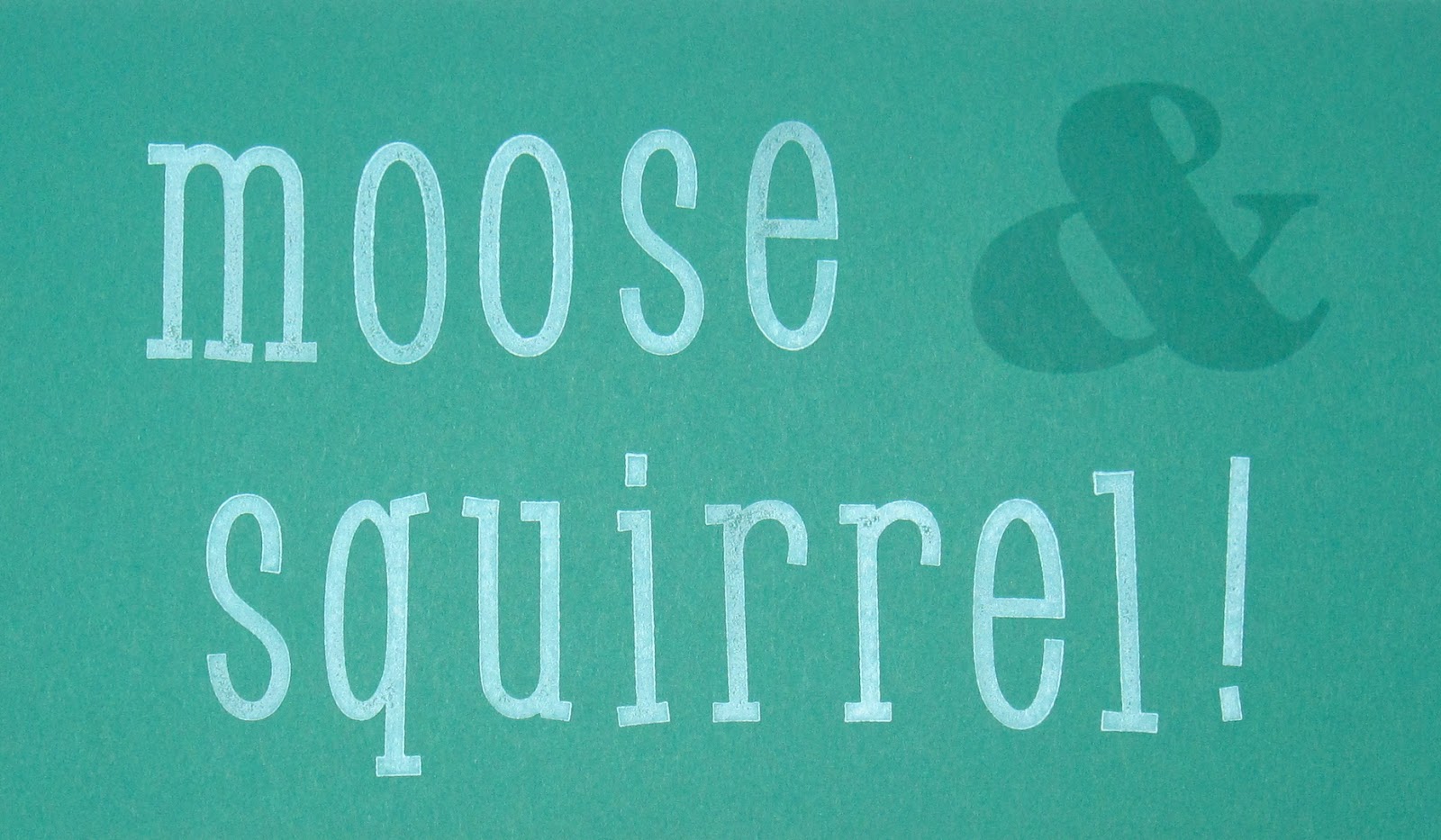
Moose & Squirrel!

Well, I meant to make a card for yesterday, or today, but...I got distracted.

By Rocky and Bullwinkle.


Explanation:  when I was little (like, under the age of 7 since it was when we lived in California), my parents used to take my brother and me to Bullwinkle's.  The funny thing is I don't remember anything about actually going there (other than this vague sense of "hey, that was fun!"), but that's where Adam and I got these green headbands with antlers on them that we called "boose ears" and we had those things FOR. EV. ER.  For all I know, there's still some boose ears at my parents' house.  So anyway, back in 2004 the hubs and I were living in North Carolina and we took a road trip down to Myrtle Beach with some friends and we happened to come across a Bullwinkle's restaurant.  I was SO excited I convinced everyone else to go there for dinner.  Turns out it's a lot like Chuck E. Cheese--kinda okay pizza, arcade games, and animatronic characters that put on a show (only these ones are less creepy than a 6-foot-tall rat).  And now I've finally got those pictures scrapped!

Fun fact:  my husband has zero memory of this place.  Or this entire road trip, for that matter.  Of course, he also has no memory of the conversation we had with Bennet and Missy this past Sunday about doing a barbecue this weekend.


The Taffy Alphabet was a bit of an impulse buy but I'm so glad I have it, I love it.  The ampersand is from the Larger than Life alphabet.


So there's my paper-pieced Rocky and Bullwinkle.  I searched for "Bullwinkle line art" on Google and came across this piece on Deviant Art, then printed it off five times on different colors of cardstock and paper-pieced it together (yes, it was a lot of cutting).  The printer toner tended to kind of flake off as I cut around it, so I went over the lines with the fine tip of a black marker when I was done cutting it all out.  Voila, the perfect accent for my page.


Today's color palette:  Glorious Green (if you thought it was Emerald Envy I wouldn't blame you because they're practically THE SAME COLOR), Marina Mist, Hello Honey, Close to Cocoa, Creamy Caramel, Smoky Slate, Basic Black, and Whisper White.  It's a lot of colors on one layout but I think it works.

Well, Ryan is asleep right now so I'm off to go see what I can do in my craft room this morning before he wakes up.  And maybe even when he's awake; I had him down there yesterday afternoon and he seemed to have fun kicking his helicopter toy around on the floor while I finished up this layout.  Cheers, y'all!

Supplies, almost all SU!
Stamps:  Taffy Alphabet, Larger than Life Alphabet
Ink:  Glorious Green, Whisper White, Basic Black
Paper:  Glorious Green, Marina Mist, Hello Honey, Close to Cocoa, Creamy Caramel, Smoky Slate, Thick Whisper White, Marina Mist DSP
Accessories:  Rocky & Bullwinkle clipart

Friday, November 11, 2016

Friday Flashback: The Free & the Brave

Happy Friday, folks!  And if you're a government employee, happy three-day weekend.  Today's Flashback stamp set is The Free & the Brave, which might seem an odd choice for November but today is Veterans Day so it makes sense.


The main image and the words are from today's stamp set, paired with Sanded on the background and I noticed as I set this up that I seem to ALWAYS use Sanded with this stamp set.


See?  This eagle is my favorite stamp in the set.


Here's a scrapbook layout that was posted not all that long ago with my favorite eagle.


And when the set first came out, I used that eagle for swaps.  With Sanded.

So for today's new projects, I've got some scrapbook pages:


The pics are from November 2005, my first visit to DC.  Unfortunately this was before I started my other blog, so I'm left with what I can remember from the trip...and I've slept since then :p I might have just written on the journaling what I could tell from the photos (okay I totally did that).


The words again, I like it.


There's the second layout since I couldn't fit all the pics on one spread.  You can't tell from the photos, but the stars are lightly stamped with Sanded in Smoky Slate and then sponged a bit on the edges to kind of grunge them up a bit to match everything else.  I used Gorgeous Grunge on the Smoky Slate textured cardstock borders because it seemed to jive really well with the grays in the photos.


There's the regal eagle again, stamped tone-on-tone with Cherry Cobbler.


Today's super patriotic color combination includes Cherry Cobbler, Night of Navy, Smoky Slate, and Whisper White.  And because it's Veterans Day, please please pretty please express your thanks to any veterans you know.  They work so hard to protect our freedom.

Supplies, scrapbook pages:
Stamps:  The Free & the Brave, Sanded, Larger Than Life Alphabet, Gorgeous Grunge
Ink:  Night of Navy, Cherry Cobbler, Smoky Slate, Basic Gray marker
Paper:  Night of Navy, Cherry Cobbler, Smoky Slate textured, Thick Whisper White
Accessories:  retired star punch

Monday, June 6, 2016

80

Scrappy Monday, y'all!  Today we're going retro:  the pictures on this scrapbook layout are from 11 years ago.


This was when the hubs' family had a big birthday party for his grandma in North Carolina, and hubs' sister and her husband found out that North Carolina barbecue is NOT barbecue (we're from Texas, y'all).


So that title took some time to stamp :p But I liked it anyway.  This layout took me forever to finish...not just because the pictures are old.  I started it when we lived in Alabama and didn't finish it until months after we moved to Virginia.  And then I made the hubs do the journaling :D


Today's color palette:  Blushing Bride (I almost never use that in my scrapbooks!), Sahara Sand, Marina Mist, Not Quite Navy, Cucumber Crush, and Whisper White.  I started this layout right after Cucumber Crush was first released, so this was actually the first thing I worked on with that color.

Have a great week, y'all!

Supplies, mostly SU!
Stamps:  Larger Than Life Alphabet, Calendar Alphabet & Numbers, Cottage Garden
Ink:  Blushing Bride, Marina Mist, Not Quite Navy
Paper:  Blushing Bride, Marina Mist, Cucumber Crush, Whisper White, Something Borrowed DSP
Accessories:  Circle Nestabilities

Sunday, May 15, 2016

Nacho Blog Hop: Mother's Day & Graduation

Happy Sunday,  y'all!  It's time for this month's Nacho Average Challenges blog hop, and this month it's all about moms and graduates.  I don't have any new or recent graduates in my immediate circle, but I did make some Mother's Day cards so that's what I have for you today.

First up is a CAS monochromatic card:


This was for my mom; the white layer is actually Shimmery White and it was made to go with her present:


It's a special edition Starbucks mug for Disneyland's Diamond Anniversary (my mom was born the same year Disneyland opened, so it's her diamond anniversary too!).  There's a gemstone in one of the Occasions catalog sets, but I don't have that one, so I looked in my past Paper Pumpkin stamp sets and found the one I used which I thought was perfect.  One die cut word and stamped sentiment later, and that card was done!

Next up is something tea-riffic:


We got my MIL some herbal teas from a tea shop in Old Town Alexandria, so I made a tea-related card to go with.  The sentiment is from a recent Paper Pumpkin kit (because I might not put the kits together, but I DO use the stamps pretty often!)

Last up is a picture frame for my SIL's desk at work:


She's a new mama, so I thought I should get her something for her first Mother's Day.  She can put a 4x6 photo on there and have it on her desk when she goes back to work full time.  How do you like the ladybugs?  They're made with two circle punches (1/2" and 1") and the sweetheart punch turned upside down.  I loved how they turned out.  I tried stamping the spots all over the heart but decided I liked just a few sprinkles of spots better.


Supplies, first card:
Stamps:  Crazy About You, past My Paper Pumpkin
Ink:  Pacific Point
Paper:  Pacific Point, Shimmery White
Accessories:  Hello You Thinlits

Supplies, second card:
Stamps:  My Paper Pumpkin
Ink:  Basic Gray, Blushing Bride, Old Olive
Paper:  Pool Party, Blushing Bride, Sahara Sand, Birthday Bouquet DSP
Accessories:  Cups & Kettles Framelits, Circles Framelits, Dimensionals

Supplies, picture frame:
Stamps:  Larger than Life Alphabet, All About Everything, Made with Love (spots), Watercolor Wings (antennae)
Ink:  Garden Green, Basic Black, Real Red
Paper:  Pear Pizzazz, Basic Black, Real Red, Whisper White, Real Red DSP
Accessories:  1/2" and 1" circle punches, Sweetheart punch, Deco Labels Framelits

Wednesday, May 4, 2016

Well, That Was Unexpected

Ya know, art is unpredictable.  Today's card is the poster child for "well, I didn't expect that but let's just roll with it".  But first, I show you the two challenges that I used, starting with the Global Design Project sketch:


And then adding the Just Add Ink inspiration photo:


Add a heaping helping of things not working out as expected, and this is what happens:


Okay, so, I started out with my favorite technique of scribbling on an acrylic block with a marker, misting, and stamping it (I really need to come up with a short name for that) and that's when it started:  I haven't cleaned my acrylic blocks in a while (you really should wash them once a month or so), so I got some light Pool Party ink on the interior of the block, but the outside of it was kind of pinkish from Stampin' Scrub residue.  But I thought ehh, I'm already using Blushing Bride, so that kind of works.

Then I stamped the chevrons from Work of Art, and after I did that I thought really, I should have stamped them off first.  Oh well, let's keep going.

I had been planning on stamping a different sentiment on there, but the chevrons turned into such attention-stealing brats that I switched gears and went with the Larger Than Life Alphabet.  Which was fine, up until...the gold embossing powder.

So I wanted just a little bit of speckly accents in gold in the lower left and upper right corners, and I just barely tapped the Gorgeous Grunge splats on the card front.  So far so good.  Only after I dumped on all the embossing powder did I realize that my super-ridiculously-juicy Calypso Coral ink pad meant that the ink on the letters wasn't really dry yet, so all the EP stuck.  But it looked kind of interesting, so I heat embossed it and decided to roll with it anyway.

So there is my "how'd that happen?" card.  I'm hoping my next project is a little more predictable :p

Cheers, yo.

Supplies, all SU!
Stamps:  Larger Than Life Alphabet, Gorgeous Grunge, Work of Art
Ink:  Pool Party, Blushing Bride, Calypso Coral, Versamark
Paper:  Blushing Bride, Calypso Coral, Shimmery White
Accessories:  Gold EP

Wednesday, November 11, 2015

Veterans' Day

(Mom, you're really going to like today's post.)

Today is Veterans' Day.  Today is the day to find someone who has served in the Armed Forces and say...


...thank you.  And if you want to hug a veteran, I'm sure they wouldn't mind.

Today's sketch is a somewhat modified version of the one from Global Design Project:


And let me be really punny and say this counts for the Cupcake Inspirations challenge too.


Because DOG TAGS.  They count as tags, right?

*game show host voice* But wait, there's MORE!  I made a scrapbook layout and I just can't wait till next Monday to share.


These pics are from when my little brother pinned on the rank of Major this past February.  I kinda want to put captions on the three photos along the left:  national anthem, administering the oath, and fabulous prizes.  But I don't want to cover up any of the pictures either.


I thought this quote was appropriate for this page.  That patterned paper is an old Karen Foster design that I have like twenty sheets of and I love it.  It's perfect for Air Force pages.


And I finally broke out the Larger than Life alphabet!


And the color palette:  Tip Top Taupe, Night of Navy, Cherry Cobbler, Soft Sky, and Whisper White.  With a slight sprinkling of stars.

So thank you to all the veterans out there.  We appreciate your service.

Supplies, card:
Stamps:  For Your Country, World Map
Ink:  Lost Lagoon, Night of Navy, Basic Gray
Paper:  Lost Lagoon, Night of Navy, Smoky Slate, Whisper White, Watercolor Paper
Accessories:  Squares Framelits, 2 1/2" circle punch, medium star punch, Dimensionals

Supplies, scrapbook layout:
Stamps:  For Your Country, Larger than Life Alphabet
Ink:  Cherry Cobbler, Night of Navy
Paper:  Tip Top Taupe, Cherry Cobbler, Soft Sky, Whisper White, Karen Foster patterned paper
Accessories:  retired star punches