Showing posts with label Elementary Elegance. Show all posts

Monday, July 13, 2026

Friends Frame

Mornin' y'all!  This week is going to be a little hectic; Ryan has a camp in the morning and a camp in the afternoon, and they're in the same place, but I have to go up there at lunchtime and grab him for an hour or else pay an extra $10 a day.  So I suppose we'll be having picnic lunches this week, and I have to really watch how I use my time with having that two-hour break in the middle (because it takes at least 20 minutes to get to where he is).  Ah well, such is the life of the Mom Taxi.

Anyway, I have a very simple card to share today.


I was thinking about my friend Missy's birthday, which is today (HAPPY BIRTHDAY, MISSY!) and she loves the show Friends, and this idea popped into my head with the frame from Elementary Elegance.  So it doesn't look a *lot* like the famous frame around the peephole on Monica's door, but I think with the colors you can kinda guess at the reference?  Anyway, the current AAA Birthday challenge is cards for girls:


And despite Ryan's propensity for calling her Uncle Missy, I am fairly certain that she is in fact a girl, so I'm entering over there.

Okay, I'm off to start some laundry and get to work on my to-do's for today because I have to leave in less than an hour and a half for the lunch break.  Cheers!

Supplies, all SU!
Stamps:  Elementary Elegance
Ink:  Versamark, Highland Heather
Paper:  Crushed Curry, Highland Heather
Accessories:  Crushed Curry embossing powder

Saturday, July 11, 2026

The Triple Hoax

Happy Saturday y'all, and welcome back to the Nancy Drew Challenge!  I'm posting a bit late today because Ryan wasn't feeling well this morning and snuggling with my kiddo will always be more important than pretty much anything else.  He's fine, just needs to take it easy today.  So anyway, here we are with the kickoff for the Nancy Drew digest paperbacks, #57, The Triple Hoax:


Let's talk covers!  The one on the left is a Wanderer arch cover (we get these up to I think #78), and oddly enough I would say that this particular edition of The Triple Hoax is the easiest paperback Nancy Drew to find at used book stores--I found copies in at least three of the stores I visited in Texas.  Anyway, the Wanderer covers have never been my favorites just from a design standpoint, but I do have to say that they have some pretty fantastic charcoal illustrations inside.  So for this cover, we have some lovely purple hues and Nancy looking pensive in front of a group of probably nefarious magicians.

The other two are what I call the checkerboard covers for the little checkerboard between the Nancy Drew name and the title of the book, the pink one is another Wanderer edition and the teal one is a Minstrel.  Style-wise I keep thinking that pink cover should be the newest one because Nancy's shorts are more fashionable ; ) and I think it's my favorite of the three, it's got more action than the other two and I like those colors.

The third cover is a similar scene to the second one and also has some great colors, but my goodness Nancy, those shorts!  This is the first of many, many opportunities to mock fashion on the Nancy Drew book covers, I tell you.  But let's talk contents.

Case file:  Aunt Eloise (yay!) invites Nancy, Bess, and George to New York to investigate when one of her friends is swindled out of several thousand dollars.  Nancy quickly becomes suspicious of The Hoaxters, a magic act performing in town, so of course she follows them to Mexico City when they clear out of NYC in a hurry, and then follows them to Los Angeles before she's able to bring them to justice.  We have lots of travel, theft, fraud, kidnapping, poison, arson--this book is a RIDE, let me tell you.

Here's my first card:


What with all the travel, Nancy spends a LOT of time making long-distance and/or international phone calls and I couldn't resist making a phone card.  I believe this card takes the cake for the most stamp sets used on a single card, I used five old Paper Pumpkin stamp sets plus five other stamp sets for a grand total of ten!  It took some time to stamp-a-ma-jig all those hellos on the front but I like it.


I had to do an arch for our first Wanderer arch cover, but when I finished I wished I had used a darker purple for the card base to match the colors better; I was so excited to make this that I just ran right ahead to stamping instead of comparing purples.  Oh well, I still like it.

Supplies, all SU!
Stamps:  Timeless Talk, Elementary Elegance, Heartfelt Hellos, Blossoms in Bloom, A Dozen Thoughts, My Paper Pumpkin (multiple sets)
Ink:  Highland Heather
Paper:  Gorgeous Grape, Highland Heather, So Saffron, Basic White
Accessories:  Everyday Arches dies, Stylish Shapes dies, Dimensionals, So Saffron Candy Dot

Despite the different colors, the text of the books is all the same but we're going to have fun with the multiple covers for quite a few books.  So here's my card for the second book:


The girls visit the Pyramid of the Sun near Mexico City and that's where they are on the cover scene:


I pulled out Flores Misticas because it has that fun pattern that looks like the carved stone of the pyramid, and I chose Watermelon Wonder, Crushed Curry, and Highland Heather for my colors.  I love Watermelon Wonder and I am hoarding the small amount of cardstock I have left in that color.  I used blending brushes to add some lighter color on the yellow and purple bits, and I embossed the butterflies with Iridescent Ice embossing powder so now everything upstairs is covered with glitter.  I added some foil gems for more glitz, too.

Supplies, all SU!
Stamps:  Flores Misticas, Make a Difference
Ink:  Watermelon Wonder, Crushed Curry, Highland Heather, Basic Gray, Versamark
Paper:  Watermelon Wonder, Basic White
Accessories:  Iridescent Ice embossing powder, Iridescent Foil Gems, Dimensionals

And for the final book cover:


The girls fly to Mexico City, but due to an airline strike, they rent a car to get to Los Angeles.  On the trip, which takes several days, they come across an indigenous community that doesn't speak Spanish, but they manage to communicate that they're looking for breakfast.  One of the older women, thinking that Bess wants an extra-fresh egg, catches a chicken and has it lay an egg in Bess's hand, which just made me laugh so much that I knew immediately this incident would be the basis for one of my cards.


To match the cover and color in my fabulous chickens, I used Pretty Peacock, Purple Posy, Rococo Rose, So Saffron, Fresh Freesia, and Golden Glow.  The Tinsel Gems are technically Berry Burst, but they match the Rococo Rose cardstock pretty well, and I was quite tickled to find that sunrise-looking pattern in my stash in one of my chosen colors.

Supplies, all SU!
Stamps:  Hey Chuck
Ink:  Memento Tuxedo Black, Stampin' Blends in Pretty Peacock, Purple Posy, Fresh Freesia, Golden Glow, So Saffron, Rococo Rose
Paper:  Pretty Peacock, Rococo Rose, Basic White, Playing with Patterns DSP Stack
Accessories:  Hey Chuck dies, Perennial Postage dies, Dimensionals, Tinsel Gems

When I was a kid, I didn't particularly care for this book and reading it now I have no idea why I didn't like it more back then.  We have lots of adventures in this book with all the travel and it was fun to do some sightseeing in Mexico, plus that incident with the chicken is hilarious.  I give it four and a half stars.  This book was the first Nancy Drew published under a new publisher, and I think they did a very good job of making it feel like a continuation of the old series.  I could seriously have done without the fat-shaming that George subjects Bess to, I wish they hadn't kept that element of the original series, but almost everything else was very fun.  If you're inspired to make a card based on this book, leave me a comment below, and I will see you next week when Nancy investigates The Flying Saucer Mystery.

Sunday, April 19, 2020

Ryan: April

Wow, I totally forgot to post Ryan's baby book layout yesterday!  The hubs arranged for Ryan to go down the street to a babysitter for five glorious hours yesterday, and then when he got home he pretty much went down for a nap.  So what did we do with all our kid-free time?  I watched a couple of things saved on the DVR (I have a lot of stuff saved and mostly we watch Paw Patrol...), got some good progress done on my giant stitching project, and managed to finish two scrapbook layouts!  It was amazing.  I love Ryan, but he's pretty much been attached to my hip non-stop for the last month, so it was nice to have that break.

Anyway, on to today's layout!


I've had Barely Banana (the background color) in my stash for years and hardly ever used it, but all of a sudden when I was working on the China books I started pulling it out.  It's like So Saffron but not muddy, I love it.  And when I made this layout I was definitely going through a Poppy Parade phase ;) They look good together though!  I love the pictures with my honorary nieces, Emma and Abby.  They begged their mama (my friend Tiana) to drive down to our house so they could meet Baby Ryan.  I love those girls.


Today's color palette:  Barely Banana, Blushing Bride, Poppy Parade, Shaded Spruce, and Whisper White.  I tend not to use a lot of Blushing Bride, it's just not my favorite shade of pink by a long shot, but it does seem to work with the other colors here.

Hope you have a great Sunday!

Supplies, all SU!
Stamps:  Letters for You, Elementary Elegance
Ink:  Shaded Spruce, Barely Banana, Basic Gray marker
Paper:  Barely Banana, Poppy Parade, Handsome Hunter, Thick Whisper White, Nursery Nest DSP
Accessories:  Large Letters Framelits

Saturday, December 31, 2016

Scrappy Showcase, Part 1

ETA:  this was supposed to show up on Saturday morning but it looks like it's already published.  So happy early new year?

Last day of the year, y'all!  And thus begins my 2016 scrappy showcase.  Since I usually only post one scrapbook layout per week, sometimes it takes quite a while between when I make one and when I post it so I didn't necessarily make all of these this year.  BUT I did complete 142 pages, so hooray for me!  My goal was 100, so I passed it by a bit :)  Anyway, let's get going!


First up is this layout from the last castle we visited in Wales; I love the dark orange colors contrasted with the green and blues.


Next is my scrappy ode to Disney's greatest villain, all pics taken at Disneyland Paris.  Again I love the colors with the photos plus it's Maleficent, can't go wrong there.


Next up is this snowy layout from England; I got the color combination of Island Indigo, Baja Breeze, and Rich Razzleberry from the old Color Coach.  I never would have put those three colors together on my own but I love the combination so much that I've used it several times on baby books too.


And the final layout for today is this New Years layout, appropriate no?  No Rock Band parties for us this year though, we'll be staying in tonight.

More scrappy goodness coming up in the next few days.  Hope you have a wonderful New Year's Eve and stay safe, y'all!

Friday, April 8, 2016

Friday Flashback: Letterpress Alphabet

Happy Friday!  Have you enjoyed Spring Break Scrap Week?  I'm finishing out the week with a Friday Flashback for Letterpress Alphabet, and you know how much I love my alphabet stamps :)  So let's take a whirl through the archives, shall we?

Also features Spencerian Alphabet
Geez, sorry about the terrible picture quality on this one.  Well, the original photos are fine, it's my picture of the layout that isn't good at all.  It was shortly after this that I figured out where to take pictures of layouts in our house in Alabama.

Also features Spencerian Alphabet

But not before I got both of these not-so-great ones.  Glare!


Ahh, here we go.  Much better photo of the layout.  And also the only time hubs and I have been to Turkey.

Also features Stars & Swirls, Amazing to Zany, Star Studded wheel

How about a card using the Letterpress Alphabet?  I'm still rather proud of this one, wait 'til you see it opened up:


It took a while to make with all the Stamp-a-ma-jigging but I still love it.  And it's Baylor Colors :D

Also features Spencerian Alphabet...again, and Noteworthy and Mosaic Madness

Here's a layout from California with some lovely bright colors.


And here's another one from Europe.

Also features Snow Flurries

I think I made this card when I was trying to come up with ideas using Snow Flurries.  I loved those little stamps but it was a challenge to make them the focal point of a card.

Also features Cold Play, Merry, Swirling Stars wheel
Oh man, this was from way back when Stampin' Up! had the spectrum ink pads!  I kinda miss those...

Also features Rough Type, Toxic Treats, Elementary Elegance, Carry On

Okay, there's the last England layout for today (though I do love it!) and now we're ready for this week's new creation!  Let's journey to St. Petersburg...


Oh dang, I got a glare on the photo in the bottom left corner.  It was really rainy and overcast when I took the picture of the layout and that makes a difference.  Anyway, this was the last place we visited in Russia before our cruise ship left, you can see the original photos here.  With no glare.


The cathedral is located on the Fortress of Peter and Paul, but it was the only thing we visited on the fortress so that's why I put "cathedral" rather than "fortress" on my page title.


Today's color palette:  Mint Macaron, Not Quite Navy, Hello Honey, and Whisper White.  And that's it for me today, hope you had a lovely week and are looking forward to a great weekend.  Cheers!

Supplies, all SU!, last layout:
Stamps:  Letterpress Alphabet, Rough Edges Alphabet
Ink:  Not Quite Navy, Hello Honey
Paper:  Mint Macaron, Not Quite Navy, Hello Honey, Thick Whisper White, Not Quite Navy DSP
Accessories: nothin' but a Stamp-a-ma-jig

Monday, January 11, 2016

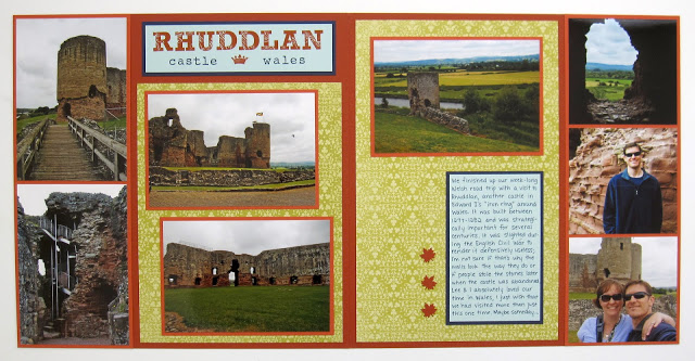
Rhuddlan Castle

Scrappy Monday, y'all!  I have actually made some new scrapbook pages this year, but today's layout is one I made last year and I just can't wait anymore to share it here.


Rhuddlan Castle was the last castle we visited on our week-long road trip through Wales; see more pics here.  I've scrapped a fair number of our Wales pictures already...it's funny, I draw random slips of paper to choose what to scrap next (you can laugh, but it makes my process SO much faster if I'm not flipping through thousands of photos trying to decide what to work on next) but somehow I've ended up doing a lot of Wales and the Med cruise we did.  Hmm.


Closeup of the title; I do love Jayne's Type and of course Rough Type (the smaller one) gets used on like half my layouts.  That little alphabet was definitely worth the purchase.


And there's my color combo.  I was flipping through my color swatch book when I noticed how Cajun Craze and Dusty Durango looked together, so I just had to use them both.  The Kiwi Kiss, Night of Navy, and Soft Sky made a nice contrast with those two warm oranges, I love it :)

That's it for me today, peeps.  Have a great week!

Supplies, almost all SU!
Stamps:  Jayne's Type, Rough Type, Elementary Elegance
Ink:  Cajun Craze, Dusty Durango, Night of Navy
Paper:  Cajun Craze, Dusty Durango, Night of Navy, Soft Sky, Bella Rose DSP
Accessories:  leaf punch

Monday, May 25, 2015

Caen

Good morning, folks!  Time already to start another week.  I don't have any scrapbook layouts that really tie in to Memorial Day, so I thought I'd share this one from when we toured Normandy since we did visit the D-Day beaches and the American cemetery there.  Of course, I haven't scrapped those pics yet but I do have this:


See the original pics here.  We stopped in Caen for a couple of hours on our way back to Paris, ate dinner and saw the castle of William the Conqueror.  And also that cool statue of Joan of Arc on the left page.  One day I'd like to go to Rouen and see more historical stuff.  Anyway, here's a closeup of the title:


The outside frame is one stamp, and then of course the letters and crown are separate stamps too.  I like how it turned out.


And there's my color palette:  Smoky Slate, Basic Gray, Real Red, and a smidge of Hello Honey.  I'm off to do my first run of the week and then work more on prepping the house for the packers on Thursday.  Time is running short!  Cheers, peeps!

Supplies, all SU!
Stamps:  Elementary Elegance, Rough Type, Wing It, Carte Postale
Ink:  Smoky Slate, Basic Gray, Hello Honey
Paper:  Smoky Slate, Basic Gray, Hello Honey, Real Red, Real Red DSP
Accessories:  Curly Label punch

Friday, March 20, 2015

Friday Flashback: Rough Type

Happy Friday, peeps!  Do I say that every week?  Well, regardless, Fridays should be happy because it's Friday Flashback day :)  This week's retired stamp set is Rough Type, which is an alphabet I've used a LOT on my scrapbooks so today is a longer Flashback and I didn't even include absolutely everything I've ever used it on.  So let's go!


My Captain America layout from my brother's return home from deployment, probably one of my mom's all-time fave layouts I've ever shared here :)

Also features Grunge Rock & Extreme Elements
You saw this one recently, from the Beijing Hard Rock Cafe.

Also features Bronc Buster

Oh hey, a card!  And I made it in my dad and brother's college colors (orange and black for Oklahoma State).

Also features Ocean Commotion

More scrapbook pages, this time from the aquarium in Okinawa.  I love Ocean Commotion...but I digress, today's Flashback is for Rough Type!  So this was actually I think the first time I punched out the letters with the 1/2" circle punch, but I did it again on the Hard Rock layout above.

Also features Ancient Asia

You'll notice I use this alphabet on my China pages a lot; to make the pages feel like they all "go" together, I'm using that calligraphy letter template and the Rough Type alphabet on each layout.

Also features Out West & Wanted

It's just a coincidence that the only two cards on today's Friday Flashback feature cowboys and the word "howdy".


More Okinawa pages, and again with the circle-punched letters.

Also features Circle Circus
This was the very first layout I did for my China scrapbooks :)  Lions and tigers and bears, oh my!


Wow, lots of Okinawa pictures here too.  Actually this layout has been modified since I took this picture, I added some of the dragons from Ancient Asia on the left-hand page.

Also features Letterpress Alphabet, Carry On, Toxic Treats, Elementary Elegance
Finally a layout from England!  And also one of my faves, I love the crowns and the ravens on here.


Another China layout you saw pretty recently, and that's the end of the Flashback part.  So here's today's brand new scrapbook layout, this time from Wales:


And here's a closeup of the Rough Type bit:


The top part is a Sizzlits alphabet, which is a total pain to use because it's always got little cling-on bits on the edges that you have to clean up and it's so tiny that it's hard to glue down without having extra glue everywhere but I just needed to use it for today's layout.  I kinda wish they'd made an uppercase version of Rough Type, though as you can see it bothers me not at all to use just the lowercase letters.


And there's my springy color palette:  Crisp Cantaloupe, So Saffron, Wild Wasabi, and Night of Navy.  I kinda wondered about using Crisp Cantaloupe for the page base, and no idea why I thought of it, but I did like how it looked with the other colors once I finished the layout, nice and springy.  And now I'm almost out of So Saffron cardstock :)

So I hope you enjoyed this scrappin' queen-sized Friday Flashback.  Have a great weekend and cheers, peeps!

Supplies, last layout only:
Stamps:  Rough Type Alphabet
Ink:  Night of Navy
Paper:  Crisp Cantaloupe, So Saffron, Afternoon Tea DSP
Accessories:  Sizzlits Alphabet

Wednesday, October 30, 2013

The Tower

So last week I was supposed to be doing housework, but instead I did a scrapbook layout.  Check it out!


You can see the pictures better if you check out my other blog here and here.  I wanted a raven on here because of the legend about how if the ravens ever abandon the Tower of London, then England will fall...somehow, the only raven stamp I have is from Toxic Treats but that ornate gate he's on looks right at home on this layout.  The big crown on the upper left is to represent the Crown Jewels, and the three smaller ones are for the three English queens who were executed at the Tower--Anne Boleyn, Catherine Howard, and Jane Grey (the Nine Days Queen).  So my layout is all symbolic and stuff!

I am SO excited to be back in the scrappin' groove, and actually I've been creating things faster than I can post them (even doing 5 posts a week).  And because I am SUCH a dork (dorkicus maximus, that's me) and I enjoy drawing random names out of a hat for the Friday Flashback post every week, I wrote down all the events I still need to scrap on little bits of paper to do a scrapbook random draw too.  I think that choosing the pictures to scrap was slowing me down because I'm so far behind, so the random draw makes that part much easier and I like the element of surprise about what I'm doing next.  Whee!

Cheers, peeps!  Thanks for stopping by!

Supplies, all SU!
Stamps:  Carry On (larger crown), Elementary Elegance (smaller crown), Letterpress Alphabet, Rough Type Alphabet, Toxic Treats
Ink:  Night of Navy, Basic Gray
Paper:  Smoky Slate, Night of Navy, Crushed Curry, Eastern Elegance DSP
Accessories:  SAMJ

Friday, May 10, 2013

Friday Flashback: Fifth Avenue Floral

It's time for another Friday Flashback!  Today's randomly-chosen stamp set is Fifth Avenue Floral, and yet again I'm surprised I don't have more stuff in my archives because this is a really pretty stamp set.  Let's take a look at what I've got, shall we?


I made this for a swap, probably right when Fifth Avenue Floral made its debut in the SU catalog.  Not hard to make a pretty card with this stamp set, amirite?  My only problem was I thought the DSP I used coordinated with Sahara Sand and then after I'd stamped all my floral pieces, I realized the DSP was actually Crumb Cake, so I had to re-stamp the whole set because my OCD wouldn't let me not be all matchy-matchy.  Oops.


But it all worked out because I used the Sahara Sand pieces to make cards to send out to my SU customers.  I just couldn't toss all those perfectly good stamped bits!


Some while later, I made this one for my friend Connie for her birthday.  I was in a hurry so I CASE'd those two earlier cards to make this one.  So that's it for the archives, but it's longer than last week's Friday Flashback ;)  I could have sworn I had used that one stripey flower for a scrapbook layout, but I went through my scrapbook pages three times and I couldn't find it on any of my pages.  At this point, given my week-long battle with insomnia, I may be delusional about that scrapbook page.

Anywhoo, how about a brand-new card!


Dang, that photo is slightly out of focus on the bottom.  Shoulda taken an extra shot for insurance but oh well, you get the gist.  I realized in looking at the archives that I'd never actually colored the flowers in (unless it was on that mythical scrapbook layout, snort) so today I pulled out an oldie from the technique files:  polished stone.  I'm sad that the glossy white cardstock is retiring because you have to have that to do polished stone, which is a technique I love.  The flower is done with Summer Starfruit and Primrose Petals ink refills, and then stamped with Raspberry Ripple for the outline and cut out.  Really fast way to color the flower and get a unique result every time!

Let's hear it for last week's Sketch Frenzy Friday sketch:


It's pretty layer-licious for my tastes but I just had to give it a go with that giant rose.  And the two strips behind the flower were a great way to use some more Print Poetry DSP, because I need to either a.) buy less DSP (yeah like that's gonna happen) or b.) use more of what I've got (I think I could actually do that one).

The color combo is from the hot-off-the-presses Fab Friday color challenge:


My challenge was working in the Soft Suede; if left to my own devices, I would have stamped the sentiment in Primrose Petals.  But I managed to hit all five colors on this challenge and didn't add any extras, can I get a whoop whoop!  :D  So given the stamp sent name and the challenges, this card is a Fab Frenzy Floral Flashback, bwahahahaa!

Thanks for joining me on today's Friday Flashback, have a fabby-dabby weekend!

Supplies, last card only:
Stamps:  Fifth Avenue Floral, Elementary Elegance
Ink:  Raspberry Ripple & Soft Suede ink pads, Primrose Petals & Summer Starfruit ink refills
Paper:  Raspberry Ripple, Summer Starfruit, Glossy White, Print Poetry DSP, Neutrals DSP Stack (the vanilla piece is actually DSP with subtle stripes on it)
Accessories:  Modern Label punch