Showing posts with label Thank You Kindly. Show all posts

Friday, January 20, 2017

Friday Flashback: Elements of Style

Happy Friday afternoon, y'all, and welcome to the Friday Flashback.  This week's stamp set is Elements of Style, which is a lovely vintage-kinda style stamp set which debuted in 2010.  So let's get started!

Also features By the Seashore, Pursuit of Happiness, Perfectly Penned
The flourish behind the postage stamp-style element is the stamp that's from Elements of Style.  Hey Stampin' Up!, we need more flourishy stamps like this.

Also features Pursuit of Happiness
The real reason I got the stamp set:  the hummingbird.  Also that ribbon is actually Marina Mist to match the hummingbird stamp, it just really doesn't look it in the photo.

Also features Fabulous Phrases
There's a big toile stamp in the set in addition to that flourish, both fun.

Also features Papillon Potpourri and Perfectly Penned

Another one with the flourish!


And hey,t here's a card that has one of the Elements of Style sentiments on it.  So there's your flashback, here's today's new card:


Seems like all my card photos are under-exposed lately.  Well, we've been socked in with clouds for what seems like forever (it's a giant swamp outside) and I really think my little camera is on its last legs.  But anyway, that's the new card...and the sentiment is a bit crooked but I'm going to write that off as proof that this is homemade.  And it's going in the mail within the next week.

I used the brand new color challenge from Fab Friday:


But I added a bit of Sahara Sand (generally you're allowed to add neutrals to any color challenge) and that means it also counts for the Inkspire Me color challenge:


Well, we've got to go pick up my car from having its oil changed, so I'm outta here.  Cheers, y'all!

Supplies, last card only:
Stamps:  Elements of Style, Thank You Kindly, Hardwood
Ink:  Soft Sky, Sweet Sugarplum, Sahara Sand
Paper:  Soft Sky, Very Vanilla
Accessories:  Stitched Shapes & Lots of Labels Framelits, Dimensionals, Pearls

Friday, January 6, 2017

Friday Flashback: Ocean Commotion

Happy Friday, y'all, and welcome to the first Friday Flashback of the year.  This week's stamp set is Ocean Commotion...it's funny to me, I'm not a huge ocean person but the hubs is, and we lived on Okinawa for a bit under three years so I do have some beachy/ocean-y pictures and basically I always get the marine sets and use them pretty frequently.  But I think Ocean Commotion might have been my first fishy set :)

Also features Rough Type

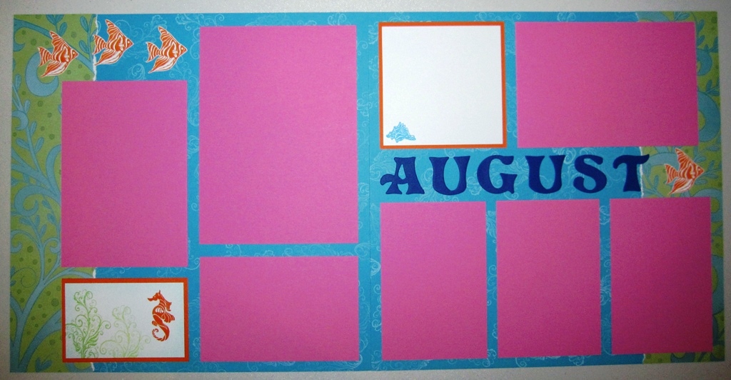
Speaking of Okinawa, here's a scrapbook layout from the Churaumi Aquarium in Nago.  I do love that photo with the sea turtle :)  Anyway, Ocean Commotion is a wee little set of just four stamps, and I used all of 'em on this layout--the fish, the seahorse, the seaweed, and the shell.


I did a couple of baby books for kiddos born on Okinawa so I made an ocean layout for those.

Also features Thank You Kindly
The hubs loves to scuba dive, so when he asked for some thank you cards I made up a set of six of these.

Also features Short & Sweet
Ocean images are perfect for using with polished stone!  I miss SU's glossy white cardstock just for polished stone backgrounds, that was one of my favorite techniques.

Also features Warmest Regards
Here's a birthday card for one of the hubs' scuba diving friends.

Also features Big Deal Alphabet
And one last scrapbook layout from the one and only time I'll ever go whale watching--I was so busy being seasick I didn't see not ONE STINKING WHALE!  But I did really like how this layout turned out.  I love the bright blues and orange together.  And while the hubs kinda laughs at how my photos all seem to tilt a little bit, I can categorically say all the crooked photos on this layout were taken by HIM, not me.

So there's the flashback, and here is my brand new card:


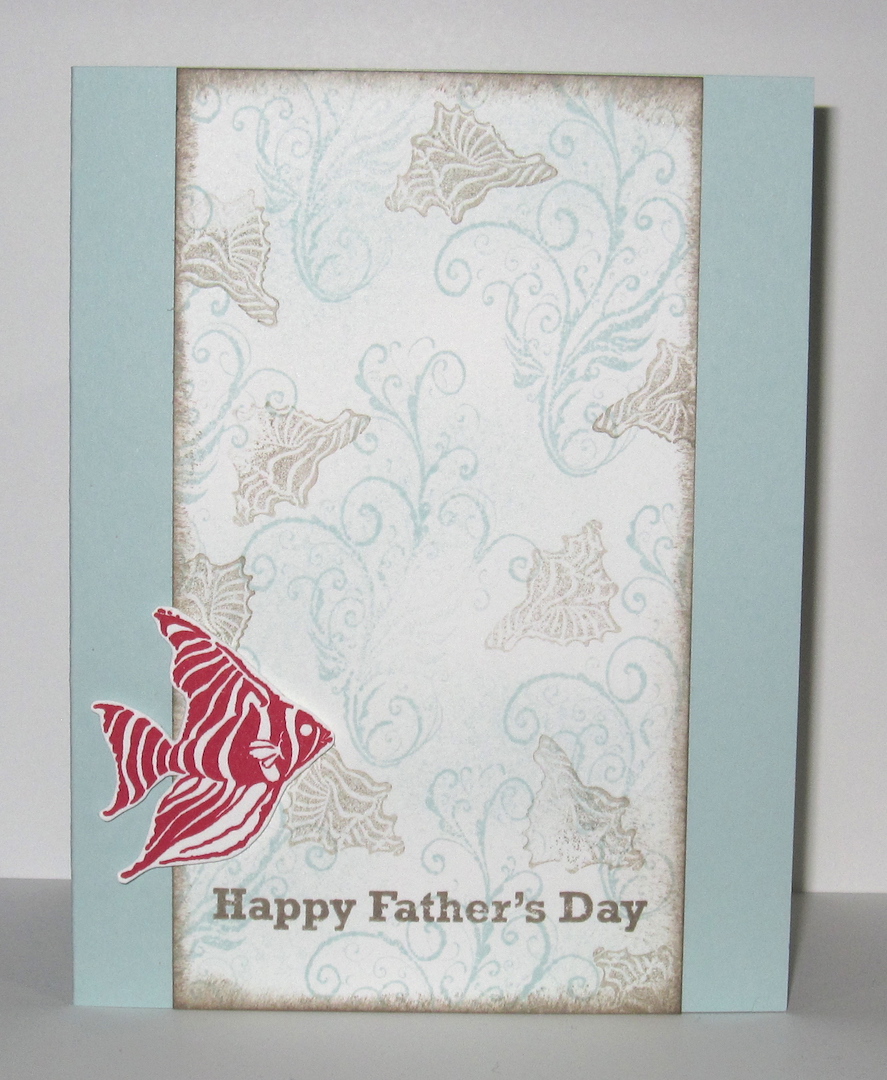
Why Father's Day?  Well, since I'm 8 months pregnant that means this year will be my hubs' first Father's Day as a daddy himself.  And the idea popped into my head when I was perusing stamp sets for a sentiment to put on this card so I went with it.  I was inspired by the Fusion challenge:


Obviously I used the sketch, but I also used the photo--completely different theme, but I took the colors Soft Sky, Tip Top Taupe, and Real Red from the picture.  So now I just need to put this card someplace the hubs won't see it, but that I won't forget where to find it in June...

Cheers, y'all!  Stay warm this weekend.

Supplies, last card only:
Stamps:  Ocean Commotion, Something to Celebrate
Ink:  Soft Sky, Tip Top Taupe, Real Red
Paper:  Soft Sky, Thick Whisper White
Accessories:  Dimensionals

Friday, April 22, 2016

Friday Flashback: Filigree

Happy Friday!  This week's Friday Flashback stamp set is Filigree, which was one of my favorite background stamps for a very long time...oh who are we kidding, I still love me some Filigree.  But I don't want you to spend all weekend trying to make it through the entire Flashback, so I just picked out a few favorite older projects with Filigree.

Oh wow, I just saw in the Splitcoast gallery that Filigree retired in 2005!

Also features Roses in Winter, Hugs & Wishes
Wow, way back in the archives for this one:  that's Vintage Violet!

Also features Best of Brides & Babies

Here's a wedding card with one of the "Best of" sets they did a couple years ago.  Filigree is stamped with Versamark and embossed with clear EP; it also looks pretty fabulous done in metallic EP or Iridescent Ice.  Which is on the retiring list, to my great surprise.  I love that stuff!
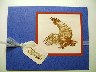
Also features Land That I Love

Here's a patriotic eagle card.  Oy, back in the day when all I had was cheap big box store ribbon.  I don't have much current SU! ribbon, but I do have a laundry basket full of retired stuff :)

Also features Petal Prints, Happy Everything

Aww, this one's sweet.  I miss Regal Rose sometimes.

Also features Coast to Coast, Sincere Saluations

You know what?  I think a lighthouse makes for good symbolism on a thinking of you or sympathy card.

Also features Print Pattern, Wonderful Wings, Sincere Salutations

Okay, one last one with the kissing technique and a fabulous butterfly.  Of course you recently saw a Filigree-kissed sun on my Here Comes the Sun layout this Monday.

So that's all I'm sharing from the archives today, otherwise you'd be here until next Friday.  Here is today's new creation:


Today's colo(u)r combo is from ColourQ:


It's been a really long time since I busted out the Cool Caribbean, I still have quite a stash of 8.5x11 cardstock which makes me happy.  Sadly, the year that Cool Caribbean was an In Color I wasn't scrapbooking much at all so I never got any 12x12 in the In Colors.

I also used this week's Mojo Monday sketch:


I had a Goldilocks moment with the gold circle element--I wanted to use one of the gold doilies I have, but the smaller size was too small and the larger size was too big, so in the end I just die-cut a plain circle and it was juuuust right.

Hope y'all have a wonderful weekend, peeps.  I think we're supposed to get thunderstorms today and tomorrow, so that means it's a good opportunity to stay home and work in my craft cave!

Supplies, last card only:
Stamps:  Filigree, Stippled Blossoms, Thank You Kindly
Ink:  Cool Caribbean, Calypso Coral, Smoky Slate, Basic Gray, Memento Tuxedo Black
Paper:  Cool Caribbean, Basic Black, Thick Whisper White, Gold Foil
Accessories:  Circles Framelits, Hexagon punch, Dimensionals

Friday, May 23, 2014

Friday Flashback: Eastern Influences

Welcome to this week's Friday Flashback!  Today's featured stamp set is another one of my very favorites:  Eastern Influences.  Let's flash back!

Also features Bella Toile and Cardinal Christmas

This was our Christmas card one year when we lived in Okinawa.

Also features Floral

This one was a swap card I made when Eastern Influences debuted in the catalog.


A red rose this time with what is possibly my favorite-ever DSP, Bella Rose.

Also features Full of Life
And another Bella Rose for good measure : )

Also features Bella Toile and Thank You Kindly

I think this was an after-Christmas thank you card.

Also features Bella Toile and Cardinal Christmas

I tried out a few color combos for my Christmas cards that one year :)


The Baja Breeze one at the top won out because I love that color.  I had fun playing with the other colors though.

So that's it for the Flashback part, and for the brand-new project I have a scrapbook layout!


The pictures are of the Golden Pavilion in Kyoto, Japan.  I had to have all my photos reprinted because the first time they came out too dark...they looked so much better the second time around!  And I'm kind of in love with the color combo:  Baja Breeze, Crushed Curry, Garden Green and Chocolate Chip.  The stamping is done in Lost Lagoon, which is like a slightly darker version of Baja Breeze.  LOVE IT.


There you can see Lost Lagoon in action on Baja Breeze.


And one more time.  I was lucky on this; when I punched the patterned paper, the place where I wanted the birds was pretty much as far down as the punch would go on the paper so it was easy peasy.  I just punched half the shape out, adhered the DSP to my page base, and stamped the birds in the negative space.  I think this is one of my favorite scrapbook layouts ever :)

So that's it for me today!  Thanks for joining me for the Friday Flashback.

Supplies, scrapbook layout only:
Stamps:  Eastern Influences
Ink:  Lost Lagoon, Chocolate Chip
Paper:  Baja Breeze, Crushed Curry, Chocolate Chip, Garden Green, Eastern Elegance DSP
Accessories:  Curly Label & Decorative Label punches

Friday, April 25, 2014

Friday Flashback: Eastern Blooms

Wow, today is already the last Friday in April.  Time is just speeding by and it's time for another Friday Flashback!  Today's featured stamp set is one of my favorites (ok, I have a lot of favorites), Eastern Blooms.  So let's go!

Also features Best Yet and Bella Toile
Let's start off with a baby card.  Hey, baby cards don't always have to have baby-specific images, right?

Also also features Best Yet :)
And here's another one for good measure, this time in purple because not all baby girls (or their mamas) love pink.

Also features Thank You Kindly
And now for something very bright!  I love these flowers with bold colors.

Also features Bring on the Cake
And maybe a lot of rhinestones.

Also features Full of Life, Sprinkles, and Itty Bitty Backgrounds
I think this one would have been better had I moved down the three flowers just a tiny bit more toward the middle of the card.


And last up, here's a scrapbook layout from our time in Japan.  So yep, I've used Eastern Blooms quite a bit I think.  So here's today's brand new card:


Again with the bright colors, they were this week's Splitcoast color challenge.  The sentiment is from Happy Day, which is on the retirement list.  I'm a little sad about that one actually; I think it's a great little stamp set.  Oh well, it will always have a permanent place in my stamp collection!

The layout is courtesy of Retro Sketches:


When I copied down the sketch I didn't make the top panel scooch over to the right like on the original sketch, so my card is a little bit different.  But hey, I got the banner and the button right!

That's it for me this week.  Have a great weekend and cheers, peeps!

Supplies, last card only:
Stamps:  Eastern Blooms, Happy Day
Ink:  Pacific Point, Pumpkin Pie, Real Red
Paper:  Pacific Point, Whisper White, retired Pumpkin Pie DSP, Ski Slope DSP (I think?  It was in my scrap box)
Accessories:  Banner punch, retired Playground button, Whisper White baker's twine

Friday, May 10, 2013

Friday Flashback: Fifth Avenue Floral

It's time for another Friday Flashback!  Today's randomly-chosen stamp set is Fifth Avenue Floral, and yet again I'm surprised I don't have more stuff in my archives because this is a really pretty stamp set.  Let's take a look at what I've got, shall we?


I made this for a swap, probably right when Fifth Avenue Floral made its debut in the SU catalog.  Not hard to make a pretty card with this stamp set, amirite?  My only problem was I thought the DSP I used coordinated with Sahara Sand and then after I'd stamped all my floral pieces, I realized the DSP was actually Crumb Cake, so I had to re-stamp the whole set because my OCD wouldn't let me not be all matchy-matchy.  Oops.


But it all worked out because I used the Sahara Sand pieces to make cards to send out to my SU customers.  I just couldn't toss all those perfectly good stamped bits!


Some while later, I made this one for my friend Connie for her birthday.  I was in a hurry so I CASE'd those two earlier cards to make this one.  So that's it for the archives, but it's longer than last week's Friday Flashback ;)  I could have sworn I had used that one stripey flower for a scrapbook layout, but I went through my scrapbook pages three times and I couldn't find it on any of my pages.  At this point, given my week-long battle with insomnia, I may be delusional about that scrapbook page.

Anywhoo, how about a brand-new card!


Dang, that photo is slightly out of focus on the bottom.  Shoulda taken an extra shot for insurance but oh well, you get the gist.  I realized in looking at the archives that I'd never actually colored the flowers in (unless it was on that mythical scrapbook layout, snort) so today I pulled out an oldie from the technique files:  polished stone.  I'm sad that the glossy white cardstock is retiring because you have to have that to do polished stone, which is a technique I love.  The flower is done with Summer Starfruit and Primrose Petals ink refills, and then stamped with Raspberry Ripple for the outline and cut out.  Really fast way to color the flower and get a unique result every time!

Let's hear it for last week's Sketch Frenzy Friday sketch:


It's pretty layer-licious for my tastes but I just had to give it a go with that giant rose.  And the two strips behind the flower were a great way to use some more Print Poetry DSP, because I need to either a.) buy less DSP (yeah like that's gonna happen) or b.) use more of what I've got (I think I could actually do that one).

The color combo is from the hot-off-the-presses Fab Friday color challenge:


My challenge was working in the Soft Suede; if left to my own devices, I would have stamped the sentiment in Primrose Petals.  But I managed to hit all five colors on this challenge and didn't add any extras, can I get a whoop whoop!  :D  So given the stamp sent name and the challenges, this card is a Fab Frenzy Floral Flashback, bwahahahaa!

Thanks for joining me on today's Friday Flashback, have a fabby-dabby weekend!

Supplies, last card only:
Stamps:  Fifth Avenue Floral, Elementary Elegance
Ink:  Raspberry Ripple & Soft Suede ink pads, Primrose Petals & Summer Starfruit ink refills
Paper:  Raspberry Ripple, Summer Starfruit, Glossy White, Print Poetry DSP, Neutrals DSP Stack (the vanilla piece is actually DSP with subtle stripes on it)
Accessories:  Modern Label punch