Showing posts with label Ocean Commotion. Show all posts

Thursday, May 7, 2026

Ocean Mosaic

Mornin' y'all!  We survived our random snow day yesterday and there's just a few tiny patches of it left in our backyard right now.  And I managed to make a card to share today!


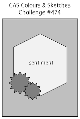
I used this week's Freshly Made Sketch:


I'll be honest, I did NOT like this sketch when I first saw it and I thought no way I could do anything with it.  Then I was looking through some other challenges and my brain joined the chat (hello brain, always nice to have you here) and ideas started percolating and I came up with a card that I think I like.  And that's why I do challenges, they help push my creativity.

Anyway, here's one of the challenges that helped with that, courtesy of Festive Friday:


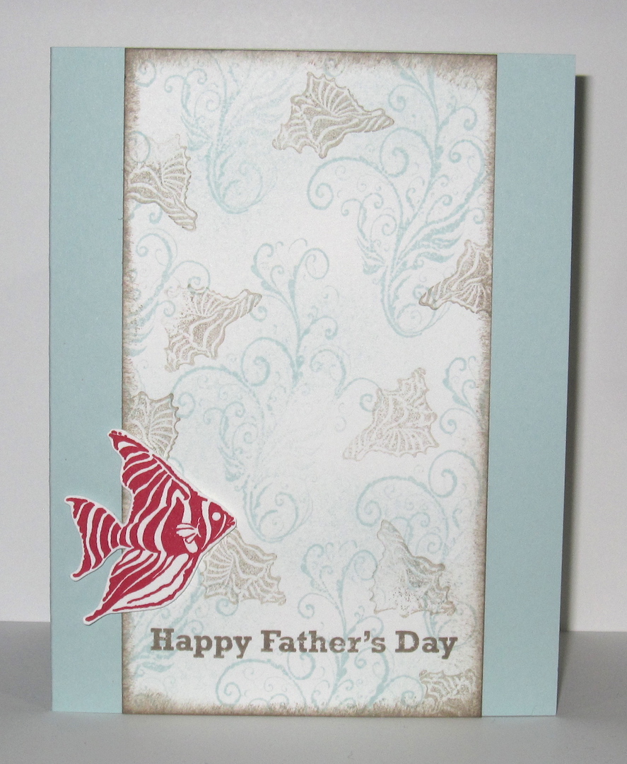
I have blue (Coastal Cabana), brown (Crumb Cake), pearls, a fish, one shell, and some seaweed so I think I did pretty well with this list.  What crystallized my card idea was the TGIF color challenge:


I thought they went perfectly with the ocean theme of the Festive Friday challenge.  I punched out a bunch of squares of Coastal Cabana cardstock to start with, stamped my seaweed on them, and then sponged some ink around the edges of the squares before I adhered them to the Crumb Cake card base.  I did start out with a seahorse for the main image (I love the seahorse from Ocean Commotion), but he looks to the left and with where the greeting was supposed to go, I needed a sea creature facing to the right.  So fish it is!  He looks kinda red in the picture, but I assure you he's Melon Mambo.

Supplies, all SU!
Stamps:  Ocean Commotion, All-Year Cheer I
Ink:  Crumb Cake, Coastal Cabana, Melon Mambo
Paper:  Crumb Cake, Melon Mambo, Basic White
Accessories:  1 1/4" square punch, Dimensionals, pearls


And here's what our backyard looked like as of six o'clock last night, almost all the snow gone.  It'll be in the 60s today so that was just a weird "And another thing!" left over from winter, all the weirder because we got so little snow over the actual winter this year.  Time to get Ryan off to school...cheers, y'all!

Friday, June 17, 2022

Fishy Thoughts

Happy Friday y'all!  We're going to be hitting the road this morning for a road trip to the Netherlands, but before that, I have a card to share.  Take a peek:


I busted out some retired stamps for this one, what do you think?  I had fish on the brain thanks to the inspiration picture from the Color Throwdown:


I used Tangerine Tango, Blushing Bride, and Coastal Cabana as my colors, though maybe I should have done Tahitian Tide but I didn't think of it when I was up in my craft room.  For the background layer, I smooshed (it's a technical term) my ink pad on my largest acrylic block, spritzed it with water, and then smooshed that on a piece of white cardstock.  That gave me a subtle color variation and looked nice and watery once I dried it out with a heat tool.

Check out the latest sketch from CAS Colours & Sketches:


That Stitched Nested Labels die was the closest shape I had to a hexagon, and the longer shape worked with the sentiment I chose to go with it.

That's it for me, peeps.  See you on Sunday for a new Paper Players challenge!

Supplies, all SU! (some retired)
Stamps:  Ocean Commotion, Perfect Pennants
Ink:  Coastal Cabana, Starry Sky, Tangerine Tango, Blushing Bride
Paper:  Thick Basic White
Accessories:  Stitched Nested Labels, Dimensionals, Polished Dots

Monday, July 12, 2021

Wilmington

Scrappy Monday, y'all!  Are you ready to start a new week?

Today I have two layouts to share, from Ryan's first trip to the beach--Wilmington, NC in May of 2018 (so he was a year old plus a few months).  At the time we lived about an hour and a half away so we just did a day trip for Ryan to experience the beach.


I love the picture of his little feets in the sand :)  I busted out my old favorite Ocean Commotion stamp set and fussy-cut the fish, seahorse, and shells for page accents.


Let's not forget to mention how I dressed Ryan in a shark shirt, haha!


Today's beachy color palette (sorry this picture is dark) includes Tip Top Taupe for sand, Coastal Cabana and Blueberry Bushel for sky and water, with a wee bit of Peach Parfait for accents and Night of Navy for the title and journaling.

Have a great week, peeps!

Supplies, all SU!
Stamps:  Layered Letters Alphabet, Ocean Commotion, Avant-Garden
Ink:  Tip Top Taupe, Coastal Cabana, Night of Navy, Peach Parfait
Paper:  Tip Top Taupe, Coastal Cabana, Blueberry Bushel, Thick Whisper White
Accessories:  None

Monday, May 13, 2019

Whale Watching

Scrappy Monday, y'all!  Hope you had a good Mother's Day weekend.  Ours was exhausting and barfy on Ryan's part, unfortunately.  He woke up at 11:00 on Saturday night throwing up and hollering for Mama, and then we all spent the next hour and a half trying to comfort Ryan while he was sick, cleaning up everything he was sick on, and changing clothes.  Ryan, the hubs and I all went through at least two outfits each.  Then poor Ryan alternated between saying he wanted to go to bed or watch Cars, so in the end we took his mattress out to the living room and he laid on that and watched Cars 2.  Twice.  The whole movie.  When it ended again a bit after 2 a.m., Ryan asked to put it on again and I was like nooooo we're going to sleep.  So Ryan slept on his mattress in the living room, and I tried to sleep on the couch next to him, and at 6:30 yesterday morning, Ryan woke up all chipper, poked me and said, "Cars on TV?"  So I started the movie again, and at 7 I tagged out with the hubs and tried to go to sleep for a bit in my own bed.  Meanwhile, hubs took Ryan to the store to get stuff for breakfast, and Ryan insisted on buying flowers for Mama, so when I woke up again I got cherry turnovers and a dozen red roses.  Awwwww.

Anywha, all that barfiness made me think of this layout so I have to re-share it today:


Hubs and I went on a whale watching tour in 2007 when we lived in Okinawa, and I didn't see not ONE STINKING WHALE because I got seasick for almost the entire time we were on the boat.  Actually, although I was the first to succumb, by the end of it there were only three people on the boat who had NOT gotten sick, including my hubs and the captain of the boat.  All the rest of us were miserable.  Don't know that I'll ever voluntarily go on a whale watching expedition again.

Hope your weekend involved much less barf and laundry than ours did.  Cheers, y'all!

Supplies, all SU!
Stamps:  Ocean Commotion, Big Deal Alphabet
Ink:  Pacific Point, Tangerine Tango, Daffodil Delight, Tempting Turquoise, Whisper White
Paper:  Pacific Point, Daffodil Delight, Tempting Turquoise, Whisper White, Haiku DSP
Accessories:  None

Monday, April 22, 2019

Advice from Dory

Hey y'all!  Hope you had a good Easter yesterday.  We had a really tough week last week (I was sick, the hubs was ridiculously busy at work and exhausted by Saturday) so we didn't do anything for Easter other than make a ham for dinner.  Ryan doesn't know what he's missing as far as Easter baskets and egg hunts go, and he got to pet the neighbors' bunny so he was happy.

Usually it's Scrappy Monday here, but this week that will be on Tuesday instead.  I found a couple of challenges that I just *had* to do and I want to make sure I get to enter my card in both of them before they expire : )  With that, here's a little aquatic advice:


I dusted off Ocean Commotion, which has been retired for years but I love it.  And here's the Fusion challenge that prompted me to ink it up again:


And the Color Throwdown was just too perfect with the Fusion challenge!


I used Tangerine Tango, Crushed Curry, and Blueberry Bushel as my colors.  The Tangerine Tango embossing powder has been retired for quite some time as well, but it was fun to play with it on this card.  For the background, I took a piece of Shimmery White cardstock and brayered the heck out of it with Blueberry Bushel ink, stamped and embossed the coral, and then flicked a bit of water on it, but the water spots didn't come out as well as I wanted them to.  Still, I'm happy that somehow I managed to get a photo that shows the shimmery part of the ocean : )

Scrapbook layout coming up tomorrow.  I finally took pictures of a whole bunch of layouts over the weekend so I have lots to choose from!  And I feel like I am once again making some scrappy progress, which makes me happy.  Maybe I'll actually finish Ryan's baby book by the time he turns 3!  Cheers, y'all!

Supplies, all SU!
Stamps:  Ocean Commotion, Labeler Alphabet
Ink:  Blueberry Bushel, Crushed Curry, Versamark
Paper:  Shimmery White, Thick Whisper White
Accessories:  Tangerine Tango EP, Dimensionals

Friday, January 6, 2017

Friday Flashback: Ocean Commotion

Happy Friday, y'all, and welcome to the first Friday Flashback of the year.  This week's stamp set is Ocean Commotion...it's funny to me, I'm not a huge ocean person but the hubs is, and we lived on Okinawa for a bit under three years so I do have some beachy/ocean-y pictures and basically I always get the marine sets and use them pretty frequently.  But I think Ocean Commotion might have been my first fishy set :)

Also features Rough Type

Speaking of Okinawa, here's a scrapbook layout from the Churaumi Aquarium in Nago.  I do love that photo with the sea turtle :)  Anyway, Ocean Commotion is a wee little set of just four stamps, and I used all of 'em on this layout--the fish, the seahorse, the seaweed, and the shell.


I did a couple of baby books for kiddos born on Okinawa so I made an ocean layout for those.

Also features Thank You Kindly
The hubs loves to scuba dive, so when he asked for some thank you cards I made up a set of six of these.

Also features Short & Sweet
Ocean images are perfect for using with polished stone!  I miss SU's glossy white cardstock just for polished stone backgrounds, that was one of my favorite techniques.

Also features Warmest Regards
Here's a birthday card for one of the hubs' scuba diving friends.

Also features Big Deal Alphabet
And one last scrapbook layout from the one and only time I'll ever go whale watching--I was so busy being seasick I didn't see not ONE STINKING WHALE!  But I did really like how this layout turned out.  I love the bright blues and orange together.  And while the hubs kinda laughs at how my photos all seem to tilt a little bit, I can categorically say all the crooked photos on this layout were taken by HIM, not me.

So there's the flashback, and here is my brand new card:


Why Father's Day?  Well, since I'm 8 months pregnant that means this year will be my hubs' first Father's Day as a daddy himself.  And the idea popped into my head when I was perusing stamp sets for a sentiment to put on this card so I went with it.  I was inspired by the Fusion challenge:


Obviously I used the sketch, but I also used the photo--completely different theme, but I took the colors Soft Sky, Tip Top Taupe, and Real Red from the picture.  So now I just need to put this card someplace the hubs won't see it, but that I won't forget where to find it in June...

Cheers, y'all!  Stay warm this weekend.

Supplies, last card only:
Stamps:  Ocean Commotion, Something to Celebrate
Ink:  Soft Sky, Tip Top Taupe, Real Red
Paper:  Soft Sky, Thick Whisper White
Accessories:  Dimensionals

Friday, November 27, 2015

Friday Flashback: Big Deal Alphabet

Heyyy it's Black Friday.  Are you getting your shop on?  I'm not really planning to.  I think we have too much stuff already, unless we're talking about craft supplies, in which case I do need some more ;)  But it's time for the Friday Flashback!  This week's stamp set is Big Deal Alphabet, and you know that if it's an alphabet that means scrapbook pages :)

Also features Up, Up & Away

But first up a name frame.  Kinda cute, right?  The paper I used is called Big Top Birthday, and half of it is really, really fabulous and the other half I don't know what you'd use it for, but happily that half is all on the flip side of the half I really like and I need about a zillion more sheets of that red star pattern.

Also features Retro Alphabet Upper & non-SU stamp

Love this layout.  I don't seem to do a lot of pink for page bases, but I love how this one turned out.  and the title.  Love the rainbow-licious title.

Also features Rough Type, Gorgeous Grunge

The thing I love about alphabet stamps is that you can use them as much as you want, unlike stickers where you always run out of E's and have a zillion X stickers and nothing to use them on.  And I can make the letters any color I want, that's pretty fabulous too.


When you read this page title, you're supposed to sing it to yourself and do jazz hands.

Also features Ocean Commotion
Another favorite page, although the day we took these pictures I was really busy being seasick the whole time.  But the pages look pretty great.  What's not to love about a blue and orange color combo!

So that's the Flashback, and here's today's new project, another scrapbook layout:


And it's another blue and orange color combo.


It's been so overcast and rainy here lately that the colors aren't coming out true to life, that's not gray it's Marina Mist.  As you can tell from the title, these pics are also from our Fuji trip, but I had pictures of us at several different restaurants so I just grouped them all together.  And "Fuji Food" just sounded funny in my head, thus my title was born.  Plus it amuses me to post a food-related layout the day after the biggest meal of the year.


Today's color palette:  Marina Mist, Garden Green, So Saffron, Tangerine Tango, Basic Black, and Whisper White.  I'm still doing green and gold for Fuji pages, although I used a different pattern from the Haiku pack than I did on the three layouts where we're actually on the dread mountain.

Have a great weekend, peeps!  And if you're out shopping, be careful out there.  People be crazy!

Supplies, Fuji Food only:
Stamps:  Big Deal Alphabet
Ink:  Tangerine Tango, Early Espresso
Paper:  Marina Mist, Garden Green, Whisper White, Garden Green DSP, Haiku DSP
Accessories:  Circles Framelits

Friday, March 20, 2015

Friday Flashback: Rough Type

Happy Friday, peeps!  Do I say that every week?  Well, regardless, Fridays should be happy because it's Friday Flashback day :)  This week's retired stamp set is Rough Type, which is an alphabet I've used a LOT on my scrapbooks so today is a longer Flashback and I didn't even include absolutely everything I've ever used it on.  So let's go!


My Captain America layout from my brother's return home from deployment, probably one of my mom's all-time fave layouts I've ever shared here :)

Also features Grunge Rock & Extreme Elements
You saw this one recently, from the Beijing Hard Rock Cafe.

Also features Bronc Buster

Oh hey, a card!  And I made it in my dad and brother's college colors (orange and black for Oklahoma State).

Also features Ocean Commotion

More scrapbook pages, this time from the aquarium in Okinawa.  I love Ocean Commotion...but I digress, today's Flashback is for Rough Type!  So this was actually I think the first time I punched out the letters with the 1/2" circle punch, but I did it again on the Hard Rock layout above.

Also features Ancient Asia

You'll notice I use this alphabet on my China pages a lot; to make the pages feel like they all "go" together, I'm using that calligraphy letter template and the Rough Type alphabet on each layout.

Also features Out West & Wanted

It's just a coincidence that the only two cards on today's Friday Flashback feature cowboys and the word "howdy".


More Okinawa pages, and again with the circle-punched letters.

Also features Circle Circus
This was the very first layout I did for my China scrapbooks :)  Lions and tigers and bears, oh my!


Wow, lots of Okinawa pictures here too.  Actually this layout has been modified since I took this picture, I added some of the dragons from Ancient Asia on the left-hand page.

Also features Letterpress Alphabet, Carry On, Toxic Treats, Elementary Elegance
Finally a layout from England!  And also one of my faves, I love the crowns and the ravens on here.


Another China layout you saw pretty recently, and that's the end of the Flashback part.  So here's today's brand new scrapbook layout, this time from Wales:


And here's a closeup of the Rough Type bit:


The top part is a Sizzlits alphabet, which is a total pain to use because it's always got little cling-on bits on the edges that you have to clean up and it's so tiny that it's hard to glue down without having extra glue everywhere but I just needed to use it for today's layout.  I kinda wish they'd made an uppercase version of Rough Type, though as you can see it bothers me not at all to use just the lowercase letters.


And there's my springy color palette:  Crisp Cantaloupe, So Saffron, Wild Wasabi, and Night of Navy.  I kinda wondered about using Crisp Cantaloupe for the page base, and no idea why I thought of it, but I did like how it looked with the other colors once I finished the layout, nice and springy.  And now I'm almost out of So Saffron cardstock :)

So I hope you enjoyed this scrappin' queen-sized Friday Flashback.  Have a great weekend and cheers, peeps!

Supplies, last layout only:
Stamps:  Rough Type Alphabet
Ink:  Night of Navy
Paper:  Crisp Cantaloupe, So Saffron, Afternoon Tea DSP
Accessories:  Sizzlits Alphabet