Showing posts with label Retro Alphabet. Show all posts

Monday, February 10, 2025

Happy Birthday Ryan (4)

Scrappy Monday!  Ugh, it feels like a long time since I last got to scrap, I want to get back to it.  I finished stitching Ryan's duckling yesterday so I need to get it washed, pressed, and put in a hoop before the weekend since his birthday is on Saturday.  And I have a Ryan birthday layout to share today!


Ryan's favorite color was red (he changed it to yellow last year), so I used that for the page base and pulled the other colors from the Merry Bold & Bright DSP.  Yeah, that was a Christmas paper pack, but lots of the patterns are good for other stuff too as you can see here.


Today's celebratory color palette:  Poppy Parade, Crushed Curry, Shaded Spruce, Lemon Lime Twist, Blueberry Bushel, Pool Party, and white.

I'm off to do laundry and take Daph for her walk.  Cheers!

Supplies, all SU!
Stamps:  Retro Alphabet Upper, Party Wishes, Celebrate Today
Ink:  Lemon Lime Twist, Blueberry Bushel, Crushed Curry, Shaded Spruce, Pool Party
Paper:  Poppy Parade, Crushed Curry, Granny Apple Green, Pool Party, Thick Basic White, Merry Bold & Bright DSP
Accessories:  Balloon Dies

Monday, January 23, 2023

Texas Trip

Scrappy Monday, y'all!  I am finally feeling better (though I still need a box of Kleenex nearby) which is good since this is the start of my birthday week.  Unfortunately, the hubs is now under the weather : (  He was asking me this morning what I want to do for my birthday and I think he's slightly disappointed that I said we'd just stay in and eat tacos and that I was planning to pick up a cake today.  Hey, I was just sick, he's not feeling well now, I think we should keep it low-key, ya know?  Plus I am perfectly happy to just eat tacos with my dudes.

Anyway!  How about a birthday layout from 2013!


That year, the hubs was gone for like two months, including over my birthday, so I flew from England back to Texas for two weeks since I didn't feel like spending my birthday alone.  This was right around the time my SIL got her '55 Chevy, so I decided to go a bit retro with this layout, using the mid-century modern style Holiday Lounge DSP and Retro Alphabet.  Had to use Barely Banana to go with Adrienne's Golden Chariot, which she's planning to paint purple...someday.


The colors are a bit off in this pic of the color palette, but they are Raspberry Ripple, Taken With Teal (I still love this color, it is a lovely bright teal and prettier than it looks in the pictures, taking pictures of my paper crafts in this house is a challenge), Barely Banana, Sahara Sand, Basic Gray, and Whisper White.

Okay, well, I'd best be off so I can go conquer the world this week.  Okay for reals I need to go to the store and the post office and then I've got some more scrapping to do.  And probably laundry ; )  Cheers!

Supplies, all SU!
Stamps:  Retro Alphabet Lower
Ink:  Taken with Teal, Sahara Sand, Raspberry Ripple, Basic Gray marker
Paper:  Raspberry Ripple, Barely Banana, Sahara Sand, Thick Basic White, Holiday Lounge DSP
Accessories:  None

Monday, May 7, 2018

Mad Hatter Tea Party 2014

Scrappy Monday, y'all!  I'm pretty excited about today's pages.


You can see the pictures close up here and here.  Tempting Turquoise is retiring; seemed like a good choice for my tea party pages!


I looooooooooove that rainbow flowery patterned paper. And my mixed-font title.  And while I have several tea-related stamp sets, this time I opted to use some Alice in Wonderland stickers I had in my stash.


Second layout of the day!  I managed to get ten pictures on each layout, not too shabby.


Today's color palette is pulled straight from the patterned paper:  Tempting Turquoise, Real Red, Tangerine Tango, Daffodil Delight, Lucky Limeade, Island Indigo, Rich Razzleberry, and Basic Gray (okay none of the polka dots are gray, but I needed to write my journaling with *something* and Basic Gray seemed like a good option).

Hope your week is off to a great start.  Cheers!

Supplies, mostly SU!
Stamps:  Larger than Life Alphabet & Numbers, Retro Alphabet Upper
Ink:  Island Indigo, Real Red, Basic Gray marker
Paper:  Tempting Turquoise, Thick Whisper White, Daffodil Delight, Rich Razzleberry, Real Red, Lucky Limeade, Summer Smooches DSP
Accessories:  Chalk Talk Framelits, stickers by EK Success

Saturday, December 31, 2016

Scrappy Showcase, Part 1

ETA:  this was supposed to show up on Saturday morning but it looks like it's already published.  So happy early new year?

Last day of the year, y'all!  And thus begins my 2016 scrappy showcase.  Since I usually only post one scrapbook layout per week, sometimes it takes quite a while between when I make one and when I post it so I didn't necessarily make all of these this year.  BUT I did complete 142 pages, so hooray for me!  My goal was 100, so I passed it by a bit :)  Anyway, let's get going!


First up is this layout from the last castle we visited in Wales; I love the dark orange colors contrasted with the green and blues.


Next is my scrappy ode to Disney's greatest villain, all pics taken at Disneyland Paris.  Again I love the colors with the photos plus it's Maleficent, can't go wrong there.


Next up is this snowy layout from England; I got the color combination of Island Indigo, Baja Breeze, and Rich Razzleberry from the old Color Coach.  I never would have put those three colors together on my own but I love the combination so much that I've used it several times on baby books too.


And the final layout for today is this New Years layout, appropriate no?  No Rock Band parties for us this year though, we'll be staying in tonight.

More scrappy goodness coming up in the next few days.  Hope you have a wonderful New Year's Eve and stay safe, y'all!

Thursday, April 7, 2016

Cocok's With the Silent K

Happy Thursday, y'all!  Apparently I'm doing an international scrap week, my scrapbook pages every day feature photos from a different country.  So let's go to Japan!


Ahh, Cocok's with the Silent K.  I miss that place.  For about $40, you could get an hour-long leg and foot massage and then get your toes painted with any one of hundreds of designs.  And it was always fabulous to go with friends.  I always took pictures of our toes and for a while I could tell who was who just by their feet.  Which is weird, I admit.


My page title today is mixed font with the Broadsheet Alphabet and Retro Alphabet, but the lower one this time (I used the uppercase one on Monday's page).


I think I should have made my colors a little more saturated on Agnes Ketto here, and the little sparkles came out a little lighter than I might have liked.  AND I had completely finished coloring in Agnes when I got some kind of schmutz on the cardstock, see the speck to the right of her?  Argh.  But I didn't want to redo it.


Today's cheery color palette is Pretty in Pink, Coastal Cabana, Brilliant Blue, and Cucumber Crush.  Maybe not something I would have put together for a card, but it seems to work for my photos today.

Cheers, y'all!

Supplies:
Stamps:  Broadsheet Alphabet, Retro Alphabet, non-SU stamps
Ink:  Pretty in Pink, Brilliant Blue, Coastal Cabana, Cucumber Crush, Basic Black
Paper:  Pretty in Pink, Brilliant Blue, Cucumber Crush, Thick Whisper White, Coastal Cabana DSP
Accessories:  Circles Framelits, Prismacolor Pencils

Monday, April 4, 2016

Rocking the New Year

Scrappy Monday, y'all!  Actually, this week is going to be Spring Break Scrap Week, because hubs and I are in sunny California to spend the week at Disneyland.  : D  So let's get this week off to a rocking good start!


These pictures are from New Year's Eve 2013, see them here. The page base kinda looks black in that picture, but trust me, it's Elegant Eggplant.  I picked out the long-retired Holiday Lounge DSP for these pictures and I loooooooove it!


Closeup of my title, the Retro Alphabet.  For some reason my Taken with Teal ink pad is some kind of dusty not-really-teal color, so I used a marker to ink up the stamps instead to match the paper.  And I interspersed a few Hello Honey letters in there just for funsies.


And there's my guitar--you can just barely see some gray splatter dots on the Sahara Sand harlequin, probably should have done those a little bit darker.


Today's rockin' color combo is Elegant Eggplant (not black!), Taken with Teal, Hello Honey, Sahara Sand, Strawberry Slush, Basic Gray, and Whisper White.  But when I finished the layout, I had one photo left over, so I used it for another project:


D'awww.  As it happens I finished up the layout (and made the card) on hubs' birthday, so that's when I gave it to him.  Is it weird to give someone a card with a picture of themselves on it?

Supplies, scrapbook layout:
Stamps:  Retro Alphabet Upper & Lower, Grunge Rock, Extreme Elements, Awesomely Artistic
Ink:  Elegant Eggplant, Taken with Teal, Hello Honey, Sahara Sand, Strawberry Slush, Basic Gray
Paper:  Elegant Eggplant, Taken with Teal, Hello Honey, Thick Whisper White, Holiday Lounge DSP
Accessories:  3/4" and 7/8" circle punches, Circles Framelits

Supplies, silly card:
Stamps:  Alphabet Rotary
Ink:  Island Indigo
Paper:  Island Indigo, Thick Whisper White
Accessories:  Hexagon punch, photo

Friday, January 1, 2016

2015 Scrapbook Showcase, Part 1

So the card showcase is already up, let's take a look back at the year's scrapbook layouts!  I'm very proud to say I made a whopping 154 scrapbook pages this year, not counting the ones I did for baby books.  I have enough draft scrapbook posts to do Scrappy Mondays through June.  So let's take a look, shall we?


January's pick is this hot layout from Greece.  It's funny, I don't really do a lot of pages with red or orange page bases, but half of my showcase picks feature just that.  Anyway, I love the Tangelo Twist base on this page because it reminds me how stinkin' hot it was in Olympia that day.


February's pick is this hot pink layout from our last days in Okinawa.  I need more Melon Mambo in my life.


My pick for March is this birthday layout, and that baby girl is now six.  Even more exciting is that my friend Tiana will be here in just a few days!!!


I just couldn't choose only one layout for April, so the first April pick is this comic-inspired layout from when my family accidentally got involved in a drug bust in London.  They seriously love telling that story, and props to Mom for taking the pictures of it so I could make this layout.


My second April pick is this layout from China, and is the genesis for a longstanding joke between me and the hubs and our friends.  I'm not in love with my fried egg embellishments on here, but I love the golden arches and the story behind this one.


For May's pick, I went with a Melon Mambo layout once again and these gorgeous pictures from Santorini, Greece.  This was the very first time I used Tip Top Taupe too.


And to cap off the first half of the scrapbook showcase, June's pick is from that same cruise and the island of Capri.  I think I've already scrapped about half of that cruise and I love looking at all the pictures (and I seriously want to go back to Greece).

Happy New Year, y'all!  Next week's Scrappy Monday will be the second half of the scrapbook showcase, and then we'll get the new year started with some new stampy projects.  Cheers!

Friday, November 27, 2015

Friday Flashback: Big Deal Alphabet

Heyyy it's Black Friday.  Are you getting your shop on?  I'm not really planning to.  I think we have too much stuff already, unless we're talking about craft supplies, in which case I do need some more ;)  But it's time for the Friday Flashback!  This week's stamp set is Big Deal Alphabet, and you know that if it's an alphabet that means scrapbook pages :)

Also features Up, Up & Away

But first up a name frame.  Kinda cute, right?  The paper I used is called Big Top Birthday, and half of it is really, really fabulous and the other half I don't know what you'd use it for, but happily that half is all on the flip side of the half I really like and I need about a zillion more sheets of that red star pattern.

Also features Retro Alphabet Upper & non-SU stamp

Love this layout.  I don't seem to do a lot of pink for page bases, but I love how this one turned out.  and the title.  Love the rainbow-licious title.

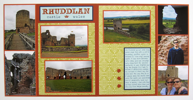
Also features Rough Type, Gorgeous Grunge

The thing I love about alphabet stamps is that you can use them as much as you want, unlike stickers where you always run out of E's and have a zillion X stickers and nothing to use them on.  And I can make the letters any color I want, that's pretty fabulous too.


When you read this page title, you're supposed to sing it to yourself and do jazz hands.

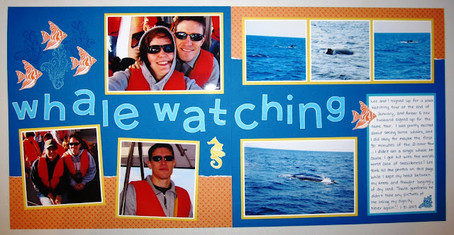
Also features Ocean Commotion
Another favorite page, although the day we took these pictures I was really busy being seasick the whole time.  But the pages look pretty great.  What's not to love about a blue and orange color combo!

So that's the Flashback, and here's today's new project, another scrapbook layout:


And it's another blue and orange color combo.


It's been so overcast and rainy here lately that the colors aren't coming out true to life, that's not gray it's Marina Mist.  As you can tell from the title, these pics are also from our Fuji trip, but I had pictures of us at several different restaurants so I just grouped them all together.  And "Fuji Food" just sounded funny in my head, thus my title was born.  Plus it amuses me to post a food-related layout the day after the biggest meal of the year.


Today's color palette:  Marina Mist, Garden Green, So Saffron, Tangerine Tango, Basic Black, and Whisper White.  I'm still doing green and gold for Fuji pages, although I used a different pattern from the Haiku pack than I did on the three layouts where we're actually on the dread mountain.

Have a great weekend, peeps!  And if you're out shopping, be careful out there.  People be crazy!

Supplies, Fuji Food only:
Stamps:  Big Deal Alphabet
Ink:  Tangerine Tango, Early Espresso
Paper:  Marina Mist, Garden Green, Whisper White, Garden Green DSP, Haiku DSP
Accessories:  Circles Framelits

Monday, February 9, 2015

Go Away!

Me, not you :)  When we were getting ready to leave Okinawa, my coworkers set up a farewell lunch for me, and then one of the guys called it a "go away lunch" (which sounds like he couldn't wait to get rid of me...) and the name stuck and now it's immortalized in scrapbook form!


What's funny is when I started this layout, I had the pages reversed so the one with the title on it was on the right.  But I like it better this way, and how it looks like that patterned paper strip goes straight through even though I cut it so there would be a border of Melon Mambo between it and the photo.

Here's my rainbow-licious color palette:


I started out with all the colors in the Sunshine & Sprinkles DSP (one of my all-time favorite packs!) and then added Pumpkin Pie and Orchid Opulence to complete the rainbow.  I needed those two extra colors to do my title all multicolored.  Do you like the title?  (You can scroll back up to look, I'll wait.)  I can't seem to get away from mixed font titles but at least I used some different alphabets this time.

That's it for me today, peeps.  Cheers!

Supplies, mostly SU!
Stamps:  Retro Alphabet Upper, Big Deal Alphabet, non-SU image
Ink:  Pacific Point, Orchid Opulence, Marina Mist, Daffodil Delight, Basic Gray, Pumpkin Pie, Lucky Limeade, Memento Tuxedo Black; Basic Black marker, Blush Blossom marker, Marina Mist, Night of Navy, & Smoky Slate Blendabilities
Paper:  Melon Mambo, Pacific Point, Basic Gray, Whisper White, Sunshine & Sprinkles DSP
Accessories:  Circles Framelits