Showing posts with label Symbols of Solicitude. Show all posts

Saturday, July 4, 2026

The Thirteenth Pearl

Happy 4th of July, y'all, and welcome to the Nancy Drew Challenge!  We get fireworks for the final hardback Nancy Drew, #56 The Thirteenth Pearl.


The one on the left is my childhood copy, and the one on the right is another matte edition that I picked up at that middle-of-nowhere used book store in Wyoming; the colors are just a bit more saturated on it but for now at least I plan to keep them both.  We get a fun BLUE book cover this time and you can tell we're traveling based on the building depicted on this cover.  I do like how Nancy is in profile and she's the only spot of color on this otherwise blue and gray cover.

Case file:  Japanese jeweler Mr. Moto asks Nancy to locate a missing pearl necklace that belongs to a wealthy socialite (we hear about her a lot but she never actually appears in the book), and shortly after that Mr. Moto also disappears.  Nancy and Carson follow rather insubstantial clues to Tokyo and start tracking an international gang of jewel thieves; upon returning to River Heights the book takes a very strange left turn when Nancy and Ned spy on a cult of pearl worshipers before getting kidnapped.  At least we got a daddy-daughter trip to Japan first, it's fun to have more Carson than usual in this one.

Here's my card:


Naturally I had to do a card featuring pearls for The Thirteenth Pearl, though I included seven pearl embellishments and a bunch of stamped ones.  Did I purchase Seaside Bay specifically to make a card for this book?  Yep.  Of course I did.


I found this Azure Afternoon (and possibly Pool Party?) wash in the Lights of Aurora DSP Stack and I like how it feels like you're underwater and the sun is shining into the water.  I kept a very simple layout and just did some Barely Blush shading on the inside of the oyster and some Wink of Stella on the pearl.  They do talk about color variations in pearls in the book, mentioning pink specifically.

Supplies, all SU!
Stamps:  Seaside Bay
Ink:  Basic Gray, Barely Blush, Barely Blush Blends
Paper:  Basic Gray, Azure Afternoon, Barely Blush, Basic Beige, Lights of Aurora DSP Stack
Accessories:  Seaside Bay dies, Layering Circles dies, Circles Collection dies, pearls, Dimensionals, Wink of Stella

It's the last hardcover book, you know we're not stopping with one card.  Here's my second:


I bought Geisha Anya from The Greeting Farm many, many moons ago (I have a collection of Asian-inspired stamps since we used to live in Japan for a couple of years) and I'm fairly certain this is the first time I've used her as I still had backing paper on the stamp.  I had some fun coloring in her hair and her kimono, and this time I used some In Color Dots but they look like the flat pearls we had last year in the newer colors so they're still pearls.


I decided to use some Golden Glow for Nancy's hair this time and Flirty Flamingo and Barely Blush for pinks to go with Nancy's face.  And lots more Azure Afternoon for my blue book cover.

Supplies:
Stamps:  Geisha Anya from The Greeting Farm, Symbols of Solicitude, French Filigree
Ink:  Memento Tuxedo Black, Azure Afternoon, Stampin' Blends in Basic Black, Smoky Slate, Barely Blush, Azure Afternoon, Golden Glow
Paper:  Azure Afternoon, Basic White, Moonlit Flora DSP
Accessories:  Stitched So Sweetly dies, Dimensionals, In Color Dots

But wait, there's more!


I had pulled Power of Hope and this pagoda before I remembered that I had Geisha Anya, but I wanted to make a card with it too.  I used the leftover scrap of DSP from my first card here and once again accented with more pearls.  I found the Basic Gray DSP scrap in my stash.


Supplies, all SU!
Stamps:  Power of Hope
Ink:  Azure Afternoon, Basic Gray
Paper:  Azure Afternoon, Basic Gray, Basic White, Lights of Aurora DSP Stack, Basic Gray DSP
Accessories:  Stitched So Sweetly dies, Dimensionals, pearls

The Thirteenth Pearl trucks along fairly normally by ND standards for like the first 80%, and it reminds me of Fire Dragon where Nancy and several friends visit Hong Kong.  Nancy even dresses up in a kimono and wig to pass herself off as Japanese in this one while George impersonated a specific Chinese girl in Fire Dragon, which is still not my favorite plot point.  I did like the part of this book spent in Japan and we learn quite a bit about cultured pearls, but the ending of it just comes out of left field where suddenly there's not just jewel thieves but a pearl cult.  Say what now?  The heck is a pearl goddess??  I give it three and a half stars for the bizarre turn, it does get extra credit for going to Japan because I loved that part of the plot.

This is the last hardcover Nancy Drew, so does that mean we're done with the Nancy Drew Challenge?  Heck no!  Starting next week, we'll turn over to the Simon & Schuster paperbacks, and not only are there many many of those, there are several cover variations for a lot of them too so I have a whole lot of cards in my future.  If you're inspired to make a card based on today's book, leave me a comment!  And I'll see you here next Saturday for The Triple Hoax.

Sunday, December 2, 2018

China: Han Tombs & Great Wall

It's China Sunday!  All the layouts I'm sharing today are ones that I've shared before, but there are six of them in a row so we're just doing a rerun post today.  Hope you enjoy!


This was one of the earlier layouts I did for the China books (original blog post here).  The page base is Elegant Eggplant, and some of the photos are matted with Perfect Plum.  This was the very last thing we did in Xi'an before boarding the plane to Beijing.


And our first activity in Beijing was going to the Great Wall!  I will never say no to an opportunity to look at these pages :)  (original blog post here).


We had SO MANY pictures from the Great Wall and I just didn't want to leave any out if I could help it, ha!


This is one of my favorite layouts ever (original blog post here).  I need to look around online and see if I can find more Handsome Hunter cardstock in both 8.5x11 and 12x12.  It was the perfect Baylor green and I'm almost completely out.


We've been teasing Missy for years about her affinity for lots of stairs but I think the Great Wall will forever hold the record for most stairs in a single day (original blog post here).


And there's the last Great Wall layout (from this day, anyway).  Hope you enjoyed this scrappy flashback.  Have a great Sunday!

Monday, May 9, 2016

The Great Wall of China, Part 1

Scrappy Monday, y'all!  Hope your weekend was good.  Ours was pretty quiet, other than going to see Captain America:  Civil War on Friday night--that was loud ;)  I love movies where stuff blows up.

Anyway, I bring to you today some scrapbook pages from our trip to China, which will make Missy very happy.


See the original pics here.  I printed out SO MANY pictures that I ended up doing FIVE layouts from our first time on the Great Wall (we went back a couple days later for the marathon, though we only walked the 5K no matter what the other three try to tell you) but I'm only sharing two of them today.


You might have noticed that we're all wearing our Baylor shirts in the pictures, so I wanted to use Baylor's colors for the pages.  Luckily for me, green and gold worked pretty well with our Great Wall photos :)  I've been hoarding Handsome Hunter and now I know why--well, after five layouts I don't have a ton of it left but this was definitely the place to use it.  I have a ton of 12x12 Summer Sun though.  Anyway, that dragon might seem like an odd choice for the focal point photo since it's not of the wall, but it was the very first picture we took when we arrived at the Great Wall and I kinda got used to seeing it first every time I flipped through the pictures so I just had to put it there.


And here's the second layout:  absolutely no finesse involved here, it was all about getting in a bunch of landscape shots and some journaling.  I still wanted the green and gold on there, so the journaling is written in Handsome Hunter ink and I sponged some Summer Sun around the edges of the journaling block.


My color combo for all five Great Wall layouts:  Handsome Hunter, Summer Sun, Crumb Cake, Chocolate Chip, and Very Vanilla.  I'm not a huge fan of Crumb Cake, even though there's lots of people out there who love it like crazy, so I was a little surprised when I liked it so much for these layouts.  I wish SU! still sold 12x12 cardstock in single-color packs...even if they did the 3-color variety packs to match patterned paper like they do in the 8.5x11 size I'd still take it.  I use some colors a lot more than others and it sucks to have to buy a combo pack to only get two sheets of what color I want when I already have 20 sheets of the other colors :p

Anywha, it's not raining right this minute (minor miracle) so I think I'll go take my doglets for a walk.  Good thing Sadie can't read what I'm typing or she'd be all up and excited and trying to shove me out the door already.  TTFN, peeps!

Supplies, first layout:
Stamps:  Rough Type, Timeless Textures, Symbols of Solicitude
Ink:  Crumb Cake, Handsome Hunter, Chocolate Chip
Paper:  Crumb Cake, Handsome Hunter, Chocolate Chip, Summer Sun, Very Vanilla
Accessories:  Lettering template, circle punches

Supplies, second layout:
Stamps:  Circle Circus, Asian Art
Ink:  Crumb Cake, Handsome Hunter, Summer Sun
Paper:  Chocolate Chip, Crumb Cake, Very Vanilla
Accessories:  Circle punches

Friday, October 10, 2014

Friday Flashback: Symbols of Solicitude

Ok, so I'm just running late all week :)  But it's still Friday and we're still doing the Friday Flashback!  Today's featured stamp set is Symbols of Solicitude, which lives in the same stamp case as the similar set Kanji.  Having lived in Japan for almost three years, of course I have to have pretty much all the Oriental stamp sets that SU! makes.  So let's go!


The picture doesn't show it very well, but I stamped the "peace" kanji and embossed it with silver on the left page.

Also features Embrace Life
What is it about Japanese/Chinese stuff and the color red?  Yep, I use them together a lot.

Also uses Kanji
This was a wedding present for a friend of mine; she wanted something Japanese (and nope, they're not Asian at all).  I made both the card and the cross-stitched piece.  And now for today's new card:


Still red, I couldn't help it :)  I'll just need to remember this card next February when my friend Chris' birthday rolls around, I think he'd like this.  I based it on a past Retro Sketch:


The card actually came together really fast once I finally got in my craft room to work on it.  I'm gonna get back in the groove so I can have posts ready ahead of time, it's my new goal.  For now though, thanks for joining me for this week's Friday Flashback and have a great weekend!

Supplies, last card only:
Stamps:  Symbols of Solicitude, Four You
Ink:  Chocolate Chip
Paper:  Riding Hood Red, Very Vanilla, Haiku DSP
Accessories:  Hexagon punch (to flag the ends of the sentiment strip), Dimensionals, Square Lattice EF

Wednesday, June 12, 2013

CreativeCrew: Battle of Okinawa Tour

Howdy, folks!  Time for me to share another CreativeCrew project for June!


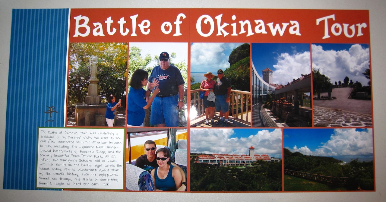
The scrapbook challenge is to do a page (or in my case, pages--I almost never do single pages other than the first and last in each album) featuring your dad.  That worked out for me since I've been trying to finish up this album from my parents' visit to see us in Okinawa in 2008...holy cow it's been nearly 5 years now and I'm still working on it.  Well, I'm almost done!  Another challenge was to use color blocking, and it didn't occur to me that this layout looks kinda color blocked until one of the other Crew members commented on it.  Mostly I was trying to figure out a way to include all those pictures without cropping them much :)

Looks like I never blogged these pics over on Snapdragon, so I'll tell you about them here.  During my parents' visit, we went on the Battle of Okinawa tour, which took us to several sites on the island connected to the 1945 American invasion, including the Japanese Naval Underground headquarters, Hacksaw Ridge, and Peace Prayer Park.  It's unreal to think of how many people died during the battle--you can see bloodstains on the wall at the Japanese Naval Underground from where some Japanese officers committed suicide rather than concede defeat.  And Peace Prayer Park encompasses the cliffs on the southern tip of the island, where more Japanese officers jumped off the cliffs rather than surrender.  Today, the park is beautiful and serene and dedicated to peace while remembering the horrors of war.

Our tour guide, Setsuko, is this tiny little Japanese lady who speaks rapid-fire English with a heavy accent, but she usually repeats herself three or four times so you have a better chance of getting everything she's saying (my favorite thing she said:  every tour--hubs and I did several with her--she'd ask if any one needed to visit the "powdah loom"--powder room).  She was just a few months old when the Battle of Okinawa happened, and she hid in caves on the island with her family.  She's very passionate about sharing the island's history, especially since Japanese accounts generally gloss over their role--the Japanese military encouraged Okinawans to commit suicide rather than allow themselves to be captured by Americans, for one thing.  (Okinawans aren't exactly the same as mainland Japanese--they only became part of Japan in the 19th century.  Before that, the Ryukyu Islands were an independent kingdom and while they were somewhat related to the Japanese, they also had a lot more Chinese influence and they were a major trading hub in the Pacific in their own right.)

It's not all doom and gloom with Setsuko, however.  In the top left picture, in front of the Buddha statue, she'd started to say something about the statue and then had a thought that cracked herself up so much that she couldn't hardly talk :)  Mom especially liked her...she was our favorite tour guide on Okinawa.

Thanks for stopping by and don't forget to check out the CreativeCrew gallery here!

Supplies:
Stamps:  Symbols of Solicitude (peace kanji on the left hand page)
Ink:  Versamark, Basic Gray marker
Paper:  Dusty Durango (retired), Gumball Green, Whisper White, retired Pacific Point DSP
Accessories:  old Sizzix alphabet