Saturday, July 30, 2016

A-Team Baby Book: One Year Old

Ya know, with big projects like baby books, a lot of the time I get project fatigue as I get to the end and the last couple layouts just aren't my favorites.


I like the bright colors okay, but the layout as a whole just isn't really doing it for me.


The cake is a little too high to be centered, but I'm not sure that matters since the design is so much fatter on the bottom than the top.


Today's '80s Day-Glo palette includes Strawberry Slush, Pumpkin Pie, Daffodil Delight, Tempting Turquoise, and Whisper White.  And only one more page left for this book to share!!

Supplies:
Stamps:  Something to Celebrate
Ink:  Basic Black
Paper:  Strawberry Slush, Daffodil Delight, Tempting Turquoise, PTI White, Party Animal DSP
Accessories:  Apothecary Accents Framelits, Floral Framelits, Sizzix Alphabet, Prismacolor Pencils

Friday, July 29, 2016

Friday Flashback: Clockworks

Howdy, kids.  Today's Friday Flashback is even more time-oriented than usual because the stamp set is Clockworks!  So let's flash back.

Also features Best of Birthdays

I made this for one of those super-annoying no-color "color" challenges.  I like colors.  Lots of colors.  Not just neutral blahs.

Also features Teeny Tiny Wishes

Something CAS...

Also features Blessings from Heaven

And something not CAS at all.

Also features Teeny Tiny Wishes

I think this one is my favorite; I used the long-retired Brushed Copper cardstock and copper brads to make this one.  So that's it for the archives, here is today's new creation:


The main character in Doctor Who is an alien called a Time Lord, so I figured there was never a more appropriate time (teehee) to use Clockworks.  I convinced the hubs to take me to the Doctor Who Experience in Cardiff when we were in Wales in 2014, even though he thinks that Doctor Who is the weirdest show ever put on television.


After I stamped all the pocket watches and gears, I realized that I had lined up the numbers so the I is at the top of the clock face instead of the XII.*  #DUH.  I'm just going to pretend that's what a Time Lord's watch looks like.  Oh, for the DW logo, I just Googled for an image of it and printed out one that was line art, then I stuck it on top of Very Vanilla cardstock with removable adhesive and cut it out with scissors.  It's a little crooked but hey, handmade.

*I just looked back through the cards and I did the same thing on Card #3.  #DoubleDuh.


Today's color palette:  Very Vanilla, Brilliant Blue (for the TARDIS, naturally), Early Espresso, Baked Brown Sugar, and a fair bit of embossed copper.  All the watches and some of the gears are copper EP, which I still have from the last time SU! sold it so hey, I'm one up on the trend.

Okay kids, time for me to go back down to the basement.  Got some projects I need to work on.  Have a great weekend!

Supplies, scrapbook layout only:
Stamps:  Clockworks, Sense of Time, Rough Type
Ink:  Versamark, Brilliant Blue, Early Espresso, Baked Brown Sugar
Paper:  Very Vanilla, Brilliant Blue
Accessories:  Copper EP

Thursday, July 28, 2016

Okay, That's Better

After yesterday's misfire, I decided to go back to the flamingo since I'd made a card with it that I liked lately and I thought maybe it would be good luck.  So here's what I have today:


I do like it a heck of a lot better than yesterday's mess.  Here's the latest from Freshly Made Sketches:


I used the Layering Circles Framelits to cut a circle out of some scratch paper, and then used the negative as a mask for my card.  I really thought about adding some stripey Melon Mambo DSP to the card, but in the end I decided to stick to the sketch and I added some of those Metallic Enamel Shapes.  They're not exactly where I wanted them, but those little boogers are sticky.

Just had to play along at What Will You Stamp? again:


I wasn't going to buy that stamp set at first, but I'm glad that I got it on a whim because I have had fun playing with it (except for yesterday).  Well, I'm off to go work on the next scrapbook layout and spend some time in the basement with little Vader man.  Cheers!

Supplies, all SU!
Stamps:  Pop of Paradise, Sunshine Sayings
Ink:  Daffodil Delight, Melon Mambo
Paper:  Daffodil Delight, Basic Black, Whisper White
Accessories:  Layering Circles Framelits, Hello You Thinlits, Metallic Enamel Shapes

Wednesday, July 27, 2016

Meh.

I have just not been having a happy time in the ol' craft cave lately.  I feel like I'm in a rut and aside from the flamingo card I made a little while back, I haven't much liked anything I've made.  And the disappointment continues today.


It's just...meh.  For once though you can actually sorta see the sparkle on the Shimmery White cardstock I used for the watercolor wash panel.  I used this week's color combo from Cupcake Inspirations:


There's no good SU! analog to the magenta, so I ended up using both Rich Razzleberry (for the watercolor wash) and Sweet Sugarplum (for the patterned paper).  The other two colors were easier--Night of Navy and Pumpkin Pie.

And here's this week's Global Design Project sketch:


And the folks at What Will You Stamp? cycled back to a stamp set I have:


Maybe I shoulda used the flamingo and then I'd like today's card better.  Well, I'm going to keep wrestling with my mojo until I make something I actually do like.  Cheers, y'all.

Supplies, all SU!
Stamps:  Pop of Paradise
Ink:  Night of Navy, Pumpkin Pie, Rich Razzleberry
Paper:  Night of Navy, Shimmery White, Sweet Sugarplum DSP
Accessories:  Banners Framelits, Sunshine Wishes Thinlits, Rhinestones

Tuesday, July 26, 2016

A-Team Wedding 4

You know what, I'm just not going to get a card done for today so here's a layout I made two years ago.


I'd done three layouts for my brother's wedding when I found an envelope with more pictures in it, so I ended up having to make a fourth.  I think I was out of creativity though, this one is just...lacking.

Supplies, all SU!
Stamps:  None
Ink:  Night of Navy marker
Paper:  Certainly Celery, Riding Hood Red, Night of Navy, Bella Rose DSP
Accessories:  None

Monday, July 25, 2016

Our House (England)

Scrappy Monday, y'all!  How was your weekend?  We went to see Star Trek Beyond yesterday (I wanna go see it again already!) and other than that it was pretty quiet.  This afternoon we take Little Man in to get his leg brace, looking forward to that.

So on to this week's scrapbook layout!


Since hubs and I move around a lot, I try to take pictures of each house we live in--about six months ago I was scrapping some photos from North Carolina and I kept looking in the backgrounds of the pictures and thinking oh hey, we had a Harry Potter calendar! or I forgot we used to have that picture hanging in the dining room.  Hubs and I will have our 13th anniversary this October, and in that time we've lived in seven different houses.  So this is our England house, which was my favorite of all.  Oh, see the little Big Ben sticker next to the stairs on the right-hand page?  That was one of my address labels--I always try to include one of those on the scrapbook pages too.


I think I go in cycles with alphabet stamps for my scrapbook pages, and lately it's been all about the Letterpress Alphabet.  I have another layout sitting on my craft table right now, and the title on that one is done with Letterpress too.


Today's color palette:  Island Indigo, River Rock, Primrose Petals, Early Espresso, and Whisper White.  I chose Island Indigo because we painted a wall that color in the living room after we moved in this house; the Primrose was kinda taken from the curtains that were hanging up in the room that became my England craft room, and River Rock seemed to go with those two colors together.

I'm excited to get back to work in my craft room today.  It's so nice having a clean table that's dog hair-free!  And since I cleaned the table, I also finished updating my personal stamp catalog and rearranged my stamps, putting all the newly retired ones in with the older ones and making sure all my alphabets and current stamps are up front.  I have two five-foot-tall cabinets for stamps and I'm thinking I need to upgrade to some 6-foot-tall bookshelves because I'm double-stacked.  Guess I know what I should ask Santa for this Christmas!

Cheers, y'all!

Supplies, all SU!
Stamps:  Spencerian Alphabet, Letterpress Alphabet, Circle Circus
Ink:  Island Indigo, Early Espresso
Paper:  Island Indigo, River Rock, Primrose Petals, Thick Whisper White
Accessories:  Oval & scalloped oval punches

Saturday, July 23, 2016

A-Team Baby Book: March

Y'all, we are almost at the end of this baby book--just a first birthday layout and the last page are left.  Woohoo!  So let's check out March:


I admit, my March layouts often look very similar across multiple baby books.  I just don't have a whole lot of St. Patrick's Day stamps, and I really do love that patterned paper.


And I love O'Leary.  And I was sneaky:  the A-Team are super rah-rah for their respective college teams, and this page is yellow and green and has a bear on it, which are the colors and mascot for MY school.  Teehee!  Well, what other colors would you use for a St. Patrick's Day layout?  By the way, the accents on this layout are Night of Navy, not black, though they look black in the photos.


One more shamrock.


And here is today's color palette:  Pear Pizzazz, Garden Green, Night of Navy, So Saffron, Chocolate Chip, and Whisper White.  In other news, I *did* get my craft table cleaned off yesterday and it looks so nice and sparkly that I really wonder why I waited so long to clean it.  I got to work yesterday updating my personal stamp catalog and I'm hoping to start another scrapbook layout today.  Cheers, y'all!

Supplies:
Stamps:  Pinch Proof, bear from Whipper Snapper
Ink:  Basic Black, Garden Green, Night of Navy
Paper:  Pear Pizzazz, Garden Green, Night of Navy, PTI White, Country Club DSP
Accessories:  Deco Labels Framelits, circle & scalloped circle punches, Sizzix alphabet, Prismacolor Pencils

Friday, July 22, 2016

Friday Flashback: Fruit Stand

Happy Friday, y'all!  I just finished up my Flashback card, and as soon as I go back downstairs I'm going to clean off my stamping table.  I don't *think* my girl dog Sadie gets up there to have fun with my craft supplies, but somehow her hair does--I've long suspected it is self-aware and also independently mobile.  But I've been needing to clean off my table for eons so I'm gonna do it TODAY.

On to the Friday Flashback!  Today's retired stamp set is Fruit Stand, a set of three stamps from 2008 and wouldn't you know, I happen to have cards with each stamp in the set.

Also features Amazing to Zany
I admit, the peaches are my least favorite stamp, but that might be because when the set was released, there was a huge discussion on Splitcoast about the peaches' resemblance to a certain male body part.  o.0

Also features Stippled Stencils

I do like the grapes, though.

Also features Short & Sweet

And the raspberries are my favorite, though I suppose they could be blackberries too.  This card has the most comments in my entire Splitcoast gallery thanks to a little prank my Mothermark. I later sent her a card with like 85 buttons on it.

So anyway, here is today's new creation:


I had to go with the raspberries because they're my favorite, and also because of today's 
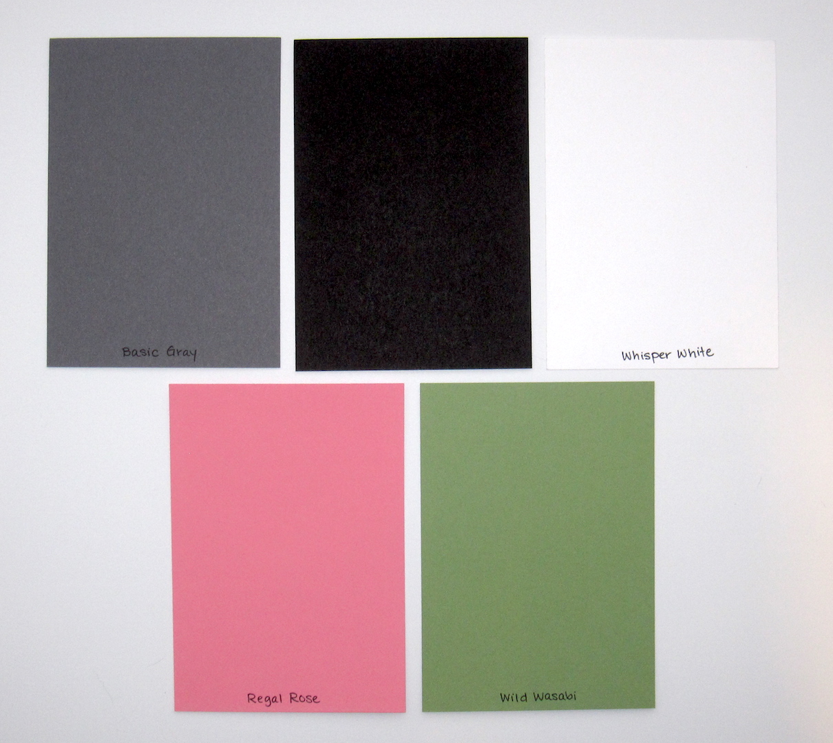
FabFriday color combo:


The colors might make you think of Christmas but I'm a rebel so I did something else.  I get kind of annoyed at those people who like to pretend fall doesn't exist and start dragging out their Christmas stuff before Halloween (I have a cousin who's planning to have her kids pose in their Halloween costumes next to the Christmas tree.  NOOOOO!) so I like to wait until at least November to think about Christmas stuff.  Thanksgiving deserves its own time in the holiday spotlight if you ask me.

Anyway, Christmas colors aside, I figure a fruit stand (and fruit in general) is a summertime thing, so I'm entering over at Retro Rubber:


And staring at that fruit stamp is kinda making me crave a piece of triple berry pie.  With ice cream because of course ice cream.  Anyway, as I said Fruit Stand came out in 2008, so it's now 8 years old, and the Four You sentiment is 3 years old.

I also used this week's Retro Sketch:


I turned the sketch on its side, and instead of having the three small circular elements clustered around the image, I lined up some Candy Dots in the corner of my card.

Okay kids, I'm off to clean up my stamp table and maybe organize a few things.  Then I can start my next scrapbook layout with a clean slate.  Have a great weekend!

Supplies, last card only:
Stamps:  Fruit Stand, Four You
Ink:  Versamark, Early Espresso, Cherry Cobbler, Garden Green, Blushing Bride, River Rock
Paper:  Cherry Cobbler, Garden Green, Very Vanilla, Bella Rose DSP
Accessories:  Clear EP, Neutrals Candy Dots, Dimensionals

Thursday, July 21, 2016

Watercolor Pineapple

Hey, y'all.  I'm spending lots of time in the basement to hang out with my injured little boy dog, and that's also where my craft room is so you'd think I was making lots of progress on stampy projects and you'd be wrong.  The last set of scrapbook pages I worked on was from the Harry Potter studio tour, which prompted me to start an HP re-read, and that seems to be sucking up a lot of my time :)  I'm on Goblet of Fire now, Harry just finished the second task in the Triwizard Tournament.  But I managed to tear myself away long enough to make a card.


I just had to make something pineappley for the tropical challenge at Cupcake Inspirations:


And I thought maybe the color combination at the Color Throwdown would work:


I used Pear Pizzazz, Peekaboo Peach, Sweet Sugarplum, and Pool Party.  Last of all I thought I'd play along with the sketch at As You See It:


For my background panel, I scribbled on my largest acrylic block with markers, misted heavily, and stamped it on Shimmery White cardstock.  The Sweet Sugarplum was still lots darker than the Pool Party, so I used an AquaPainter to add in more blue.  I kinda wonder if my card still needs a little something extra but I don't know what.

Anyway, I'm going to head back to the basement.  Maybe this time I'll work at my craft table instead of reading...oh J.K Rowling, your books still suck me in even though I've read them all several times over.  It's still quite the tale!

Supplies, all SU!
Stamps:  Pop of Paradise, Love & Affection
Ink:  Pool Party, Sweet Sugarplum, Peekaboo Peach, Pear Pizzazz
Paper:  Pool Party, Peekaboo Peach, Shimmery White
Accessories:  corner rounder punch, Dimensionals

Wednesday, July 20, 2016

Big Shot Magic

Ya know, with all the great new dies that SU! came out with this summer, it's easier than ever to make a cute card super fast.  Which is nice when it's 3:00 in the afternoon and you still need to go to the grocery store if you're gonna make lasagna for dinner tonight and yet you still want to make a card...not saying that happened around here ;)

(It totally just did.)

So I broke out two new Sunshine Sayings dies, plus the Lots of Labels Framelits that apparently are my favorite thing lately, and ten minutes later I had this:


The only reason it took ten minutes is because my girl dog, Sadie, insisted on plopping herself under my craft table so I couldn't roll my desk chair where I wanted it to access my paper trimmer, so I was having to lean over crazy angles to cut the cardstock and she just looked at me like yep, I'm in charge around here.  Sometimes I think she really is...

Anyway, I used today's hot-off-the-presses Freshly Made Sketch:


I admit, though, that my interpretation of the sketch is a bit liberal...I used the heart for the circle element, and the die-cut word is meant to take the place of the long skinny piece on the sketch.  When I finished adhering everything to the card base, I was looking at it and trying to decide if it needed anything else when the song "Rhinestone Cowboy" started playing on my iPod, so I took it as a sign and added some rhinestones.  Who doesn't like rhinestones.

I also used this week's Global Design Project color combination:


Since I got the Pop of Pink DSP last week (not to mention the Pop of Paradise stamp set with the flamingo!) I've been wanting to Melon Mambo everything all the time so this challenge was excellent timing :)

Anyway, I'd better skedaddle to the grocery store or we ain't havin' nothin' for dinner at all.  Cheers!

Supplies, all SU!
Stamps:  Sunshine Sayings
Ink:  Smoky Slate
Paper:  Smoky Slate, Melon Mambo, Thick Whisper White, Pop of Pink DSP
Accessories:  Sunshine Sayings & Lots of Labels dies, rhinestones

Tuesday, July 19, 2016

Nachos: Bright Blooming Birthday

Mornin' Nacho fans!  I'm a little late with my post today, I'm still so preoccupied with poor little Vader and his knee.  We got him some pain medication yesterday (yay!) and he's got an appointment this afternoon to have a cast of his leg done to be professionally fitted for a leg brace to help that knee heal, so that's good.

Anyway, Nacho Average Challenges has some bold, bright, beautiful colors for you this week, lookie!


If you have the Festive Birthday DSP (and the matching Birthday Fiesta stamp set, complete with party llama!) then this will be easy for you!  I don't have either yet, though I llove the llama :)  And who wouldn't love a card that says "Party like there's no manana"?

Well anyway, I thought these colors would be great with some bold black patterned paper and some bright flowers.


That pattern is from Pop of Paradise and it kinda makes your eyes cross a little bit IRL, it's not just the picture.  But I wanted a black layer to make my flowers pop.  I also used the circular Metallic Enamel Shapes for the flower centers.

Check out the Nacho blog to see some other festive creations...I spied a pinata but no party llamas, so if you've got that stamp set and participate in this color challenge I will give you a giant gold star :)  Fiesta!

Supplies, all SU!
Stamps:  Flower Patch
Ink:  Pumpkin Pie, Tempting Turquoise, Emerald Envy
Paper:  Pumpkin Pie, Thick Whisper White, Pop of Paradise DSP
Accessories:  Flower Fair Framelits, Metallic Enamel Shapes

Monday, July 18, 2016

Sadie's Surgeries

Hey kids, scrappy Monday.  I spent about 85% of the weekend in the basement with Vader, though the hubs says he thinks that's more for myself than it is for Vader because he's sleeping most of the day anyway.  So long as he's not trying to get up and move around, that's good...and we've got a vet appointment for him tonight (finally).

So anyway, given that we once more have an injured dog in the house, it seemed appropriate to share this layout today:


So Sadie has gone through this injury twice too, but she had surgery for it both times and Vader can't have surgery because of some weird blood work.  To be honest though, Vader's recovery with a leg brace was easier than Sadie's after surgery--no incision, no Cone of Shame, and it seemed easier on him but too, I think he wasn't injured as seriously as Sadie was.  Except this time we reckon he really did a number on his knee.  :(

Sorry I'm a bummer today.


The color palette today includes Basic Gray, Basic Black, Smoky Slate which I forgot to put in the palette, Whisper White, Regal Rose, and Wild Wasabi.  I chose the pink to match Sadie's compression bandage, and the green to match her "sorry you had to have surgery again" toy.

Cheers, y'all.  I'm gonna go spend more time with Vader :)

Supplies:
Stamps:  alphabet from Unity, apostrophe from past Paper Pumpkin kit
Ink:  Memento Tuxedo Black, Basic Black marker
Paper:  Basic Gray, Basic Black, Whisper White, Regal Rose, Wild Wasabi, Basic Gray DSP
Accessories:  Lettering template

Sunday, July 17, 2016

Surprise Sweetie!

Guess what guess what GUESS WHAT!!!


I'm a Surprise Sweetie at Cupcake Inspirations!  They kindly invited me to play along with this week's challenge:


a.) Those cupcakes look ridiculously yummy.
b.) I wouldn't say no to eating the pineapple, too.
c.) I think I need to make another card with a pineapple on it, but for now here's what I made:


I kinda seriously love this card and I know exactly who's going to get it.  My friend Ashlea lives in Hawaii (hello tropical!), and she loves hot pink and bold black & white prints.  I don't know how she feels about flamingos but I'mma find out.  I just got the Pop of Paradise stamp set last week so I was very excited to ink it up...and there's a pineapple in the set, so I think I may just have to play along with this challenge a second time.

And you can play along too!  Go check it out at Cupcake Inspirations.  Cheers!

Supplies, all SU!
Stamps:  Pop of Paradise
Ink:  Melon Mambo, Emerald Envy
Paper:  Melon Mambo, Emerald Envy, Basic Black, Thick Whisper White, Pop of Paradise DSP
Accessories:  Lots of Labels & Layering Circles Framelits, rhinestones, Dimensionals

Saturday, July 16, 2016

A-Team Baby Book: February

Well, with all the distractions of my little man Vader being injured again, I forgot to get this posted this morning.  Behold, the February layout for my niece's baby book:


Her mama is a TCU horned frog, so I used purple for the page base and a cute little frog for the main image:


I think this was the very first layout I started for this book.  And can I say I'm pretty proud of my shading on Ms. Frog here.  My Prismacolor pencils have gotten a workout this year.


Can't leave off a cute little something on the journaling block.


And some hearts, in case you missed that this is a Valentine's layout.


And here's the color palette for today:  Orchid Opulence, Regal Rose, Rose Red, Kiwi Kiss, and Whisper White.  I should pull out cardstock swatches of Orchid Opulence and see how it compares to Sweet Sugarplum

I'm off to the basement to go spend some more time with my little doglet.  Cheers, y'all.

Supplies:
Stamps:  I {Love} Love, I {Heart} Hearts, Whipper Snapper frog
Ink:  Basic Black, Regal Rose, Kiwi Kiss
Paper:  Orchid Opulence, Regal Rose, Rose Red, Kiwi Kiss, PTI White, Raspberry Tart DSP
Accessories:  Sizzix alphabet, Prismacolor Pencils