Scrappy Monday, peeps! Hope you had a good weekend. On Saturday I was working in my craft room to meet my scrappin' goal for February, I'm now officially at 40 pages for the year so far. Woowoo! So today's layout is from China, take a look:
You can see the original pictures
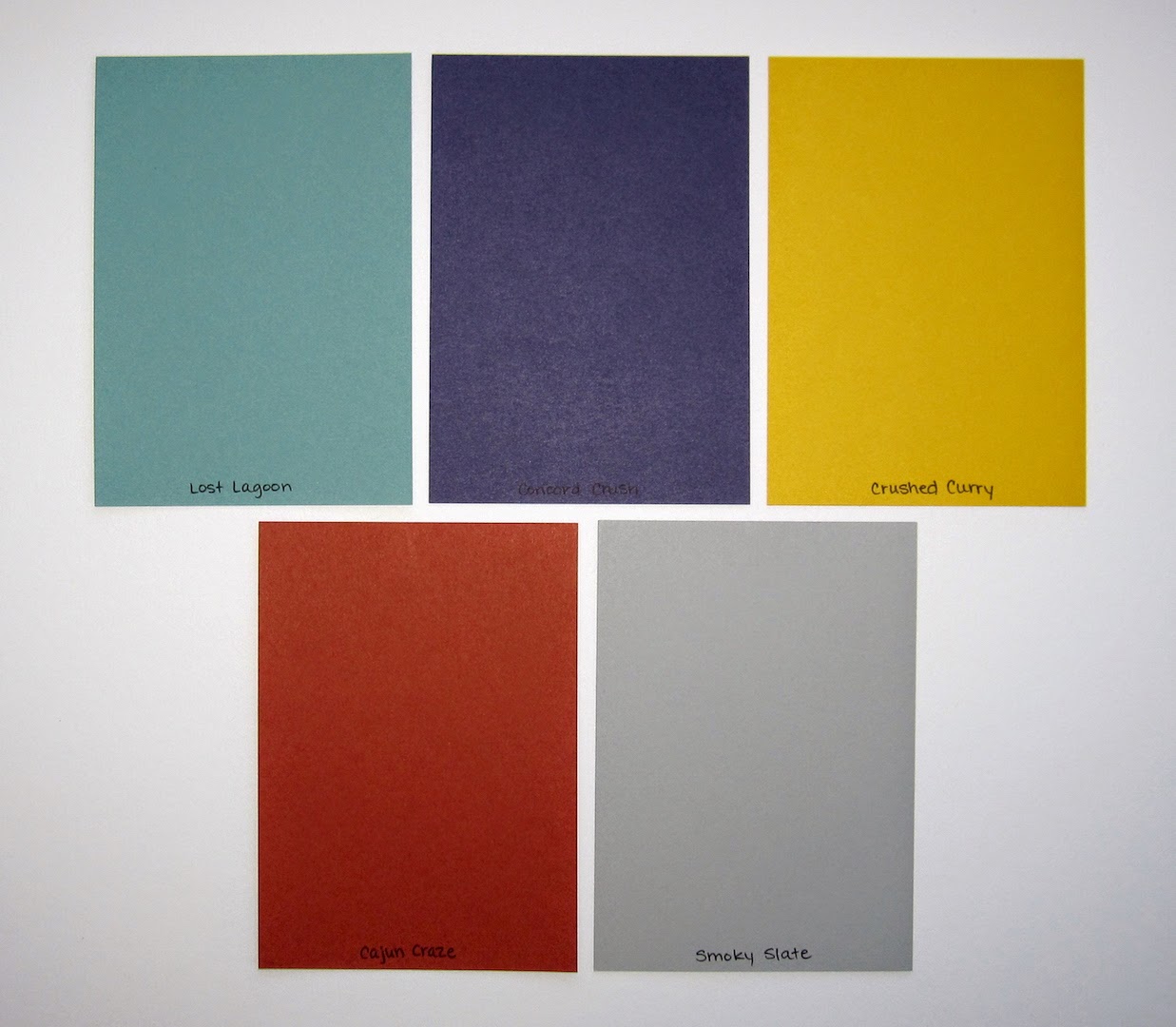
here (scroll down to the bottom). And here's my color palette:
I think it was overcast when I took the picture of the layout; the Lost Lagoon page base makes it a *little* dark but it looks even darker in the photo. Anyway, the colors are Lost Lagoon, Concord Crush (I so wish I had an ink refill for my ink pad), Crushed Curry, Cajun Craze, and Smoky Slate.
I'm using this combination of the letter template and Rough Type alphabet to do all the titles on my China layouts, to kinda make them feel like they all go together. I thought this title needed a little something so I sponged a circle behind the words to kind of mimic the Hard Rock logo.
Here's my stampy collage on the journaling block. I bought both Extreme Elements and Grunge Rock right before they retired on a whim, but I'm glad I did. I've used them both a few times and I have other layouts where I know they'll come in handy.
A trio of guitars as accents...I didn't even think about it until the layout was done, how many circles/polka dots I used on here. Variations on a theme!
And finally there's my stamp of authenticity, which I thought was a nice touch since when we went to the Hard Rock, all four of us were kinda tired of Chinese food and dying for a good ol' fashioned American hamburger. Or chicken caesar salad. And French fries.
Have a great Monday, peeps! I'm off to get my run on, which is gonna suck because my legs are sore from my workout on Saturday. Oh well, gotta do it anyway.
Supplies, mostly SU!
Stamps: Grunge Rock, Extreme Elements, Rough Type Alphabet
Ink: Lost Lagoon, Crushed Curry, Concord Crush, Cajun Craze, Smoky Slate, Basic Black, Versamark
Paper: Lost Lagoon, Crushed Curry, Cajun Craze, Whisper White, Concord Crush DSP
Accessories: Circle punches & Framelits, Crushed Curry EP, lettering template